| Image |
Comment |
| 06/21/2005 09:52:46 AM |
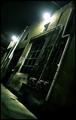
Darkness Pervades the Morning Lightby banmornComment: Marvelous composition. The framing is perfect and the grey mid-tones are very good. Just a nice capture that proves that great pictures are everywhere. B&W works for this image.
On the technical side the top lighted parts of the blinds are overexposed and hurts the composition slightly.
This is a very goo capture and should score high. |
 Photographer found comment helpful. Photographer found comment helpful. |
| 06/21/2005 09:48:06 AM |
The Evil Eyeby ecdillonComment: Black cats fit a dark theme for this challenge. General photographic qualiity and clarity is good and the closeup composition is fine. Lighting is OK.
This woud be wrong but many viewers will see this as an attempt to slip a pet picture into the challenge and vote it lower.
There are a lot of white specks, particularly around the right eye, that will detract from the composition as will the out-of-place hair on the right near the whiskers. This image would score higher if those items could have been cleaned off.
The image shows some digitalization 'jaggie' effects on the cat's whiskers. The reflection of the flash in the cat's right eye is a slight distraction.
Overall this is a well framed macro composition. |
| Photographer found comment helpful. |
| 06/21/2005 09:38:39 AM |
Homeless in Dupont Circle 09by DeliberateSpoonComment: Homelessness is good darkness concept. Framing is fine. Depth of field works for the greenery behind.
The softness of the image focus will result in lower scores and is its most notable defect. At this distance viewers expect to be able to see more detail in your subject, despite his condition and the nature of this shot.
Overall the colors in this composition are weak, even the green in the background. Brightening the colors would add more visual interest to the composition. This could be intentional but will not work very well for most viewers.
This image captured from a 'snapshoot' angle and might be more interesting if taken from a different perspective like from below or from the level of the homeless person. This makes you look figuratively like you are looking down on the homeless though that is probably not you intention. |
| Photographer found comment helpful. |
| 06/21/2005 09:28:12 AM |
Urban Ampby er0kComment: Good attempt to add interest to the composition though use of perspective. This urban study peaks the interst of the viewer. The harsh lighting on the building is the strength of the composition. General photographic quality is OK.
Generally speaking the two overexposed areas where the lamps are would be a photographic error but appear to support the nature of this particular composition. That will work for some viewers but not for others. Some viewers will have difficulty finding something in the composition they care much about or can relate to and will vote it lower because of it. |
| Photographer found comment helpful. |
| 06/21/2005 09:17:38 AM |
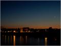
Darkness fallsby cbonsallComment: Sky, moon, and reflective water are good ingrediets for en evening cityscape. To have about 1/3rd of the image devoted to horizon below the sky is generally about right for a cityscape. Sunset is the gateway to darkness so fits the challenge theme well.
This image will score low for several reasons. There is considerable electronic noise in the sky that should be removed. The image is very soft focused and has a yellowish hue common inn low light level situations. There should be color corrections applied in post processing to bring out latent colors and add visual interest to the image.
There is not a lot appealing for viewers to see in this image. The composition lacks a central focal point that the viewer will like to look at. The building and moon ar about the only things to attract the viewers eyes and those are small with little detail to be seen.
The river is calm and would make for great reflections but there is very little for it to reflect. There is plenty of sky in the composition but not much there to look at either. Good cityscapes with lighted skies like this are better if it contains clouds. |
| 06/21/2005 09:04:48 AM |
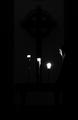
Contemplativeby charliebakerComment: Outstanding clarity. Good tonal range. B&W is a good choice of presentation. You are to be commended for including very, very faint detail. Interesting way to convey the idea of darkness.
The outstanding photographic quality is the strength of your image. Most viewers will understand it fits the challenge, but there will be a few that do not.
The rightmost candle is a little overexposed which will hold down your score slightly.
Overall this is an outstanding image that should score decently if studied closely by viewers. Message edited by author 2005-06-22 15:30:21. |
| Photographer found comment helpful. |
| 06/21/2005 08:54:01 AM |
And in the dark she dancedby GoldBerryComment: Unique coloring, action pose and good use of the rule of thirds. Different interpretation of the challenge topic. Overall photographic quality is good.
Your presentation very interesting. The use of blur to convey the sense of action by your model is a very interesting idea that wil work for some viewers but not for others. |
| Photographer found comment helpful. |
| 06/21/2005 04:16:47 AM |
Sensing Youby datcatComment: Interesting and creative idea for this challenge. Color is OK and clarity of the open eyes is good. Generally decent photo quality.
You will be rewarded by viewers for a creative idea but to what degree is to be seen.
On the technical side there is a bright patch of light on the upper right side that will act as a distraction to the average viewer. It probably should be removed. Viewers will be curious to know what the jagged edge around the eyes is and why it was set up that way but the image itself does not provide an answer.
You might score higher if the eyes occupied a physically larger area of the frame. |
| Photographer found comment helpful. |
| 06/21/2005 04:09:48 AM |
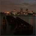
Darkness Fallsby howardjComment: Nice evening cityscape that conveys a concept of darkness well. Good clarity, composition and the horizon is level.
The image is slightly low contrast and you can give it a little more visual appeal by setting a true black point or by using selective color to make blacks just a little balcker. It will loose some detail but will have better contrast as a payoff.
You might consider color processing to bring out brighter and more eye catching color in the sky at the top of the frame.
Overall this is a nice image. |
| Photographer found comment helpful. |
| 06/21/2005 03:58:02 AM |
SandSeaStarsby pollComment: Curious photograph.Apears focused for the stars at the infinity position. What is surprising is that you could capture anything at all. The stars are best focused but it seems like you would have to have the shutter open so long that the waves would be completely blurred out.
The idea for this image seems solid but it will score poorly primarily because of poor focus of the foreground elements of ocean and sand. It almost looks hand held. If this is the case then using a tripod would be recommended. You will need a longer exposure time and a narrower aperature in order to get everything clear in this image. That will likely result in the ocean being blurry because of wave action motion during the time the shutter is open, but that might turn out to be a neat effect. |
| Photographer found comment helpful. |
Home -
Challenges -
Community -
League -
Photos -
Cameras -
Lenses -
Learn -
Help -
Terms of Use -
Privacy -
Top ^
DPChallenge, and website content and design, Copyright © 2001-2025 Challenging Technologies, LLC.
All digital photo copyrights belong to the photographers and may not be used without permission.
Current Server Time: 08/17/2025 02:21:27 AM EDT.