| Image |
Comment |
| 05/05/2006 09:15:28 AM |
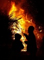
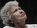
Piss out the fire, call the dogs and lets go home!by birkinComment: Color/exposure/contrast: 2/2 perfect
Focus/sharpness/DOF: 1/2 sharpness not very good
Idea/creativity: 2/2 just for the fact that this could be someone's house burning although could be just a normal fire (in which case I would give a 1)
Theme: 0.5/2 not very fortunate chosen
Framing/appeal: 1.5/2 nicely framed, appealing, but sharpness takes some of the pleasure watching
TOTAL:7 |
 Photographer found comment helpful. Photographer found comment helpful. |
| 05/05/2006 09:12:40 AM |
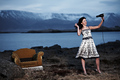
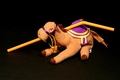
Not playing with a full deckby LalliSigComment: Color/exposure/contrast: 2/2 perfect
Focus/sharpness/DOF: 2/2 perfect
Idea/creativity: 2/2 very creative
Theme: 0/2 the theme-title-picture are totally disconected. terrible.
Framing/appeal: 1.5/2 nice picture but I just can't get the chair and can't connect the hair drying with the background
TOTAL:7.5 |
| Photographer found comment helpful. |
| 05/05/2006 09:10:19 AM |
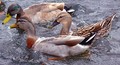
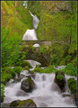
It's like water off a Ducks Backby trainComment: Color/exposure/contrast: 1.5/2 good contrast. palette not very appealing (red shift)
Focus/sharpness/DOF: 2/2 perfect
Idea/creativity: 1/2 good connection with the title pretty common image
Theme: 2/2 fits
Framing/appeal: 2/2 i like the standalone picture
TOTAL:8.5 |
| Photographer found comment helpful. |
| 05/05/2006 09:08:01 AM |
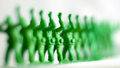
All in the Same Boat...An Army of Oneby commendatoriComment: Color/exposure/contrast: 0/2 overexposed, not very appealing color/palette
Focus/sharpness: 0/2 Terrible DOF, focus
Idea/creativity: 0.5/2 Easy, not very creative
Theme: 1/2 Title should have been only one saying
Framing/appeal: 0/2 Some framing but is totally unatractive DOF should be used more carefully
TOTAL:1.5 |
| Photographer found comment helpful. |
| 05/05/2006 09:05:22 AM |
Keep Your Chin Upby SandyPComment: Color/exposure/contrast: 1.5/2 Grat palette, good contrast, little bit desturated @ medium luminance. The title would go for a mor optimistic color saturation
Focus/sharpness: 2/2 Perfect
Idea/creativity: 2/2 Not hard to obtain but creative though
Theme: 2/2 Fits
Framing/appeal: 1/2 Good framing but I am not appealed :S
TOTAL:8.5 |
| Photographer found comment helpful. |
| 05/05/2006 09:02:29 AM |
Walking on Air...by SavannahComment: Color/exposure/contrast: 1/2 Slightly overexposed/burn spots. Not very appealing color palette
Focus/sharpness: 1.5/2 I guess it's the best one can take
Idea/creativity: 1/2 Photographer has no input. Hard to find a snapshot like this though.
Theme: 0.5/2 Don't get it/too pushed.
Framing/appeal: 1/2 Framing is good but not very appealing
TOTAL:5 |
| 05/05/2006 08:58:40 AM |
Like Water Under a Bridge by DrAchooComment: Color/exposure/contrast: 2/2 Perfect!
Focus/sharpness: 2/2 Perfect!
Idea/creativity: 0.5/2 Usual easy shot
Theme: 1.5/2 Not very good theme connection
Framing/appeal: 2/2 Perfect!
TOTAL:8 |
| Photographer found comment helpful. |
| 05/05/2006 08:56:22 AM |
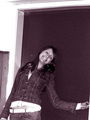
Please take a picture of me!by Boris the bladeComment: Color/exposure/contrast: 1.5/2 tint is not so fortunate
Focus/sharpness: 0/2 too much noize, not very sharp
Idea/creativity: 0/2 just another easy snapshot, with front flash
Theme: 0/2 Does not fit the theme
Framing/appeal: 0.5/2 Framing is owfull. too much space above the head, should have tighten the frame. 0.5 - the girl looks nice. I have to know who she is, I might know her :)))
TOTAL:2 |
| 05/05/2006 08:52:44 AM |
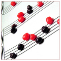
Band Nerdsby RebeccaComment: Color/exposure/contrast: 1/2 overexposed/wrong gamma
Focus/sharpness: 1.5/2 foreground not very focused
Idea/creativity: 2/2 really nice idea
Theme: 0/2 I just don't get it. Don't blame me, it should be easy for everybody.
Framing/appeal: 1/2 framing generally good but has an unatural look as if shot from a wicked angle - like upside down, makes me dizzy
TOTAL:5.5 |
| Photographer found comment helpful. |
| 05/05/2006 08:47:51 AM |
|
| Photographer found comment helpful. |
Home -
Challenges -
Community -
League -
Photos -
Cameras -
Lenses -
Learn -
Help -
Terms of Use -
Privacy -
Top ^
DPChallenge, and website content and design, Copyright © 2001-2025 Challenging Technologies, LLC.
All digital photo copyrights belong to the photographers and may not be used without permission.
Current Server Time: 08/04/2025 07:20:39 AM EDT.