| Author | Thread |
Comments Made During the Challenge  |
|
|
05/09/2006 01:22:11 PM |
|
Is that really a cliche or saying? |
|
|
|
05/08/2006 06:46:04 PM |
|
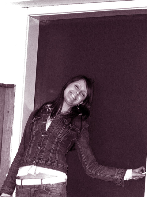
The tilt of the frame doesn't help the composition here. I like the grainy quality and the monochrome, but that little strip of white in the lower right and the space above her head kind of distracts from the focus on the subject. 4 |
|
|
|
05/06/2006 03:53:13 AM |
|
|
|
05/05/2006 08:56:22 AM |
Color/exposure/contrast: 1.5/2 tint is not so fortunate
Focus/sharpness: 0/2 too much noize, not very sharp
Idea/creativity: 0/2 just another easy snapshot, with front flash
Theme: 0/2 Does not fit the theme
Framing/appeal: 0.5/2 Framing is owfull. too much space above the head, should have tighten the frame. 0.5 - the girl looks nice. I have to know who she is, I might know her :)))
TOTAL:2 |
|
|
|
05/03/2006 09:19:42 PM |
|
|
|
05/03/2006 10:36:30 AM |
|
cute, but what are you trying to show? |
|
Home -
Challenges -
Community -
League -
Photos -
Cameras -
Lenses -
Learn -
Help -
Terms of Use -
Privacy -
Top ^
DPChallenge, and website content and design, Copyright © 2001-2026 Challenging Technologies, LLC.
All digital photo copyrights belong to the photographers and may not be used without permission.
Current Server Time: 06/29/2026 01:53:07 PM EDT.