| Image |
Comment |
| 10/29/2004 04:39:37 PM |
|
| 10/29/2004 04:38:52 PM |
|
 Photographer found comment helpful. Photographer found comment helpful. |
| 10/29/2004 04:37:45 PM |
|
| Photographer found comment helpful. |
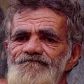
| 10/29/2004 04:36:01 PM |
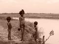
Wearyby BudComment: You cropped him a bit harshly. Very interesting and sad face. 7. |
| Photographer found comment helpful. |
| 10/29/2004 04:35:27 PM |
|
| 10/29/2004 04:33:52 PM |
|
| Photographer found comment helpful. |
| 10/29/2004 04:32:22 PM |
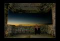
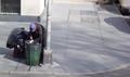
Searching for lifeby GisliBComment: More contrast needed here. What a pity. It would've been great candid photo. I guess you were far from the subject. Just too much negative space to my liking. -> 6 |
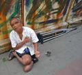
| 10/29/2004 04:30:43 PM |
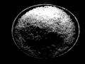
One a Dayby bigfishComment: That is a very very good concept. I thought of it for a while also. The shadow in front is a bit distracting, but on general it is classic purity symbol, easily understood worldwide. 9. |
| Photographer found comment helpful. |
| 10/29/2004 04:29:01 PM |
|
| Photographer found comment helpful. |
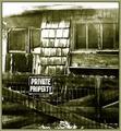
| 10/29/2004 04:04:51 PM |
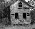
Poor Houseby medinfo2000Comment: I was looking at this house for long. I have few impressions. First, I think it would've been helpful if the house looked more like house in which people are still living. I also think maybe a different angle could help. You cropped it also in a bit strange way (you cropped the top of the house, leaving unnecessary grass). I like it B&W. 6 overall. |
| Photographer found comment helpful. |
Home -
Challenges -
Community -
League -
Photos -
Cameras -
Lenses -
Learn -
Help -
Terms of Use -
Privacy -
Top ^
DPChallenge, and website content and design, Copyright © 2001-2025 Challenging Technologies, LLC.
All digital photo copyrights belong to the photographers and may not be used without permission.
Current Server Time: 07/23/2025 10:35:28 AM EDT.