| Author | Thread |
Comments Made During the Challenge  |
|
|
11/02/2004 06:40:52 PM |
|
 Photographer found comment helpful. Photographer found comment helpful. |
|
|
10/31/2004 03:31:43 PM |
|
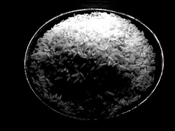
simple. clean. nice texture. |
|
| Photographer found comment helpful. |
|
|
10/30/2004 06:30:10 PM |
|
The lighting is a little too contrasty for my taste, but the message is clear and identifiable. Good job. |
|
| Photographer found comment helpful. |
|
|
10/30/2004 12:32:28 AM |
|
wellthought out the highlighton the top is a little bright for me overall an effective image |
|
| Photographer found comment helpful. |
|
|
10/29/2004 04:30:43 PM |
|
That is a very very good concept. I thought of it for a while also. The shadow in front is a bit distracting, but on general it is classic purity symbol, easily understood worldwide. 9. |
|
| Photographer found comment helpful. |
|
|
10/29/2004 01:03:55 PM |
|
While I do catch the Idea of a bowl of rice for poverty. I had to score a littl eon the low side due to the glare on the rice at the top of the photo. |
|
| Photographer found comment helpful. |
|
|
10/29/2004 02:46:29 AM |
|
I think the contrasts of this photo are a little distracting. The light area is blown out, and the dark area is lost, no details. |
|
| Photographer found comment helpful. |
|
|
10/27/2004 12:45:04 PM |
|
Good idea, but the shadows are too dark and the highlights blown out. Would have been better with softer lighting. |
|
| Photographer found comment helpful. |
|
|
10/27/2004 11:31:38 AM |
|
needs work on the lighting, over exposed at top |
|
| Photographer found comment helpful. |
|
|
10/27/2004 10:49:37 AM |
|
I can't tell what is in the bottom portion of the picture, it is too dark. |
|
| Photographer found comment helpful. |
|
|
10/27/2004 10:12:17 AM |
|
| Photographer found comment helpful. |
|
|
10/27/2004 06:44:01 AM |
|
I like the idea and the composition, but It's a shame it's a bit burnt out from the light, losing some of the detail. 6 for me |
|
| Photographer found comment helpful. |
|
|
10/27/2004 02:08:25 AM |
hey man i wish you the best of luck my one grip would be the lighting from the back is nice but it makes the front to dark IMHO if you had lit it from the front just a little i think it would have brightened the overall image up.
and just looking at it one more time you also over ex. the back like a yinyang sign oh well i still like it i think too saleeverything you should've just lit it from thr top back & a little further away from the entire thing good luck though it is a very nice shot.-BC |
|
| Photographer found comment helpful. |
Home -
Challenges -
Community -
League -
Photos -
Cameras -
Lenses -
Learn -
Help -
Terms of Use -
Privacy -
Top ^
DPChallenge, and website content and design, Copyright © 2001-2026 Challenging Technologies, LLC.
All digital photo copyrights belong to the photographers and may not be used without permission.
Current Server Time: 06/29/2026 03:57:30 PM EDT.