| Image |
Comment |
| 09/01/2006 12:32:21 PM |
|
 Photographer found comment helpful. Photographer found comment helpful. |
| 09/01/2006 12:19:22 PM |
|
| Photographer found comment helpful. |
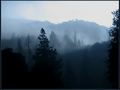
| 09/01/2006 12:05:59 PM |
Old Birdby audinutComment: A LITTLE TOO MUCH NOISE. GOOD PERSPECTIVE THOUGH. |
| Photographer found comment helpful. |
| 08/11/2006 04:04:19 PM |
|
| 08/07/2006 09:11:05 AM |
Business Cardby ArtysteComment: Excellent photograph for your business card. However, I have learned that you should print out a test card to see if your info can be read. It appears that your font is too small. I can imagine you are trying to keep your text away from the important features of the photograph, but if they can't read your name - it does not matter how good your card looks.
It looks like you have plenty of room around the child's shoulder, so I would increase the font...just a suggestion. |
| Photographer found comment helpful. |
| 08/04/2006 01:14:40 PM |
|
| Photographer found comment helpful. |
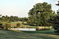
| 07/31/2006 12:06:38 PM |
Contemplationby talmyComment: I would like to see more in the foreground as opposed to just the water. I am not sure what you had to work with, but typically a landscape is more pleasing with both a foreground and background subjects. This is something I am just learning! So take my advice with a grain of salt. Great concept though. |
| Photographer found comment helpful. |
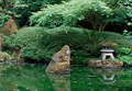
| 07/31/2006 12:03:45 PM |
Zen Mountainby PanderComment: I would like to see a tighter crop...leaving out more of the dark bottom portion. I like the concept, very peacful. |
| Photographer found comment helpful. |
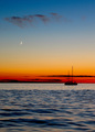
| 07/31/2006 12:02:36 PM |
- An Ocean of Harmony -by seebrownComment: I like this one. I am intrigued by the portait orientation of this image but am also wondering if landscape would have worked better. either way, great colors and very well balanced.
hmm, now that I take a second look, cropping just below the boat would give you a square image...niether portrait or landscape, but I seem to like it. what do you think?
Great job. |
| Photographer found comment helpful. |
| 07/31/2006 11:58:10 AM |
The Green Zenby EayeshComment: Seems a little flat. perhaps increasing the saturation would help. |
| Photographer found comment helpful. |
Home -
Challenges -
Community -
League -
Photos -
Cameras -
Lenses -
Learn -
Help -
Terms of Use -
Privacy -
Top ^
DPChallenge, and website content and design, Copyright © 2001-2025 Challenging Technologies, LLC.
All digital photo copyrights belong to the photographers and may not be used without permission.
Current Server Time: 08/19/2025 01:44:14 PM EDT.