|
|
|
Showing 401 - 410 of ~725 |
| Image |
Comment |
| 11/23/2008 12:12:47 AM | |  Photographer found comment helpful. Photographer found comment helpful. |
| 11/23/2008 12:11:44 AM | | | Photographer found comment helpful. |
| 11/23/2008 12:11:04 AM | | | Photographer found comment helpful. |
| 11/23/2008 12:10:34 AM | Cytoplasmby BudyaComment: This would be a cool desktop background if rotated 90 degrees. | | Photographer found comment helpful. |
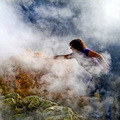
| 11/23/2008 12:08:34 AM | Solfatara-Please don't stolen sulfurby Rino63Comment: Greetings from the Critique Club Gennaro!
First Impression: Cool photo that fits well into the challenge.
Composition: Good composition with great colors. I love the contrast of the yellow sulfur with the green rocks and the purple shirt. The colors work very well together. The vapor seems almost fake and I wish there was slightly less of it around the persons hand, lower portion of the face, and body.
There are a few places in the photo that seem a bit off. A few places the fog feels over exposed. There is also a distracting region on the lower left portion of the photo that seems the contrast was increased in that location, but no where else in the photo. The sulfur in that region almost look like it is glowing red hot. The region is on the basket.
Subject: Great subject. When I look at it, I can feel and smell the sulfur. The bright yellow of the sulfur would make it a fun subject to shoot.
Creativity: You showed a good bit of creativity in this photo. The use of the smoke and colors add atmosphere to the photo.
Improvements: To improve the photo, fix the minor areas that I have mentioned above. This is a really strong photo.
My Thoughts: This is a really neat photo. You really add a lot to your photo through the composition. The photo should have scored a little higher in my opinion.
Overall, great photo. I hope my critique has been help and informativeand If you have any questions please PM me.
Cheers,
Ron | | Photographer found comment helpful. |
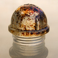
| 11/22/2008 09:54:37 PM | Element: Iron (Ore) Symbol: Feby Delta_6Comment: Greetings from the Critique Club Dave!
First Impression: Simple and the lighting is a bit harsh on some of the reflective areas.
Composition: The crop is too tight for me. Also, the white background doesn't add much to the photo. A black background would have helped the ore stand out more. Next time, experiment with the lighting. In this case, the lighting is a little bit harsh off of the reflective portions of the ore. Also experiment with the orientation of the ore in the photo to try and give a different feel.
Subject: This is a great subject and has great potential. The subject has a lot of colors, textures, and physical features that should be exploited.
Creativity: To me this photo isn't very creative, it more looks like a photo of a rock.
Improvements: To improve the photo, try making changes to the suggestions in my previous sections. Try to exploit the texture and the fact the ore has parallel lines. Try to reduce the reflection from the flash if one was used.
My Thoughts: You have a great subject and all of its feature were not exploited. The photo is well taken, just isn't creative. You have access to a subject that not a lot people have access to.
Overall, a well taken photo, but doesn't show a lot of creativity. If you have and questions please PM me. I hope my critique has been help and informative.
Cheers,
Ron | | Photographer found comment helpful. |
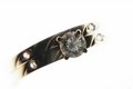
| 11/22/2008 05:22:16 PM | Carbonby LovinlifesmComment: Greetings from the Critique Club Steve!
First Impression: Great idea but the subject is too dark.
Composition: Good composition. I like how the ring appears to fade into to the white. My biggest problem with the composition is the the fact that diamonds are known for the sparkling characteristics and this photo the diamond looks really looks muted. It would have been nice if the top of the ring was a little brighter so the diamond was nice and bright and the metal wasn't as dark. Good focus.
Subject: Good subject for the challenge. The diamond represents carbon and the carbon structure gives the diamond its appeal. Good choice.
Creativity: I find the photo very creative. The use of the flash was creative and I like how it gives the ring the appearance it does.
Improvements: I think if you were to show off the diamond a little more with better lighting and this photo would have done a lot better.
My Thoughts: Good composition and good subject. I just wish the lighting was a bit different.
Overall, good photo. If you have and questions please PM me. I hope my critique has been help and informative in some way.
Cheers,
Ron |
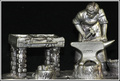
| 11/22/2008 02:11:08 PM | Blacksmith in Cu Sn & Sb {pewter}by TerComment: Greetings from the Critique Club Terrence!
First Impression: Decent photo, but doesn't strike me as anything special.
Composition: Decent composition. The crop is too tight for me. I would have liked to have seen a little more black around the edge of the subject. It feels very tight near the top of his head and the right side of the anvil. The lighting is also a tad harsh from the flash. If you would have a constant light source from the left side of the object, it would have caste shadows and would have given the photo a different feel. The subject is also too close to the backdrop because I can see its texture on the lower part of the photo. There is also four white spots on the backdrop that are distracting.
Subject: The subject is very interesting, but I don't know if the material it is made of represents the periodic table of elements. The blacksmith himself on the other hand does represent the periodic table. When I think of a blacksmith, I think of working with iron. I like how the subject has a lot of texture its self. Like Trollman said, it would have been better if it was a real blacksmith, but since they are hard to find, I can't fault you for that.
Creativity: This photo does not show a whole lot of creativity because it is a photo of an object that is already artistic.
Improvements: Loosen the crop, experiment with different lighting and move the subject away from the back drop. You could use a polarizing filter to reduce some of the reflections.
My Thoughts: If you try using the improvements I have listed, the photo would be more appealing to me. It would also be a very good B&W photo. You said in your comments that you made this piece. If so, I am very impressed with your metalworking skills.
Overall, I scored this photo a 6, which is above average in my book. If you have any questions please PM me. I hope my critique has been help and informative in some way.
Cheers,
Ron | | Photographer found comment helpful. |
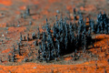
| 11/21/2008 02:40:49 PM | Iron Forestby Shutter-For-HireComment: Greetings from the Critique Club Eric!
First Impression: This photo fits into the challenge perfectly.
Composition: Great composition. I like the large grouping of iron on the right, but I really like how smaller fillings fill the frame. The smaller fillings really add depth to the photo. The lighting also really adds depth to the photo by giving the filings some great shadows. The colors of the rust are also perfectly used. Good focus.
Subject: I feel that the use if iron in this photo fits the challenge perfectly. I also really enjoy how you used the physical(magnetic) and chemical(rust/oxidation) properties of iron in your photo.
Creativity: I find this photo very creative because of the reasons in my subject portion.
Improvements: I am not sure if it is the texture of the iron filings or the use of USM, but edges of the filings almost seem too sharp and a little harsh. The filings are distracting to me. Softening up these edges a little bit would be a good improvement in my opinion.
My Thoughts: The composition and the subject are just awesome. I study Physics and the fact you used the magnetic properties of iron shows your creativity. I could easily see a photo like this being used in physics texts or lectures. I honestly feel that not many of the photographers who scored higher than you showed there subject in a manor that truly reflects their particular element on the periodic table. You on the other hand, nailed it!
Overall, great photo. I would score this a 9. If you have and questions please PM me. I hope my critique has been help and informative in some way.
Cheers,
Ron
| | Photographer found comment helpful. |
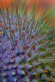
| 11/20/2008 12:47:40 AM | Spikeby delinComment: Great photo! and I love the colors. Beautiful DOF and awesome composition. This would be an interestin B&W photo. | | Photographer found comment helpful. |
|
Showing 401 - 410 of ~725 |
Home -
Challenges -
Community -
League -
Photos -
Cameras -
Lenses -
Learn -
Help -
Terms of Use -
Privacy -
Top ^
DPChallenge, and website content and design, Copyright © 2001-2025 Challenging Technologies, LLC.
All digital photo copyrights belong to the photographers and may not be used without permission.
Current Server Time: 08/20/2025 08:12:26 AM EDT.
|