| Author | Thread |
|
|
11/22/2008 09:54:37 PM |
Greetings from the Critique Club Dave!
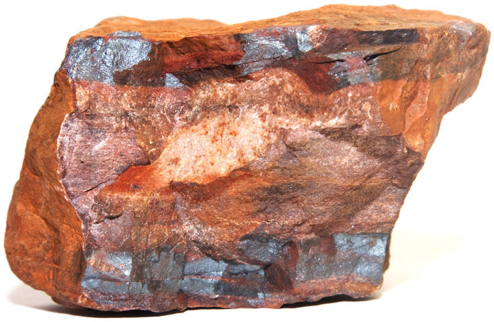
First Impression: Simple and the lighting is a bit harsh on some of the reflective areas.
Composition: The crop is too tight for me. Also, the white background doesn't add much to the photo. A black background would have helped the ore stand out more. Next time, experiment with the lighting. In this case, the lighting is a little bit harsh off of the reflective portions of the ore. Also experiment with the orientation of the ore in the photo to try and give a different feel.
Subject: This is a great subject and has great potential. The subject has a lot of colors, textures, and physical features that should be exploited.
Creativity: To me this photo isn't very creative, it more looks like a photo of a rock.
Improvements: To improve the photo, try making changes to the suggestions in my previous sections. Try to exploit the texture and the fact the ore has parallel lines. Try to reduce the reflection from the flash if one was used.
My Thoughts: You have a great subject and all of its feature were not exploited. The photo is well taken, just isn't creative. You have access to a subject that not a lot people have access to.
Overall, a well taken photo, but doesn't show a lot of creativity. If you have and questions please PM me. I hope my critique has been help and informative.
Cheers,
Ron |
|
 Photographer found comment helpful. Photographer found comment helpful. |
Comments Made During the Challenge  |
|
|
11/15/2008 09:07:24 PM |
|
Nice shot, but a bit clinical. Take it a step further and add some context. |
|
| Photographer found comment helpful. |
|
|
11/14/2008 08:52:21 PM |
|
| Photographer found comment helpful. |
|
|
11/13/2008 02:50:44 PM |
|
crop seems a bit tight. not as unique as i was hoping for in this challenge, but it IS an element:) |
|
| Photographer found comment helpful. |
|
|
11/12/2008 11:29:03 PM |
|
I think the lighting on this is a overly bright, even and gives a flat appearance. Perhaps some side lighting would have shown off the wonderful crusty details of this a little better. |
|
| Photographer found comment helpful. |
|
|
11/12/2008 12:32:04 PM |
|
It's an image of a rock although not a bad looking rock. Technically it is good but does not for me make an interesting photo. |
|
| Photographer found comment helpful. |
|
|
11/11/2008 08:10:23 PM |
|
Um... it's a rock. OK, I understand it may be iron ore, but you didn't DO anything with it to make a visual connection with "element." Maybe carve an "Fe" symbol into the surface or put a puff of smoke behind it and call it a steam iron. Something, anything to make an interesting story. As-is, every single voter will look at this and think, "It's just a rock." :-( |
|
| Photographer found comment helpful. |
|
|
11/11/2008 04:44:44 PM |
|
Nicely shot and interesting piece to shoot, but just lacks oomphhhh. Technically well done though! |
|
| Photographer found comment helpful. |
|
|
11/11/2008 08:39:10 AM |
|
It is a beautiful piece of ore, but I think it could have been photographed better. |
|
| Photographer found comment helpful. |
|
|
11/11/2008 08:20:51 AM |
|
Good color, I think a different background would have warmed and improved the image. I suspect you will be dinged more for lack of originality than anything else. |
|
| Photographer found comment helpful. |
|
|
11/11/2008 01:00:10 AM |
|
Now that is simple! Well done, and good luck. I think it would have worked better with deeper depth of field. |
|
| Photographer found comment helpful. |
Home -
Challenges -
Community -
League -
Photos -
Cameras -
Lenses -
Learn -
Help -
Terms of Use -
Privacy -
Top ^
DPChallenge, and website content and design, Copyright © 2001-2026 Challenging Technologies, LLC.
All digital photo copyrights belong to the photographers and may not be used without permission.
Current Server Time: 06/30/2026 04:45:50 AM EDT.