|
|
| Image |
Comment |
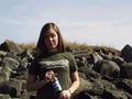
| 05/12/2002 03:46:00 PM | What's better on a warm summer day?by Palli747Comment: Cute model :) but the picture lacks focus. If the target of the picture is the pepsi bottle, then it might have been nice to have at least made sure the bottle was well-lit and facing front. The whole left-side of the model is in shadow, and I think it would have been better served (the picture) to have her turn, or take the picture at a different time of day, or bring your own lights, so that this wasn't the case. A much-tighter zoom would have been good, too. This might be nitpicky (even more than the rest of this) but her outfit is itself an ad that only distracts. In other words, you have 4 separate focal points (the bottle, the girl, the clothes, and the background), and toning that down a bit would have served this photo well. Still, I gave it a higher score, if only for the overall effort, and having a live model :) |
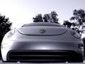
| 05/06/2002 06:52:00 PM | VW: The New Beetleby chariotComment: I like this shot. Very metallic and sleek - the sky matches the car and the trees frame the shot very nicely. The whole image looks smooth. nice framing of the car itself as well, and good positioning. |
| 05/12/2002 03:41:00 PM | Absolut Frustrationby cbonsallComment: I gave this shot a high score because I thought it was clever, even if people outside of this forum might not ever get it :) But we're not worried about other people, so that doesn't matter. You did a good job on the focus and capturing a computer monitor, and have a nice themed color with everything having a blue look to it. Good job. |  Photographer found comment helpful. Photographer found comment helpful. |
| 05/13/2002 10:05:00 AM | | | Photographer found comment helpful. |
| 05/06/2002 06:48:00 PM | Absolut Inebriation.by GordonComment: Holy Cow! The highest I have ever given a photo is an 8. I have to give this one a 9. There's good, and then there's so good that I don't even know what is going on. I could never in a million years figure this one out; hopefully, you'll write up a description for the "learn" section of the forum. It looks like you reflected the bottle onto your screen or some such, and then blurred it somehow - maybe by shifting the camera and using a slower shutter? I have no idea what I could say about this one that would be of any use. Nice job! :) | | Photographer found comment helpful. |
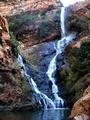
| 04/29/2002 12:19:00 PM | red cliff and waterfallby sulamkComment: I feel like I could say this for a lot of the current photos, that if I listened to the "gripers" on the boards, I'd be recommending most of these for disqualification. But I like this picture, and think you captured something really strong, even if the camera angle isn't so dramatic as to give you whiplash :) Your colors are beautiful and you have decent texturing on the rock. I might suggest zooming in a bit more on the water, as that seems to be the stronger focal point. It would also give more dimension and make for a more powerful image. But definitely, good job overall. | | Photographer found comment helpful. |
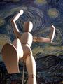
| 04/29/2002 01:37:00 PM | Prepare to be Squashed: Giant Dummy on Rampage!by magnetic9999Comment: I had a feeling that there would be more pictures in this style, because it has such a fun appeal to it. There weren't, so that makes your stands out more, especially since it is so well done. The starry night background is fantastic and very fitting. The lighting on the subject is well-done, in that it fits the theme of the picture, but somehow it seems distracting. Maybe it's because the light is too intense on his right arm where it bleaches out the image. I would have given this picture another point if you had gotten the foot in stronger focus, and dropped the lighting just a notch. Aside from that, great job. | | Photographer found comment helpful. |
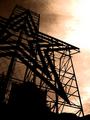
| 04/29/2002 12:51:00 PM | Evening Starby hokieComment: You did a good job here of capturing a "simple" image. You have two colors, basically - sepia toned sky, and completely shadowed machinery. I'm having some trouble with the sun coming through the clouded sky, though... it looks somewhat bleached or washed out because of your coloring scheme. I'm also not sure the horizontal angle works so well for this picture. It might have come across better if you got closer to the picture and looked more upward (that star pattern really accentuates the up). Then again, because of the simple style, it's hard to tell how close you are or are not. Maybe you are as close as you can get. A nice effort :) |
| 04/29/2002 12:34:00 PM | Untitledby mtngoatComment: I know you're probably getting a WHOLE LOT of comments about this tongue-in-cheek picture not filling the requirements of the current challenge. Whatever. Personally, I gave this photo a lower score because it was hard for me to determine what the photo was trying to present. Is it the Earth From Above book? There's some nice color in this picture, but no real strong focal point or texture to the picture. To be honest, I'm not sure what I would have done with this photo to try and improve it. It's a very challenging picture that you've taken, and that's admirable. |
| 05/08/2002 06:52:00 PM | The First of Many Clichesby TrickyBuddhaComment: Thanks for the great comments, guys! I learned a few things on this one. I thought the manual focus would work better than it did. Next time, I'll have that first stair be in-focus. I dont know why I put the tilt in there. I guess I was just playing around too much. I'll kill it next time :) And people, do not make fun of my stairs! *I* like them! :) I'm going to come to y'all's houses and tell you how bland your stuff is. Sheesh :) You can make fun of the walls, though, if you want, because they are different colors. Seriously, I think it was just the lighting from the living room messing with things. And yes, the stairs go up, but if it makes you think MC Escher to look at them and think down, maybe I can figure out a way to emphasize that more... :) |
Home -
Challenges -
Community -
League -
Photos -
Cameras -
Lenses -
Learn -
Help -
Terms of Use -
Privacy -
Top ^
DPChallenge, and website content and design, Copyright © 2001-2025 Challenging Technologies, LLC.
All digital photo copyrights belong to the photographers and may not be used without permission.
Current Server Time: 08/03/2025 09:41:08 PM EDT.
|