| Image |
Comment |
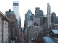
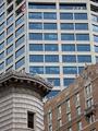
| 04/07/2002 08:07:00 AM |
Pick One !by mcorwinComment: Good clarity, and I love the composition (esp the street running right up the third to the Chrysler). Sky looks a little blown out, depending on what the weather was like that day, but good colors right there on the horizon. |
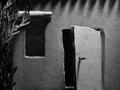
| 04/07/2002 08:03:00 AM |
House of Shadowsby connieComment: Creeeeepy, but good. Well lit and composed, and a bit of a standout in this challenge subjectwise. |
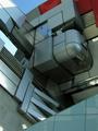
| 04/07/2002 08:13:00 AM |
Aoyama School of Architectureby che_foxComment: Situations like this are the reason I carry Windex and a squeegee (and a 50' ladder) in my camera bag at all times. Hard to miss with a great subject like that. Nicely composed. |
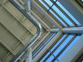
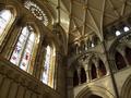
| 04/07/2002 08:19:00 AM |
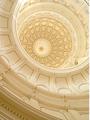
Atrium Thrustby MousieComment: I like it, but I like it better rotated 90 degrees CCW. Nice colors and sharpness. |
| 04/07/2002 08:02:00 AM |
Contrastsby timj351Comment: Wouldn't mind this just a little straighter, too, but it's a very nice composition. The bit of bg building showing between the two in the fg is a bit of a minus. Subjetively, I'm not sure I like the flag and top of the bg building, but it's very nice work. Prolly make a great B/W. |
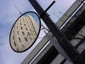
| 04/07/2002 07:59:00 AM |
Calm Confusionby Ricky CleaveComment: I vote to disqualify, as I seem to remember the rules stating that you could, under NO circumstances, use a mirror or your outstretched arm in this challenge. {g} Great diagonals and a very creative take on this challenge. Colors are very good, too. Wish I'd managed to get one together for this round. |
| 04/07/2002 08:34:00 AM |
|
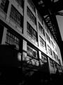
| 04/07/2002 08:30:00 AM |
lines and lightby JunkphotoComment: Very dramatic. Everything just grows out of the shadows, and all the lines lead to the light. Nice work. |
| 04/07/2002 08:15:00 AM |
Lone Star by GordonComment: Great, warm light, and a wonderful subject. I'd have composed it differently, but then it would be my pic instead of yours. Nicely done. |
| 04/07/2002 08:18:00 AM |
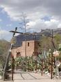
De Graziaby ciscocaliComment: I like the framing effect, but I also think it would be more effective from lower down / closer up to get the sky behind more of the arch. Comes across slightly jumbled as is, but still quite good. |
Home -
Challenges -
Community -
League -
Photos -
Cameras -
Lenses -
Learn -
Help -
Terms of Use -
Privacy -
Top ^
DPChallenge, and website content and design, Copyright © 2001-2025 Challenging Technologies, LLC.
All digital photo copyrights belong to the photographers and may not be used without permission.
Current Server Time: 06/21/2025 08:44:01 PM EDT.