| Image |
Comment |
| 06/04/2007 01:30:11 AM |
Elements in Harmony by NuzzerComment: very smart using the same place and time again. I think it was the same time in the day, or about, but seems the sun moved because of winter coming in your part of the world. So it move a bit to the north giving you a shorter day.
Good nice work. Message edited by author 2007-06-04 01:33:55. |
 Photographer found comment helpful. Photographer found comment helpful. |
| 06/03/2007 06:33:04 PM |
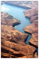
Mujib_Dam.jpgby HighNoonerComment: Originally posted by Tom:
this is great! you might even be able to get away with chopping off the top part of the image, since it's pretty hazy. where was this? |
Mujib Valley - Jordan |
| 05/31/2007 05:29:33 PM |
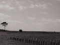
Refugeby quiet_observationComment: This is one of my favorites. I love the feel of it. One needs to know, love and understand nature to appreciate such beautiful shot. It is not about cropping, more or less sky, or subject; it's all about the feel you get from a photo. It is the feel of this  and this 
Good work. |
| Photographer found comment helpful. |
| 05/30/2007 06:16:26 PM |
The Girl With The Red Balloonsby WildcardComment: Hi, I just came back to look at the picture. I love it.
I do not know about these voters... Just kills me, how a photo like this does not win!!! |
| Photographer found comment helpful. |
| 05/29/2007 04:07:05 PM |
|
| Photographer found comment helpful. |
| 05/29/2007 03:55:35 PM |
|
| 05/23/2007 05:26:56 PM |
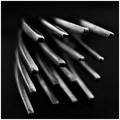
Forksby AranchaComment: very good composition, however the shallow depth of field used here is resulting in a very poor outcome.
The light is not well studied and it is not serving to add any additonal meaning to the photo.
Monochrome is ok |
| Photographer found comment helpful. |
| 05/23/2007 06:23:12 AM |
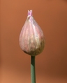
Chiveby CoinCounterComment: Usually I do not like objects floating in a picture’s composition without an anchor point; yours has an anchor point which is the stem; and in this case I would prefer to see it much weaker to give a floating feel to the nice shape you have captured.
The harsh light and shadow cast on the stem is taking attraction from the shape especially with non-contrasting color of the background, and the right bottom side is under lit.
The color saturation feels a tad under. |
| Photographer found comment helpful. |
| 05/23/2007 05:55:35 AM |
Ghosts of Tulips Pastby kletkemanComment: The main attraction is too much to the bottom left; and its tilt to the left makes it feel as if it’s about to leave the canvas. The vast blurred area feels dominant, especially because it’s not blurred enough and the tulip upfront is not sharp enough. No decisive shape there.
The light feels good and it’s adding a nice atmosphere right in the center of the photo, and towards the right top and bottom parts of the tulip.
Very well balanced saturation. |
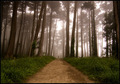
| 05/23/2007 01:14:53 AM |
Morning Sentinels by mpetersComment: very nice. did not get to comment on it while voting, but i did give it an 8
really nice.
thanks for u kind words on my entry Message edited by author 2007-05-23 01:16:40. |
| Photographer found comment helpful. |
Home -
Challenges -
Community -
League -
Photos -
Cameras -
Lenses -
Learn -
Help -
Terms of Use -
Privacy -
Top ^
DPChallenge, and website content and design, Copyright © 2001-2025 Challenging Technologies, LLC.
All digital photo copyrights belong to the photographers and may not be used without permission.
Current Server Time: 08/11/2025 10:15:55 PM EDT.