| Image |
Comment |
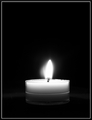
| 08/14/2006 05:49:32 PM |
Solitaryby LucidLotusComment: Ooooooh. This is so obviously meeting the challenge, and doing it in such a unique way - the first shot I've come across where the flame isn't orange/yellow/red. It gives my eyes something new to ponder, and I applaud your monochromatic idea. Border and centered composition add to the elegance of this shot. |
 Photographer found comment helpful. Photographer found comment helpful. |
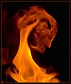
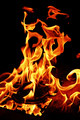
| 08/14/2006 05:48:28 PM |
Portrait of the Demonby EricMGB1974Comment: Wow, it looks like silk. That is amazing. The ONLY thing I can see to improve would be maybe the border. I personally think it would have been better without the outer red border, and the inner border a tiny bit less yellow. But of course those are such nitpicks. This is an awesome entry. |
| Photographer found comment helpful. |
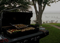
| 08/14/2006 05:46:50 PM |
Cooking with Fire - BBQ with a viewby vencapComment: Composition is good - I especially like the perspective. But of course it would have been a better fit for this challenge if there had been flames showing. Some contrast or color adjustments may have helped bring this shot to life. I don't think this is a bad photo, just one that could have used a little extra to impress. |
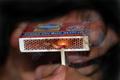
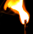
| 08/14/2006 05:46:10 PM |
Ignitionby zaflaboutComment: Would have prefered the hand and match box in focus, or no smoke. Both of these elements together are too visually confusing for me. But I do like how you captured the moment of ignition - the shot fits your title well, and I think it is a great theme to enter into this challenge. |
| Photographer found comment helpful. |
| 08/14/2006 05:40:13 PM |
explosionby gocComment: The shot does not say explosion to me, as my perception of explosion is bits flying off a central point, but not marking down for that. I could see how you might be getting marked down for harsh contrast, but I personally am a fan of high-contrast shots. I love how the match is in focus so that the small details are visible. |
| Photographer found comment helpful. |
| 08/14/2006 05:35:11 PM |
"Z"by graphicfunkComment: Looks a little bit too staged for my liking (I think the plastic mask is the culprit here) and I think there is too much negative space on the bottom. But the actual flame part of the image looks great - the shape of the Z is right on, and I like how there are two separate lines of flame. |
| Photographer found comment helpful. |
| 08/14/2006 05:33:05 PM |
|
| Photographer found comment helpful. |
| 08/14/2006 05:30:54 PM |
Fiery Cocktailby dfstevensonComment: I think the grain and the haloing is what really hurts this shot. I like the idea (I am a fan of spicy foods!), the colors, and the composition. |
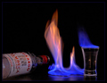
| 08/14/2006 05:29:17 PM |
Flaming Good Shot!by taljComment: I like the concept - I would have prefered it without the bottle, keeping the colors to just orange and blue. Or perhaps if the bottle label was orange or blue that would have worked as well. As it is I am not hugely fond of it but I do think it is a good shot and I like the idea a ton. |
| Photographer found comment helpful. |
| 08/14/2006 05:19:50 PM |
Grim Reaperby OdysseyF22Comment: This shot really makes the fire come alive. Great job. It would be interesting to see what it would look like with the entire bottom cropped off, so that there is only flame in the shot. (Not marking down for this at all, just saying it would be an interesting idea) |
| Photographer found comment helpful. |
Home -
Challenges -
Community -
League -
Photos -
Cameras -
Lenses -
Learn -
Help -
Terms of Use -
Privacy -
Top ^
DPChallenge, and website content and design, Copyright © 2001-2025 Challenging Technologies, LLC.
All digital photo copyrights belong to the photographers and may not be used without permission.
Current Server Time: 12/21/2025 01:00:41 PM EST.