| Image |
Comment |
| 09/21/2006 03:42:07 PM |
|
 Photographer found comment helpful. Photographer found comment helpful. |
| 09/20/2006 03:07:10 PM |
SP Day 16by MelethiaComment: Gorgeous gorgeous GORGEOUS colors and processing and composition. |
| Photographer found comment helpful. |
| 09/20/2006 02:53:56 PM |
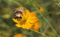
Pellucid Hawk Mothby Pug-HComment: I think the focus really hurt you here. I would have liked to see all of the moth in focus, if not the moth and the flower. Great composition and colors, and the lighting seems to be very nice. Your crop and contrast adjustment really worked.
Just thinking about it, the lack of focus may have worked better if the background had not been so busy. Then, with the great colors and contrast, it may have made a beautiful abstract. Right now it is pretty, but a bit too "busy" for me to look at it in an abstract way. I hope that makes sense - let me know if it doesn't. |
| Photographer found comment helpful. |
| 09/20/2006 02:50:48 PM |
The Wizardby JudiComment: I hate when people dress in period clothes and it seems like a costume. It's perfectly ironed or not the least bit dirty or... it just seems like dress-up and marrs the illusion. What you did in this shot, and what I think you have a real knack for, is avoiding that.
It really looks like this is a wizard in his real, everyday robes, that you happened to find and photograph. (The only thing would be that the ball he's holding looks a little bit too plasticky and modern, but even that's sort of minor here.)
I like the composition. I think it adds something that is head is not completely included. Lighting is great and I love the expression on his face. |
| Photographer found comment helpful. |
| 09/20/2006 02:45:21 PM |
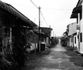
Urbanizationby crayonComment: You got things framed well.. nothing's tilted.... and yet somehow it seems to me that everything is sort of going to fall to the right. I don't know why - it might have to do with the plants in the left corner seeming a bit too overbearing? But otherwise, this is a great shot. Good tones and contrast... even the power lines don't seem to be a distraction. Everything just fits together quite well, and it's a great example of perspective. |
| Photographer found comment helpful. |
| 09/20/2006 02:42:55 PM |
Out To Pastureby xXxscarletxXxComment: So if you'd been allowed to edit, maybe this could benefit from a bit of contrast/levels adjustment and maybe a bit of increased saturation. I think that the lighting may have been too direct, which is causing things to look slightly faded? Not sure. But I do like the colors, myself - I just know that voters like the vibrant saturated style a bit more.
One thing you may have improved while taking the shot was leveling out the... road? The line right under the trees. It doesn't look tilted enough to be deliberate but it's tilted enough to be noticable.
Things I really like - the shot has depth. There's interesting things in both the extreme foreground and the background, and they all work together and none takes more attention than it should. Also, I really love the positioning of the horse. Just a good pose for it, I think! |
| Photographer found comment helpful. |
| 09/20/2006 02:38:31 PM |
Tooled Leather (Detail)by jemisonComment: What you did with the lighting really works. I think that the one thing that bothers me a bit is looking at the square of squares on the right, I feel like the right edge should be parallel to the edge of the shot. Other than that I like the composition - maybe would have liked to see a looser crop so that the circular areas could look more completed, but then you'd loose the focus on the texture (so I think you did make the right choice for this challenge!). |
| Photographer found comment helpful. |
| 09/20/2006 01:26:07 AM |
|
| Photographer found comment helpful. |
| 09/20/2006 01:25:07 AM |
Day 15 - The Devil Withinby acrotideComment: Oh. Freaking heck. When I saw the thumbnail I was like "oooh interesting red" and then seeing the full size, I was like "oh my gosh TEXTURE d00d SCARY" |
| Photographer found comment helpful. |
| 09/19/2006 11:09:40 PM |
|
| Photographer found comment helpful. |
Home -
Challenges -
Community -
League -
Photos -
Cameras -
Lenses -
Learn -
Help -
Terms of Use -
Privacy -
Top ^
DPChallenge, and website content and design, Copyright © 2001-2025 Challenging Technologies, LLC.
All digital photo copyrights belong to the photographers and may not be used without permission.
Current Server Time: 08/09/2025 09:33:06 AM EDT.