| Image |
Comment |
| 07/29/2008 08:04:39 PM |
|
 Photographer found comment helpful. Photographer found comment helpful. |
| 07/29/2008 08:04:10 PM |
|
| Photographer found comment helpful. |
| 07/29/2008 08:03:16 PM |
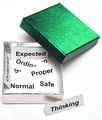
Outside the Boxby togtogComment: I love it! Not only is green my favorite color (and this is a wonderful shade of green in your image) but this really does sum up my experience on this site :-D So it's a personally meaningful image for me. |
| Photographer found comment helpful. |
| 07/29/2008 08:03:15 PM |
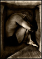
f r u s t r a t i o nby bnileshComment: I don't like the super-gritty feel of the image, and the space where the clothing is just seems to cut the person in half completely, but I like the idea dn composition. |
| Photographer found comment helpful. |
| 07/29/2008 08:02:23 PM |
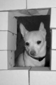
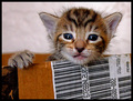
The house that Moe builtby ladpupmoeComment: I can tell they're cardboard but not at first glance, so that might hurt your score. Lighting and details are very good and the fur has a lot of detail in it so that is very nice. |
| Photographer found comment helpful. |
| 07/29/2008 08:01:48 PM |
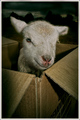
preciousby rozComment: Aw, how cute! I think the image overall is a little dark but otherwise it's very nice. |
| Photographer found comment helpful. |
| 07/29/2008 08:01:29 PM |
ICARUS FALLEN with cardboard wings...by desertsnailComment: Beautiful. It's a *tiny* bit hard to see that the wings are cardboard but when I look and can see that they are, it then meets the challenge because you used a box to be creative! Didn't say it had to stay a box. Composition and lighting are very nice and this just seems to be a very lovely modern interpretation of the Icarus myth. Good job. |
| Photographer found comment helpful. |
| 07/29/2008 07:59:29 PM |
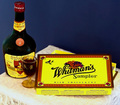
Two Great Vintagesby BrianRComment: I think that this image is very oversaturated. I know what that candy box looks like and it is not that bright. That would be okay, if you wanted to brighten it, but there seem to be these little yellow dots on the table area and I think *overall* there is too much yellow. However, I DO like what you did with matching the colors of the box to the colors on the bottle. That is what I noticed first and I think it was very nicely done. So to sum up, I think the colors and color combination are good, just overall they are overpowering. |
| Photographer found comment helpful. |
| 07/29/2008 07:57:23 PM |
Diving Right In!by klkitchensComment: Wow, this is very unique! I love the colors - the yellow and deep purple combination is really awesome. |
| Photographer found comment helpful. |
| 07/29/2008 07:56:49 PM |
You Wanna Piece of Me?by BAMartinComment: With a little less noise and a little more sharpness/focus/nonblur this would be so fantastic! It's good as it is, but with less noise and such it would really stand out. |
| Photographer found comment helpful. |
Home -
Challenges -
Community -
League -
Photos -
Cameras -
Lenses -
Learn -
Help -
Terms of Use -
Privacy -
Top ^
DPChallenge, and website content and design, Copyright © 2001-2025 Challenging Technologies, LLC.
All digital photo copyrights belong to the photographers and may not be used without permission.
Current Server Time: 08/05/2025 01:56:37 AM EDT.