| Image |
Comment |
| 05/03/2006 06:44:49 AM |
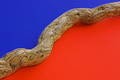
Divisionby nards656Comment: I gave a 6 on this one. I liked the minimalist approach but would have preffered a bit more clarity on the wood. I figure the letters on the blue side were not intentional and if in advanced editing they would be gone. Overall it was a good shot. Good colors and the angle works well. Lack of "Wow" factor hurt it. Now if you had a chameleon walking on that log...
(quick read of lower comments - I do see cc with blue and orange) |
 Photographer found comment helpful. Photographer found comment helpful. |
| 05/03/2006 12:17:36 AM |
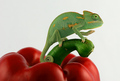
G'day Mate! by cheegirlComment: Great shot - my only ten. I knew this was a blue all the way. Congrats!!! |
| Photographer found comment helpful. |
| 05/02/2006 07:47:57 AM |
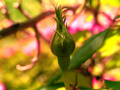
New life buddingby KelliComment: Right off the bat I am thinking "Too much saturation". Knock down the saturation as a whole and then maybe knock down the saturation again in the background to allow the bud to stand out on its own rather than be flooded by the intense colors in the background. Rotate the pic so the bud is coming more from a corner into thepic instead of standing right there would be nice too. But stillwhen I go back and look at it again the saturation is just overwhelming. |
| Photographer found comment helpful. |
| 05/02/2006 07:44:19 AM |
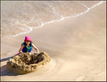
A New Castle Awaits the Coming Tideby chaliceComment: The setup and positioning of this works well. The negative space is also fine in my opinion - maybe cropped just a wee bit tighter, but not much. If taken later in the day the lighting may have not been as harsh. (Just peeked down and looked at the sepia version and I like that one a bit better myslef). Overall this shot was ok but not a real eye catcher making me want to stay longer to view. |
| Photographer found comment helpful. |
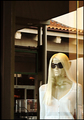
| 05/02/2006 07:39:54 AM |
Reflectively Staring at Her Manby chaliceComment: Hey there - running a bit behind on commenting and as I havent been reading the comments here before writing my own, I did read yours in the thread. It seems that mine would not be much different. I didnt notice the man unstil you mentined where he was. Having him somewhere else more pronounced in the shot would have helped. Tripod would have helped big time. It is an interesting idea and it is nice to see people thinking out of the norm. Keep going at it and you will soon succeed. |
| Photographer found comment helpful. |
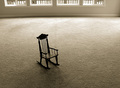
| 05/01/2006 10:49:23 PM |
Goneby RolandBComment: Interesting shot. When I bring the screen down to hide the window bottoms i get a shot that seems a bit more vast or empty feeling. Then the focus is solely on the chair. none theless I did like this shot. |
| Photographer found comment helpful. |
| 05/01/2006 10:44:15 PM |
|
| Photographer found comment helpful. |
| 05/01/2006 10:43:47 PM |
Boy: Lostby JutildaComment: Great black and white treatment. And his eyes convey the title very well. Good shot and the post processing is very well done. |
| Photographer found comment helpful. |
| 05/01/2006 10:41:16 PM |
Popby glodaComment: People will do anything to get their picture ont his site huh? This shot made me smile. The eyes do just as your title states without going overboard and the candy on the face and body go just enough overboard without feeling totally ridiculous. Very interesting shot - well done. |
| Photographer found comment helpful. |
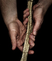
| 05/01/2006 10:38:57 PM |
Pulling through....by philupComment: Great shot. These hands look worn and not just like hands that have had some dirt rubbed on for a posed shot. Very nice detail and sharp focus. Well done and bumpin gup. |
| Photographer found comment helpful. |
Home -
Challenges -
Community -
League -
Photos -
Cameras -
Lenses -
Learn -
Help -
Terms of Use -
Privacy -
Top ^
DPChallenge, and website content and design, Copyright © 2001-2025 Challenging Technologies, LLC.
All digital photo copyrights belong to the photographers and may not be used without permission.
Current Server Time: 08/05/2025 12:13:42 AM EDT.