| Image |
Comment |
| 05/11/2006 08:38:16 AM |
Every Day Rhythmsby tngrndreamComment: Trading Post -
Hmmm. This one left me a bit flat. Its nice that you have the decorations arranged symmetrically. I dont know if its the decoratiosn or the focus but it seems just a wee bit soft. The colors are a bit flat - but I think thats just the way they are. I think what would have made this better would be to crop the shot or take the shot that takes in only a quarter of your objects. When I resize my page to just show the lower right corner from the center of the bowl the pic becomes a bit more interesting. Even a hlaf shot may have been better. The whole plate set in the square crop just doesnt do much for me. Half shot could give more of an interesting balance of light and shadows and maybe even make you look at it a bitlonger to think about what it was you were looking at instead of opening up the shot and seeing "plate, plate, bowl". |
 Photographer found comment helpful. Photographer found comment helpful. |
| 05/10/2006 10:13:20 PM |
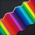
Staccato stilled; bass line lingersby MelethiaComment: Trading Post -
Nice shot Deb. This may have done better in a lines challenge. The angle and depth of this shot work really well. The colors are nice as well. Not sure what you could do to improve this. In advanced editing some spot saturation would have worked out well I think. |
| Photographer found comment helpful. |
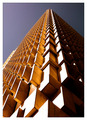
| 05/10/2006 10:01:52 PM |
Up, up and awayby ericwooComment: Trading Post -
Way to go - front page and that cool star by your title. Congratulations on a great score and placement. Very cool shot of a very cool building. The angle is great and just makes the lines, highlights and shadows work all the better. I have no comments on how to make this any better. Very nice work. |
| Photographer found comment helpful. |
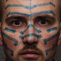
| 05/10/2006 09:57:35 PM |
'Til I'm Blue in the Faceby nards656Comment: Trading Post -
Not quite sure about this one. I think you should have fully committed to the title and went all blue baby. I may have opted for a slightly tighter crop - taken the ears right out. Your lines on the nose are a little off which left the pic seeming a bit off balance. The lines on each side of your face seem symmetrical though. I think the lighting on your eyes was maybe in the middle of where it would have worked better. A little brighter to see the color and detail of your pupils or a littl edarker to make it more sinister.
This shot did make me smile when I first saw it - but you would have scored much higher in my book had you just dipped your whole head in blue paint. That would have screamed dedication to your craft. |
| Photographer found comment helpful. |
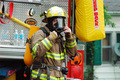
| 05/10/2006 09:39:15 PM |
Small Town Emergencyby bryantbusComment: Greetings from the Critique Club -
First let me say that photojournalism in not my expertise so please bare with me.
My first thought is that you got a good pic of a fireman. It would have been nice to see some aspect of the emergency so to tell more of a story (that must be the rubber necker in me).
The colors are nice and crisp. The focus could have been a bit sharper in my opinion. I see that your ISO settng was at 1600 which probably didnt help - might be the cause for the slight noise in the background/house area. Cropping that area out may have been a slight improvement.
Not sure what else to add here. Overall the pic doesnt really tell a story by itself. It may have worked as one piece of a larger work of pictures. It's not a bad shot but not a strong one either IMO. But please take my opinion for what its worth - an opinion. Good luck on your future entries and I look forward to seeing more of your work.
Tim |
| Photographer found comment helpful. |
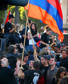
| 05/10/2006 01:45:30 PM |
Armenian Protest at the Turkish Embassyby bvoiComment: Greetings from the Critique Club -
Forewarning - I am not an expert on photojournalism, so I will comment to the best of my ability.
My first impression is that this works well for the challenge. It gives the feeling of being in the masses documenting what is going on. You get a strong sense of the crowd and even if these were the only people present you give an idea that there are many, many more.
I really like how the red colors stick out. Most everyone is wearing black or dark blue clothing and the reds shine out nice, both in the flags (ok the orange too) and the various articles of clothing (the red cross on the bottom and the red on the older ladies shirt in particular). The colors in general just work very well for me.
I am not really sure how to comment on improvements. There does not seem to be anything that really sticks out to me as being \"wrong\". I could see this pic being one of a series with other close up shots of some of the demonstrators. I think you have a really nice shot here and a great score to go with it (Anything above a 6.0 is great in my book). Well done.
Tim |
| Photographer found comment helpful. |
| 05/10/2006 12:41:18 PM |
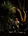
At dawn, we rememberedby KiwiShotzComment: Greetings from the Critique Club -
Let me start with the fact that photojournalism is not my forte, so my comments will not be from an expert PJ point of view.
I think that cropping out the left side of the tree would have helped. It is obvious that your focus is on the military man, but the tree is so large that it becomes a quick draw to the eyes secondly. I am sure a different angle to initially capture the pic would have taken care of it, but this is what we are dealing with. A slightly lower crop in the top would have helped as well IMO as the top part of your pic doesnt really have much to offer. I can see how leaving the crowd in positively affects the pic, just a shame that it had to come with the tree.
I think the lighting and detail on your main subject is great. The shadow on his face from his hat, yet still being able to see his eyes, really helps set a mood. I know that many think that you shouldnt do much editing to a PJ shot, but a slight desat on the background (tree and people behind) may have made him stand out even better. This may have also taken away some of the focus on the large tree in the back.
Overall - I think you have a pretty good capture here. You have a good shot of the military man under tough photography conditions. I hope this comment helps and I look forward to seeing more of you rowrk inthe future.
Tim |
| Photographer found comment helpful. |
| 05/10/2006 12:17:38 PM |
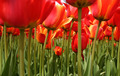
A Bug's Viewby jwillertonComment: Greetings from the Critique Club -
Please bare with me as I give you my first CC comments.
First off - I love the perspective. This shot gives me a feeling of looking into a forest of neverending tulips. The view definitley suits your title. A slightly lower point of view may have gotten an even deeper sense of this.
I believe the colors on this shot could have stood out a bit more. I am not an expert on Photoshop techniques, but I think that an increase in saturation on the green and maybe a slight increase on the other colors would have made these stand out even more (pop as they say). The stems just seem a bit flat to me. Maybe a little dodging and burning on the stems would have helped as well (but I probably only say that because I have become recently hooked on those techniques).
The point of sharpness on the centered tulips work great. I like the blur on the front flowers which just adds to the depth of the whole pic.
Overall I like this shot. Not a typical flower shot by far. Well done on your first Free Study entry. I look forward to seeing more of your entries in the future.
Tim |
| 05/10/2006 12:23:16 AM |
Rainbow Rhythmby sherpetComment: Congratulations Shez!!! Front page, PB and a cool star by one of your pics. Well done!!! |
| Photographer found comment helpful. |
| 05/10/2006 12:22:21 AM |
Nature's Rhapsody by CamComment: Great pic. I liked this one alot. Its a great pleasure to be amongst this company (and boy were we close). Great job and congrats om the ribbon. |
| Photographer found comment helpful. |
Home -
Challenges -
Community -
League -
Photos -
Cameras -
Lenses -
Learn -
Help -
Terms of Use -
Privacy -
Top ^
DPChallenge, and website content and design, Copyright © 2001-2025 Challenging Technologies, LLC.
All digital photo copyrights belong to the photographers and may not be used without permission.
Current Server Time: 08/06/2025 02:58:49 AM EDT.