| Image |
Comment |
| 06/05/2006 10:54:55 PM |
Failure: Another Loser DPC Score!by chaliceComment: Trading Post -
I didnt vote in this challnege but I would have probably gone with a 5 on this. Its a funny idea but lacking any kind of pop. More of your eye would have been nice and maybe a different color shirt. The shot has a brown kind of feel to it and a little bit of color could have livened it up a bit. The background is a bit distracting, but the overall focus is good. If you could have included something to send home the idea that its DPC that youare looking at outside of the title (maybe clutching a brown ribbon in your hand) that would have added to the interest. Overall not a bad shot just not a great one. |
 Photographer found comment helpful. Photographer found comment helpful. |
| 06/05/2006 10:48:17 PM |
A child's crowning achievementby KelliComment: Trading Post -
Good focus and colors but the background is really lacking. The shadows are a bit odd and the white just doesnt really do much for the overall pic. Now if you had your son wearing the medal with a big grin I think you would have conveyed success much stronger and had not only a better score but a fun pic of your child. The way it sits now leaves it kind of flat and boring. I scored it a 5 in the challenge. |
| Photographer found comment helpful. |
| 06/05/2006 12:56:31 PM |
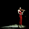
total successby DanSigComment: Trading Post -
First off congrats on your top 10 and a great score. This shot is composed and cropped beautifully. The negative space on top and left is a great compliment to the woman and her shadow. The color of her dress, lips and violin are also a great compliment to the eery feeling, glow and lack of color in her skin all topped off with the lower fog. This is a beautiful shot and deserving of the score you recieved. WEll done. |
| Photographer found comment helpful. |
| 06/05/2006 12:51:51 PM |
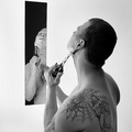
my daily shaveby DanSigComment: Trading Post -
Well done and great score. I liek tyhe black and white treatment on this althoug the left side seems a bit too bright. Great focus on both of you. I would have liked to have seen either a slightly different angle on you or the knife to see more detail in the knife as it is kind of hiding in both places. A closer crop on the left would have gotten rid of some of the bright empty space without negatively affecting the shot over all I think. Overall though - a great idea and well executed. |
| Photographer found comment helpful. |
| 06/05/2006 12:43:24 PM |
Public Libraryby MelethiaComment: This one left me a bit blah. It almost seemed to be more of an abstract rather than an architecture entry. While the lines were kind of interesting the shot as a whole didnt leave me wanting to look at it too long. Technically I think you did very well here. The shades and shadows work well and the sky is a good contrast to the color of the building but it just didnt grab me overall. But you cant complain about a 6+ score. |
| Photographer found comment helpful. |
| 06/05/2006 12:39:31 PM |
Careful...beverage...extremely hotby MelethiaComment: Great shot Deb. You trounced me hard on this one. What can be said other than compliments on this one. Great flame. I like how the flame leaves the shot - it wasnt necessary for the whole thing to be within frame. The shape of the burnt cup works great and the text on the bottom is like a nice little surprise that finishes off the whole shot perfectly. Well done and congrats on your top 15 placement. I need to be wary of when I challenge you to a head to head. |
| Photographer found comment helpful. |
| 06/05/2006 12:10:21 AM |
|
| 05/31/2006 03:06:30 AM |
|
| Photographer found comment helpful. |
| 05/31/2006 03:03:21 AM |
|
| Photographer found comment helpful. |
| 05/30/2006 10:26:22 AM |
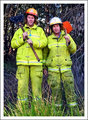
Mark & Steve, Our Firemen Hero'sby sherpetComment: Hey Shez - I am looking at this with my moms computer and its pretty dark (her monitor that is). I really like this shot. I like the grass in front and the low color brush inthe back. The looks on their face and their poses are wonderful. When I get back home I will look at this one again when I can see it in the best lighting and color, but I think this would have done very well even with two people. I would have voted this high and not even thought of it in a DNMC kind of way. Great shot. |
| Photographer found comment helpful. |
Home -
Challenges -
Community -
League -
Photos -
Cameras -
Lenses -
Learn -
Help -
Terms of Use -
Privacy -
Top ^
DPChallenge, and website content and design, Copyright © 2001-2025 Challenging Technologies, LLC.
All digital photo copyrights belong to the photographers and may not be used without permission.
Current Server Time: 08/07/2025 01:07:25 PM EDT.