| Image |
Comment |
| 08/15/2007 07:15:30 AM |
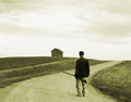
Hollis Brownby ColeyComment: I really like this image. Gave it a 9 last night before going to bed. Coming back around to comment I still really like this but I think that the color tones used could have been better. Kind of has a green hue going on in my monitor where I think a maybe more true sepia could have been better. Anyway, love the comp, simple and entertaining. Good luck! |
 Photographer found comment helpful. Photographer found comment helpful. |
| 08/15/2007 07:13:31 AM |
|
| Photographer found comment helpful. |
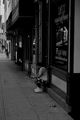
| 08/15/2007 07:11:17 AM |
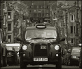
'The Dear Green Place' by xtineComment: While maybe not what most people are looking for when it comes to a proper landscape I think this image rocks! Great balance, great feel, wonderful detail running down the street sides. This image made me stop and look longer than my usual stay and when I came back sorting through it brought a smile back to my face. Great image. I hope this scores well for you. Bumping up. |
| Photographer found comment helpful. |
| 08/15/2007 06:29:11 AM |
The Playroom Incident by h2Comment: Well done Oliver! Didnt let me stay ahead of you in the ribbon count for long huh? Great idea and great execution. Congrats! |
| Photographer found comment helpful. |
| 08/13/2007 10:36:22 PM |
|
| Photographer found comment helpful. |
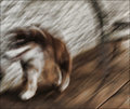
| 08/12/2007 03:46:43 PM |
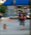
Walk the Dog (30 days of blur)by JutildaComment: This one didnt really do much for me. Where the first image had a flow and primary subject that was rewarded by it, this image is just a bit too busy for me with out any real impact. Had the background been missing the car and building (next time see if you can get them torn down before you shoot) and we had just been left with the dog and his owner the image could have been much stronger. AS is though the man kind of blends in in a not so good way with the vehicles and the lines from the blur on the building end up distracting. The first image works well as a blurry image because it benefits from all the aspects (lines, colors, flow, contrast) working together to provide a somewhat cohesive subject. This second image just feels more like a quick snapshot that was taken out of focus. (from the blurgeois thread) |
| Photographer found comment helpful. |
| 08/12/2007 03:45:53 PM |
She's Like the Windby JutildaComment: This shot drew me in from thumbnail. I was drawn to the lines and colors first off, but it was the overall texture of the shot that kept me the extra bit longer. It almost feels like you could reach into the screen and touch it. That it would have hard underbody to it but also an almost furry soft touch on top as well. Like most of the pictures I prefer here there is a flow and movement to the shot that is very appealing. I may have tweaked the blacks to make them just a bit more prominent, but overall I enjoyed this image very much. Just enough blur to almost make it abstract but not enough to totally hide what the subject matter was. (from the blurgeois thread) |
| Photographer found comment helpful. |
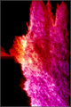
| 08/12/2007 03:29:56 PM |
Day 11 - Treeby Bruce_the_RobertComment: This one doesnt work so much for me. The vibrant color is nice, but its not enough to carry the image. Where in the first the shapes and patterns are a great compliment to the colors, this one just seems to be a bit flat. Almost like a big splatter on a wall with no real purpose or interest grabbing element to make it more than what it is up front. (from the thread) |
| Photographer found comment helpful. |
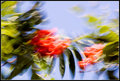
| 08/12/2007 03:29:28 PM |
Day 2 - Berriesby Bruce_the_RobertComment: What I like about this image are the colors of the subject and the patterns created with the camera. Cool almost fluid movement from left to right swirling around the bottom and fading off. The abstractness of it makes me not strain to see what the subject actually was. The motion blurred contrasty shapes just work for me. It has a good feel. (from the thread) |
| Photographer found comment helpful. |
| 08/10/2007 10:01:41 PM |
|
| Photographer found comment helpful. |
Home -
Challenges -
Community -
League -
Photos -
Cameras -
Lenses -
Learn -
Help -
Terms of Use -
Privacy -
Top ^
DPChallenge, and website content and design, Copyright © 2001-2025 Challenging Technologies, LLC.
All digital photo copyrights belong to the photographers and may not be used without permission.
Current Server Time: 08/25/2025 02:03:21 AM EDT.