| Image |
Comment |
| 05/21/2003 04:36:15 PM |
|
 Photographer found comment helpful. Photographer found comment helpful. |
| 05/21/2003 04:35:11 PM |
Open Wide and say AHHHHby BAMartinComment: Very clever capture. I think you could have benefitted from an even tighter crop and still show the humor. A little more sharpening would help as well. -T |
| Photographer found comment helpful. |
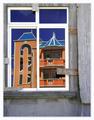
| 05/21/2003 04:32:35 PM |
New house on the blockby JeanComment: Very interesting photo. I always love photos that use some sort of internal framing of a sbject. Nice colors, too. -T |
| Photographer found comment helpful. |
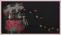
| 05/21/2003 04:26:08 PM |
The Great Escape by wayne9232Comment: I'm not quite sure how you did it but you did it well. Nice composition and arrangement of the jelly beans. -T |
| Photographer found comment helpful. |
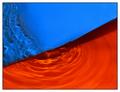
| 05/21/2003 04:23:43 PM |
|
| Photographer found comment helpful. |
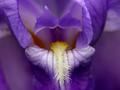
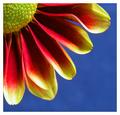
| 05/21/2003 04:17:35 PM |
Petals by agwrightComment: Critique Club critique by Tim Jensen
First off, congratulations on your award. This photo is very deserving of it.
My first impression was the gorgeous colors in this photo. It certainly meets the challenge very well. I'm sure you boosted the saturation and levels a little to make it pop out but it still looks natural. I like the highlights near the edges of the pedals. They really help to define that edge and the separation between the flower and the blue sky.
The lighting is very good in the way that it creates some nice dark shadows on the pedals and at the same time highlights the center area. Each element of the photo from the sky to the individual parts of the flower are distinctly visible with the right amount of light.
The focus is pretty good, excellent in most of the image. Since it is sharp in nearly every area of the flower I would like to see that taken even further by decreasing the aperture size to the smallest size of F8 (whatever the smallest is on your camera) to try to get that lower pedal more in focus. Hey, it's such a great photo that I am grasping at straws to come up with something to nitpick.
The composition is very appropriate. It is a common composition for these kinds of flowers but that is because it works very well. The square cropping was definitely the way to go.
You executed this image very well and produced a very clean, colorful, and dramatic photo that I'm sure would look great on just about any wall. Good job.
Tim |
| Photographer found comment helpful. |
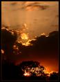
| 04/22/2003 08:45:19 PM |
Burning Bushby crabappl3Comment: Congratulations! This is a fantastic shot. You may have gotten lucky to see such a scene but you had the forethought to have your camera ready and properly take the shot. Seems like a good amount of skill to me. Way to go.
T |
| Photographer found comment helpful. |
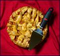
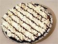
| 04/20/2003 11:45:39 PM |
Area (circle) = PI (3.1415926...) X r (radius of circle)2 (squared)by ArtifactsComment: Critique Club critique by Tim Jensen
My last critique was a pie photo as well but this one is executed much better. As I told the last person I personally do not like these types of plays on words.
This pie looks very tasty and I like the addition of the server (whatever you call it). The red colors also makes it stand out and look even more inviting.
The composition is fine but safe. It is pretty easy to just take an overhead shot of a pie and have it look pretty good compositionally but it is also somewhat boring and overdone. There must be other cmaera angles that would look very interesting and fresh. Shooting from the side, from an angle, up close with a shallow depth of field, or any number of other ways could be effective.
Everything else is pretty good. Nice colors, well executed with good clarity and focus, effective cropping, and even a simple and tasteful border. So even though I think it is a bit of a cop out to use pie instead of Pi I still think you did a pretty good job with this photo.
Tim |
| Photographer found comment helpful. |
| 04/20/2003 11:09:58 PM |
Pi with an Eby OneSweetSinComment: Critique Club critique by Tim Jensen
These kind of entries where it is a play on words really does nothing for me, to be honest. It always seems like just an attempt at being clever while avoiding the real challenge. With that being said I will critique what I do see.
It is an ordinary pie and not even a fancy one photographed from a very ordinary angle. If you are going to shoot a real pie for this challenge it needs to be shot from a real creative angle and/or use some creative lighting so that it stands out. Something needs to be done very creatively and visually so that it can make up for not really meeting the challenge. Maybe you could have tied it in with the number Pi somehow. Dot the i in Pi with it or slam it against a wall where Pi is written out or something. If it's dramatic in someway it will be a more visually entertaining photo.
It is not executed real well. The cropping is off balance by crowding the left and bottom edges and it is fairly grainy. It appears to be taken by a lower end camera and that's ok because you can't avoid that. So some things like graininess or softness are acceptable as long as you are doing all the other things right that you can control like lighting and composition.
Just keep working at it and try to get real creative with you compositions, lighting, depth of field, textures, colors, and anything else you can think of to make your images stand out. There is nothing wrong with trying to go too far and seeing what happens especially when you are already bending the rules with you subject matter.
Tim |
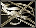
| 04/20/2003 10:43:21 PM |
Endless Ribbonby JackoComment: Critique Club critique by Tim Jensen
Jacko, This is a great concept and you pulled it off very well. It also clearly meets the challenge.
The one thing that stands out for me is the blank backside of your strips. Did you consider printing on both sides? As if you didn't already give yourself enough work. Keeping it pretty much black and white works well making it very clean and easy to understand.
I like your composition quite a bit. There is a nice combination of straight lines and curves. It has a nice balanced feel to it.
The depth of field is very appropriate for this image. The slight blurring as it recedes helps to convey a bigger sense of depth which supports your idea well.
The lighting is pretty good overall allthough slightly contrasty as evidenced by the very bright area on the backside of the curved loops in the middle. You may have intended this so it stood out more but I would have preferred some more diffused light.
It is executed very well with clean sharp lines.
I feel like I am basically nitpicking a very good image with a tough topic. Nice job.
Tim |
| Photographer found comment helpful. |
Home -
Challenges -
Community -
League -
Photos -
Cameras -
Lenses -
Learn -
Help -
Terms of Use -
Privacy -
Top ^
DPChallenge, and website content and design, Copyright © 2001-2025 Challenging Technologies, LLC.
All digital photo copyrights belong to the photographers and may not be used without permission.
Current Server Time: 07/31/2025 12:18:12 PM EDT.