| Image |
Comment |
| 08/25/2003 03:39:56 PM |
Freestyler by ToddhComment: Congratulations, Todd. This was definitely the best of the bunch. Keep up the great work.
T |
 Photographer found comment helpful. Photographer found comment helpful. |
| 08/24/2003 11:33:36 PM |
Hope?by sagestudioComment: Wow, this is great. This really defines negative space. Excellent perspective, composition, textures and colors. I love the blue tones that help accentuate the skin colors. Well done. -T |
| Photographer found comment helpful. |
| 08/24/2003 11:28:57 PM |
Space?by dacrazyrnComment: I'm not sure what it is but it doesn't matter, I like it. Nice composition and choice of B & W. -T |
| Photographer found comment helpful. |
| 08/24/2003 11:24:30 PM |
The Boatby Geo_GriffinComment: Nice and simple with good clarity and bold colors. I may have shown some sand direct under the boat but I'm not sure, I would have to see it. -T |
| Photographer found comment helpful. |
| 08/24/2003 11:20:42 PM |
Father and Sonby arnitComment: I really enjoy this photo but I don't see it fitting the challenge that well because there are interesting things to look at throughout the background. So I don't see it as an effective use of negative space in order to support the main subject. It seams like it would fit a "perspective" challenge or some other one. It is vey good though with good clarity and bright colors. -T |
| 08/24/2003 03:35:19 PM |
Trinity by crabappl3Comment: Wow, this is an incredible photo. Easily one of the best in the bunch. It is very powerful and emotional with its bold values and symbolism. Excellent job. -T |
| Photographer found comment helpful. |
| 08/24/2003 03:31:05 PM |
Filling It Inby Firstrich1Comment: I love this shot but I don't really get the negative space. I find the background just as interesting as the foreground crane. While I think both areas work very well together I don't see the background as simply supporting the foreground, rather it is commanding it's own attention as well. It is a great shot with bold values and effective composition. -T |
| Photographer found comment helpful. |
| 08/24/2003 03:25:34 PM |
Ascensionby goodtempoComment: Great shot but I don't understand the negative space. Everywhere I look I see interesting detail and color. I have to mark it down a little for not meeting the challenge very well even though the photo is very good. -T |
| 08/24/2003 03:19:03 PM |
Not Forgottenby ClubJuggleComment: Very interesting idea. One of the best graveyard images I have seen. This perpective really shows the differences between the tombstones and provides an incredible design. I don't think the tree is necessary, though but I'm not sure. Great shot. -T |
| Photographer found comment helpful. |
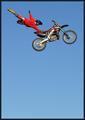
| 08/24/2003 03:15:24 PM |
Freestylerby ToddhComment: Well this has to be a ten. Couldn't you get the kid to go any higher :) Excellent shot, great clarity and wonderful composition. I hope he made it back onto the seat. -T |
| Photographer found comment helpful. |
Home -
Challenges -
Community -
League -
Photos -
Cameras -
Lenses -
Learn -
Help -
Terms of Use -
Privacy -
Top ^
DPChallenge, and website content and design, Copyright © 2001-2025 Challenging Technologies, LLC.
All digital photo copyrights belong to the photographers and may not be used without permission.
Current Server Time: 07/31/2025 12:18:25 PM EDT.