| Image |
Comment |
| 07/18/2002 02:39:00 PM |
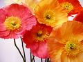
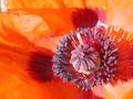
Poppiesby JeanComment: I think a background that is an orange-yellow color would have worked better. It easy to think that it should contrast with the flowers but in this case, with flowers, I think it is just the opposite. nice cropping. 8 -Tim |
| 07/18/2002 02:25:00 PM |
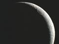
Slice of Pie in the Skyby spidermanComment: There is some color abberation on the right of the moon that should have been easy to fix by desaturating the image to a black and white. Still a cool shot. 8 -Tim |
| 07/18/2002 02:41:00 PM |
|
| 07/18/2002 02:31:00 PM |
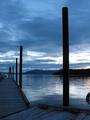
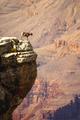
Dock at Twilightby bdshortComment: You definitely should have cropped out that flotation ring on the right side. The sky is a bit ordinary. 6 -Tim J |
| 07/18/2002 02:58:00 PM |
Poppyby spillerComment: This is very well done. It has all of the right elements, vivid color, exceptional composition, the right amount of contrast, and even an abstract element. 10 -Tim J |
 Photographer found comment helpful. Photographer found comment helpful. |
| 07/13/2002 03:44:00 PM |
Fearless by chakkobboComment: Doesn't fearless mean a lack of fear? Maybe it would have worked better for a fearless contest. 4 -Tim |
| 07/13/2002 03:07:00 PM |
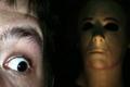
Did You Ever Get The Feeling...?by chuckComment: I don't think the guy on the left needs to be that well lit. That kind of light looks a little unatural to me. I think a blueish light would contrast very well with the yellowish figure in the background. It is quite good, maybe the best in this round. It has a great sense of fear about it. 9 -Tim |
| 07/13/2002 03:15:00 PM |
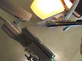
Say ahhhhhhhh.by wargloryComment: I like the idea but I dont think it is executed very well. I think your depth of field needs to be just the opposite of the way you have it with the needle sharp and the background blurry. The composition needs some work too. 5 -Tim |
| 07/13/2002 03:42:00 PM |
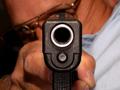
Fear Thisby David EyComment: I like the idea but I would like to see a darker background. Subject wearing a dark shirt and perhaps gloves. Maybe slightly red lighting.Get rid of the glasses. A vertical format may have worked better so you could include the entire gun and hand in the shot to increase the illusion that the gun is really coming out of the picture at the viewer. 8 -Tim |
| Photographer found comment helpful. |
| 07/13/2002 03:20:00 PM |
Before Piercingby darylbrownComment: This is another case of a title trying to carry the photo. If it wasn't for the title I would not know what this is about. 4 -Tim |
Home -
Challenges -
Community -
League -
Photos -
Cameras -
Lenses -
Learn -
Help -
Terms of Use -
Privacy -
Top ^
DPChallenge, and website content and design, Copyright © 2001-2025 Challenging Technologies, LLC.
All digital photo copyrights belong to the photographers and may not be used without permission.
Current Server Time: 08/05/2025 03:43:40 AM EDT.