| Image |
Comment |
| 01/14/2003 09:35:16 PM |
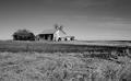
Abandoned to the Cold Prairieby jimmspComment: This is a nice photo. However I don't like where the horizon line is. I would I preferred to see it either higher to see more of the grass which I think would work better here or lower to show more of the sky if the clowds were more interesting.
6 |
 Photographer found comment helpful. Photographer found comment helpful. |
| 01/14/2003 09:28:25 PM |
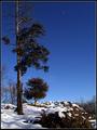
Zenithby KarenBComment: This is a very nice composition. The values and colors are very good and it is technically very clean and sharp. 8 |
| Photographer found comment helpful. |
| 01/14/2003 09:24:45 PM |
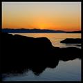
Olympic Peninsulaby jimmythefishComment: I know this mountain range very well. I've taken numerous photos of it. The colors, shapes and contrast in their simplicity make this a stunning shot. A great combination of abstract and landscape. It may be slightly oversharpened but not too bad. It is very lovely. 9 |
| Photographer found comment helpful. |
| 01/14/2003 09:19:30 PM |
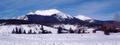
Mountain landscapeby jimsappComment: This is very beautiful and a nice choice of aspect ratio. I probably would have increased the brightness in the mid tones to help reveal more of the details in that range. The lower part of the mountain, for instance. I would love to see this photo at full resolution. The color and shape of the building on the right adds a lot. 7 |
| 01/14/2003 09:15:27 PM |
He likes itby lumbusComment: The colors are nice but I find this scene fairly ordinary. I like the deer but I am distracted by darkness of the group of trees on the left. They interfere with the openess that would have appealed to me. It is also off balance with the deer on the same side. Maybe if you would have moved quickly to left to frame the deer on the right side and a smaller bit of the dark trees on the left to frame the scenery in the background. 5 |
| Photographer found comment helpful. |
| 01/14/2003 09:09:17 PM |
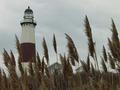
Light Houseby TurcoComment: This photo has nice composition and a nice feeling about it. The quality is difficult to gauge at this size but it looks pretty clean to me. The color seems a little flat and could really use some saturation. You should keep this scene in mind for when the sky is real dramatic. 5
|
| 01/08/2003 03:14:32 PM |
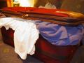
I need another bagby jab119Comment: This is a humerous photo, with the overloaded suitcase. I'm thinking if it is overloaded now than just imagine what it will look like after you come back from the trip after buying a bunch of new things. Unfortunately, while I find it humorous I don't find this to be a very compelling photo. It's needs something more. The lighting needs some help. The bright area in the background by the lamp is very distracting and the white clothing is starting to bet blown out. I may have tried to make everything in the background dark or darker and only light the suitcase. This would add a little drama just from the lighting alone. I also might have exaggerated the humor by overstuffing the sutcase even more and scattering some clothing around the suitcase as well. Instead of the white clothing maybe another color like blue would be more appropriate and less bright. The purple sweatshirt and the color and texture of the suitcase are nice. I think it is a matter of trying lots of scenarios with the lighting and the arrangement of the scene. It fits the challenge well enough but it is a little soft on the focus, particularily around the zipper handle. It's a good photograph but it just needs some more work maybe by emphasizing the humerous aspect some more. One idea would be to have everything dark except for one soft diffuse light from above and to one side and taking the photo from directly above the suitcase (avoid showing your own shadow) with it positioned squarely inside the frame with clothing protruding from every side of the suitcase and cropped tightly. It would give it a dynamic and abstract quality while giving the impression that you might be leaning over the suitcase to attempt to close it.
Tim Jensen |
| 01/08/2003 02:38:43 PM |
After travelling, all what's left: Souvenirsby Mo ElfComment: This photo should have placed higher than it did. I find it to be very intersting and colorful. It has a lot of abstract qualities that a lot of people may not appreciate enough. The one thing that bothers me just a little is the placement of the pink instrument (I don't know what it is called) in the middle. I feel it competes with the shoe visually and maybe it would look better if it was placed further to the left to give each their equal space. As it is, it is also too centered. The colors, shapes, and textures are wonderful, however, I find the shadows to be too dark. Some fill lighting would have helped to bring out more detail in those dark areas, especially inside the shoe. I have the strange feeling that I am looking up at the scene for some reason. It must be an illusion. It meets the challenge well and it is executed very nicely with sharp details, clean edges, and solid colors. Nice job.
Tim Jensen |
| 01/07/2003 05:40:08 PM |
Road Tripby Fibre OptixComment: I went to Toronto when I was young and I loved it. This photo brought back a lot of great memories for me. Often the dream of a place is better than seeing one actual photo of the place. This photo accomplishes that very well. I particularily like the simplicity and the colors. For example, the color of the thumb tack matching the freeway lines. I love the lighting. It is as if you are hunched over this map late at night studying and dreaming about the places you are going to go. I think the position of the keys or the way they are lighted could be better. I don't like the large black shape to the keys. There is just a little too much darkness and not enough detail in that area. Perhaps if evrything in the frame was move al ittle bit to the right and down to show a little more of the map and a little less of the keys. Technically I think it is handled pretty well, nice and sharp were it needs to be. It's creative and meets the challenge very well. I'm also so glad you didn't put some obnoxious border on it like so many other people are doing. Nice job.
Tim Jensen |
| 01/07/2003 04:25:22 PM |
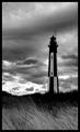
A Trip to the Coast by smellyfish1002Comment: This is a lovely photo. At first I felt it was a little dark but I found that darkness to be appropriate and added greatly to the overall mood. There is power and drama in the lighting and composition and it works quite well as a black and white. There is strong sense of motion in the grass I even thought I saw it move once. Probably just too much coffee for me. I'm not quite sold on the cropping, though. Maybe only because I am so used to a more conventional crop. It seems like ther might be a little more sky than necessary. It's one of those images that demands to be seen large so the viewer can enjoy all of the interesting details in the grass and the lighthouse. Without seeing the original scene or the original photo I am hardpressed to find anything significant to change except for maybe the proportion of the crop and that is iffy. It appears to be very clean and sharp. It clearly nails the challenge theme. I also like the simple border. If all borders were handled this way I would be more in favor of them. Ok, I found one thing to nitpick. That one piece of grass that is standing straight up should be leaning too :- ) Awesome photo. Congratulations.
Tim Jensen |
| Photographer found comment helpful. |
Home -
Challenges -
Community -
League -
Photos -
Cameras -
Lenses -
Learn -
Help -
Terms of Use -
Privacy -
Top ^
DPChallenge, and website content and design, Copyright © 2001-2025 Challenging Technologies, LLC.
All digital photo copyrights belong to the photographers and may not be used without permission.
Current Server Time: 08/03/2025 07:16:23 PM EDT.