| Image |
Comment |
| 01/19/2003 04:06:01 PM |
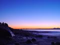
Evening Tideby a1leyez0nm3Comment: First of all, this is a very lovely image. However, when I see an image like this with very interesting foreground elements, I tend to wonder if it may have been better to show even more of it. But since I wasn't there I can't know that. I just love the darkness and subtle highlights that reveal the shapes of the rocks. Is this Seattle? Hmmmm. the colors seem just right, the exposure is perfect and technically, it looks very sharp and clean. Nice job. 9 -T |
 Photographer found comment helpful. Photographer found comment helpful. |
| 01/19/2003 03:53:51 PM |
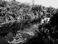
Nature at it's best ...by CreativeFlyPhotoComment: It was an interesting decision to make this a black and white. Was there some specific colors that you didn't like? I think I would have preferred it in color. The large dark area of bushes on the right side is distracting. It feels too dominating of the scene. I do really like the lilipads in the water as well as the fine detail in the trees and around the building. The bright areas appear a little too bright and I wish the sky could be darker. I like the composition in the way that the river leads the eye to the building. Technically it looks very good, clean and sharp. 6 -T |
| Photographer found comment helpful. |
| 01/17/2003 12:54:15 PM |
Murder - The Crystal Methodby cq107Comment: This photo definitely does have some shock value and it does seem to represent the song title. There are several things that I don't care for, however. The scene seems too bright to represent an act so dark. I think it would have worked much better with a dark background and only a single light source barely lighting the bloody gloves. The glove itself seems wrong for this. The white color is fine but the style and texture doesn't really go with murder. It looks more like a gardening glove or a kitchen glove. The knife is pretty cool even though it is quite short. I think I would have worked on the composition some more by having the glove at a more severe angle to the knife as if they were just dropped or tossed in that position. Technically it is very good, sharp and detailed. What is basically lacking for me is the mood of such a grissly act. I think you needed to go further than the blood and knife and really experiment with different lighting situations. 5 -Tim |
| Photographer found comment helpful. |
| 01/17/2003 02:32:31 AM |
Kissed by a Roseby RiderGalComment: I really like the idea of this photo and I really think it has a lot of interesting things going for it. I don't think that the reflected rose is necessary. Maybe there is a reason for it that I may be missing. What I like is the pure black background and the kiss and the rose or roses seemingly floating in space. But there seems to be a disconnect between them. This is a difficult challenge and I'm not sure how I would resolve it. One idea I have is to show a side view of yourself with extreme backlighting so that only the edge of your profile is showing. You are wearing the bright red lipstick and the rose is close to your lips in a close up view. As it is now, the idea is a good one but it isn't being conveyed strongly enough. I think you handled the sharpness and DOF very well. The contrast is good and the colors are vivid. This seems to be exactly what you intended and for that you did a very nice job in executing your idea. I applaud you for taking a very difficult concept and creating a very interesting photo out of it. I think you have the right elements, they just need to be arranged a little differently to produce a more compelling photo. You are obviously trying to be very original with your photography and it may not always relate to everyone but I believe it is much better to error on the side of creativity rather than trying to be too safe and mainstream. My score 6 -Tim |
| Photographer found comment helpful. |
| 01/16/2003 06:27:46 PM |
Sydneys Greatest (Bridge)by RavenComment: I hate to say this but I really don't like the sepia color on this photo. It just doesn't work for me. It feels old instead of fresh. I think a straight black and white would have been much better and would have kept the timelessness of the scene. The composition is a little off. I would have framed the scene more to the left and down a bit to show the entire boat in the lower left corner. The mast that is sick up from the bottom edge is very distracting as well. This is a very beautiful location but I don't feel that you captured it as well as it could have been. 5 -Tim |
| 01/16/2003 06:20:50 PM |
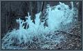
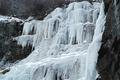
Frozen Forestby karmatComment: As much as I like this photo I am having a difficult time viewing it as a landscape because the focus is so squarely upon the ice formation rather than the landscape or an area of the environment. It's too specific. If you would have stepped back and photographed this formation in it's environment I think it would have fit the them better. It is cropped very well, has nice colors and is technically well done. 6 -Tim |
| Photographer found comment helpful. |
| 01/16/2003 06:10:44 PM |
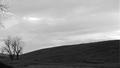
Storms a Comingby kevinswopeComment: This is a little too simplistic for me and I don't like the bits of branches stick out on the left top. Maybe if the sky was more dramatic looking it would work better for me. It's a good idea but it needs some more work. 5 -Tim |
| Photographer found comment helpful. |
| 01/16/2003 06:07:36 PM |
Tranquil Seaby Clou9Comment: This would be fun to take at different times of the day and year to see the different affects of the sky and lighting. I really like how you have this cropped by showing only a necessary amount of the foreground foliage and lots of sky. It really gives me a good feeling. A polarizer filter or a split neutral density filter probably would have helped to darken and enhance the sky a little more. Nice job. 8 -Tim |
| Photographer found comment helpful. |
| 01/16/2003 06:01:32 PM |
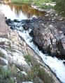
Refreshing!!by BigSmilesComment: Now this has some dramatic lines. I realy like the composition here as well as the texture and detail. I feel that it is slightly overexposed though as evidenced by the overly bright water and the slightly washed out area in the foreground. 8 -Tim |
| Photographer found comment helpful. |
| 01/16/2003 05:57:24 PM |
Wall of Winterby YomiComment: This is one of those images that I have a difficult time suggesting what it might need as far as composition goes because I have no idea what the rest of the scene looks like. I feel that it needs something more in the way of composition because I feel that the ice is too centered. The ice is beautiful and dramatic but the composition doesn't really support that. Maybe a vertical shot with the dark rock on the right side and the white of the ice hugging the left edge and eliminating some of the dark areas on the left side. 6 -Tim |
| Photographer found comment helpful. |
Home -
Challenges -
Community -
League -
Photos -
Cameras -
Lenses -
Learn -
Help -
Terms of Use -
Privacy -
Top ^
DPChallenge, and website content and design, Copyright © 2001-2025 Challenging Technologies, LLC.
All digital photo copyrights belong to the photographers and may not be used without permission.
Current Server Time: 08/03/2025 01:45:50 PM EDT.