| Image |
Comment |
| 01/24/2003 06:39:13 PM |
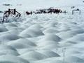
SNOWFIELDby howzaComment: I selected this photo for the Critique Club although I already commented on it. I will try to expound on it further. As you can see from my comments I really like this photo but there were a few things that I would have changed. The bit of grass under the fence is distracting in part because it is so dark and doesn't show a lot of detail. However I do like the taller, thinner grass and maybe would like to see more of that. I would have really tried to keep this scene as simple as possible by showing only the fence and the beautiful snow mounds. I do like the gate and would maybe like to see that emphasised a little more. A slightly different composition may have been even more interesting such as getting even lower to to the ground so that the closest mound looked even bigger and helped to exaggerate the perspective. I wish I were there to study this location it looks really interesting. I would have taken every possible angle and composition I could think of. But as it is it is still very good. You did a nice job with the exposure and colors and it is as sharp as it needs to be. Good job.
Tim
Critique Club |
 Photographer found comment helpful. Photographer found comment helpful. |
| 01/24/2003 06:21:33 PM |
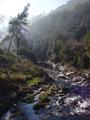
Riu Ripollby bcncrazyComment: I really wanted to like this photo because it seems to have a lot of the right elements like sunny weather, a river, rocks and greenery but instead it feels too cluttered. It doesn't have a focal point, my eyes just keep wandering around without really enjoy any one thing in particular. I think there probably was something good to photograph at this location but this particular composition just isn't working for me. Of course without knowing the location I can't really recommend a better composition. Was there a cleaner looking part of the river? Was there an angle that showed more of the beautiful trees? It's often a little tricky to shoot into the sun so as to avoid a washed out sky or lens flare. Maybe you could have pursued that element and showed the sun even more for a real striking shot by positioning the sun directly behind a tree or other object or something like that. Technically it is pretty good, fairly clean and sharp. For this particular shot the photo may have benefitted by underexposing it about a 1/2 to 1 full stop to maintain more of the color in the trees and grass. Like I said many of the right elements are there it just needed a better composition and some elements of emphasis. It looks like a fun area to explorer.
Tim
Critique Club |
| Photographer found comment helpful. |
| 01/20/2003 05:05:53 PM |
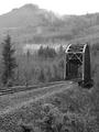
Crossing by timj351Comment: That's what made it for me too, Chris. The other photos I took that showed much more of the tracks placed too much emphasis on the tracks and began to compete with the interesting background. At least for this challenge topic. The image was about how the tracks and bridge complimented and supported the background.
T |
| 01/19/2003 07:25:23 PM |
tired of sexby andresComment: This is nicely focused and well lit but it has very little impact on me aside form it containing sexual content. I don't know how showing a condom out of it's package conveys the idea of being tired of sex. If anything, it suggests that you are about to enjoy sex. It just doesn't seem to match the theme to me. It is too well lit and is absent of any kind of mood. Your choice of colors and the softness and length of the shadows are good. Compositionally it is pretty ordinary with the content placed squarely in the center of the frame. The lighting and the composition are probably just the way you wanted it and for that you did a fine job in execution, however I just find this photo to be lacking in visual and emotional impact. Score 5
Tim
Critique Club |
| Photographer found comment helpful. |
| 01/19/2003 07:10:08 PM |
Waltz of the Flowersby jitamsComment: I personally like the DOF quite a bit on this photo. It adds another interesting aspect to it. There is more to DOF then merely directing your eyes to a specific spot. It creates a softness and dreaminess that is appropriate for this theme. I find this composition to be very creative and a good representation of the theme. I usually don't like elements crowding the edges but in this case, the petals touching the edges help to add to the triangular aspect that is a big part of the composition as well contrasting nicely with the soft curves of the flowers. I may have framed the flowers a little more towards the top edge while showing a little more of the stem. Technically it is very strong. I do see some evidence of the halo effect on some edges but it isn't a big deal. It otherwise has the right amount of sharpness with no signs of jpeg compression. The colors are beautiful without being over saturated. I really enjoy this photo. Score 9
Tim
Critique Club |
| 01/19/2003 04:58:40 PM |
Oak Treeby GotchaComment: Darn, and I just told another person in my comments that their's was my favorite so far. Now your's is my new favorite. This is so dynamic. It has everything. It is simplistic yet has wonderful texture and detail. It has great complimentary colors and contrast. Each of the elements are perfectly spaced and don't crowd any edges and you have just the right amount of blue sky. Even the shape of the clouds are subtly adding to the dynamic effect. Absolutely excellent. 10 -T |
| Photographer found comment helpful. |
| 01/19/2003 04:47:23 PM |
Sunset on Lake Ontarioby firstduchessComment: I haven't finished my ratings of all the photos yet but this is currently my favorite. This is very, very good. I am so glad you didn't over saturate the colors and over sharpen the edges like so many people would have done. There is something incredible going on here visually. It seems to be both calming and energetic at the same time. The complimentary colors evoke the calming feeling and the wonderful textures in every area of the photo give the sense of energy and motion. The horizon line looks tilted slightly but the rest of the image more than makes up for it. I want to just keep looking at it. Excellent job! 10 -T |
| Photographer found comment helpful. |
| 01/19/2003 04:34:15 PM |
The Trioby GussiComment: The composition and framing is superb. In fact nearly everything is excellent except it seems slightly washed out. I think a little increase in the dark tones and maybe a little more saturation would have made this photo even more striking. It is still one of my favorites this week. Nice job. 9 -T |
| Photographer found comment helpful. |
| 01/19/2003 04:27:57 PM |
Stand Tallby TurbotechComment: One word, polarizer filter. This is a classic example of where a polarizer filter would have significantly helped to keep the sky blue while maintaining the proper exposure on the rest of the photo. Without the filter you could have helped this photo by underexposing abput 1 stop and then making further adjustments in the individual color channels. It is still a very nice photo. I like the symmetrical composition but I would have centered the building horizontally, as well, so that it didn't crowd the bottom edge. This scene clearly presents a difficult lighting situation. A different time of day with different lighting would probably help to get more light into the trees on the right side. 7 -T |
| Photographer found comment helpful. |
| 01/19/2003 04:16:43 PM |
Where I use to Chillby takethatComment: It's leaning to the left. That's a big mistake because it is so obvious yet so preventable. Ok, other than that, I really like this photo. There are a couple of small things that I would adjust. Since it is already very symmetrical I would have gone the rest of the way and perfectly center the horizon line with the middle of the frame and the middle of the building. I would have also brightened the middle values just a little bit more to reveal a little more of the buildings. I love how the texture of the sky mirrors the texture on the building. Of course, the colors are spectacular. Technically it is very good, but that leaning horizon line......... 7 -T |
Home -
Challenges -
Community -
League -
Photos -
Cameras -
Lenses -
Learn -
Help -
Terms of Use -
Privacy -
Top ^
DPChallenge, and website content and design, Copyright © 2001-2025 Challenging Technologies, LLC.
All digital photo copyrights belong to the photographers and may not be used without permission.
Current Server Time: 08/02/2025 10:37:15 PM EDT.