|
|
|
Showing 771 - 780 of ~830 |
| Image |
Comment |
| 07/22/2006 06:42:35 PM | lollypopby DrJOnesComment: Sweet picture, I'm a sucker for a sucker and chocolates.
Good angle, maybe the lighter gradiance of blue could split around the red, er pink sucker, for emphasis. With a solid blue or green background, the background can easily be altered, such as laying on clouds or feathers/flowers or in the road in times square (NY).
I've seen some interesting layouts with lollypops, these sweets come in multi-colors and other shapes, too. |
| 06/29/2006 02:50:55 PM | Alien landingby justamistereComment: Thanks for not putting this in last place.
I think if I spent more time it has potential. I'll be back!
Like the irridescent -foil covered tubes/funnel-top needed more light.
This was taken upside down in a black box puppet theatre style. I slowly rotated a flashing, wierd ball, that's shaped like an atom nucleous.
And I created a 30-second .mp3 file in which I recorded my own voice counting-down. I played that on my iPod used as the audio-prompter for my timing. |
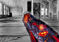
| 06/19/2006 01:07:36 PM | This is a job for... Indestructable-Mylar-Baloonby justamistereComment: Thanks for all the great comments. Please continue commenting pros/cons, that is invaluable to all challemgers.
I agree, the baloon, stands out like a bank robber with a clown/president mask. That was intentional, may be disturbing to some.
Yes, it is in the same room as mentioned below. Metatate and I went on a before day-job, photo expedition.
The contrast is called juxtaposition. "A side-by-side comparison...of similarities or contrasts", according to the dictionary. I really would like some input, a comparison of this one and the ribbon holder, who also had a juxtaposed shot with an umbrella, and a warmer-toned room.
As always, some of my outakes may have been better, I will update my portfolio soon. If anyone uses baloons keep the wind in mind it makes them "fly". |
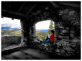
| 06/16/2006 12:38:54 AM | thinking of what lies aheadby RikkiComment: The rock-texture is cool and the colors are sharp, the only thing that bothers me is the "window/portol" on the left is cut in half. Maybe a closer cropping of the right-window only may work better. And more of the empty floor to depict/clarify an empty room, which was the challenge category. My superman baloon was also lower than I expected 41/113 and the 3rd place one had similar juxtaposition, but with warmer colors. |  Photographer found comment helpful. Photographer found comment helpful. |
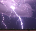
| 06/14/2006 01:11:11 PM | Too close for comfort by M.O.C.Comment: Great shot, just like a purple glass plasma ball, only natural.
I would not reccommend chasing tornados next. | | Photographer found comment helpful. |
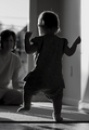
| 05/31/2006 10:36:35 AM | One Small Step ...by tateComment: Congrats!, IMHO, Some may or may not like the subject/object but although we're judging the photographers skills, techniques and interpretation. The emotions created and depicted in art and photography, and aimed at/for the viewer, is equally important.
You've captured a warm spot in everyones memory. As always some totally like the blurred shadow of the mother and some don't.
My sons actual first steps, he suddenly jumped up, and with arms stretched up, ran toward his crib in the bedroom. Photographs are treasures, too. - Just-a-Mister-E | | Photographer found comment helpful. |
| 05/24/2006 11:49:47 PM | |
| 05/24/2006 11:42:47 PM | Hi, my name is LENby justamistereComment: Thanks for the votes. It's LEN's lens-cap holder. A double-meaning-pun.
I darkened the original so it wouldn't look obvious that I was covering the real cap-logo with a "LEN-sticker" created in photoshop.
Let me know if the original-lighter one in my portfolio was better. |
| 03/23/2006 01:32:34 AM | | | Photographer found comment helpful. |
| 03/23/2006 01:31:35 AM | | | Photographer found comment helpful. |
|
Showing 771 - 780 of ~830 |
Home -
Challenges -
Community -
League -
Photos -
Cameras -
Lenses -
Learn -
Help -
Terms of Use -
Privacy -
Top ^
DPChallenge, and website content and design, Copyright © 2001-2025 Challenging Technologies, LLC.
All digital photo copyrights belong to the photographers and may not be used without permission.
Current Server Time: 09/04/2025 09:46:40 PM EDT.
|