| Image |
Comment |
| 01/27/2003 12:47:44 PM |
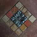
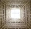
14 Squaresby DennisFComment: There seemed to be a lot of pictures similar to this one this week, but yours stood out to me. I think the first thing that caught my eye was your use of vivid colors. I enjoy the interaction between the reds in the bricks and the blue in the center tile. This picture has strong lines that draw my attention into the frame no matter which side I start from. I also enjoy the texture in the bricks and center tile. The lighting you used here works well. For me this is one of the strongest pictures in the challenge. I found it difficult to make “square” to be interesting, but I think you have done it here.
Greg
|
 Photographer found comment helpful. Photographer found comment helpful. |
| 01/27/2003 12:47:39 PM |
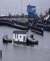
Too square for a houseboatby johnmkComment: Wow what an interesting picture! For me this was one to the top two this week. Those boats look so unusual. I am wondering did you compress the image to make the house a square or was it really like that. The way the boats look leads me to think it was, but if you did compress it, you did a good job because it isn’t so compressed to be blatantly obvious. Those boats look like something from a cartoon. You made good use of contrast here, with your subject being much brighter than the surrounding picture. I also find myself enjoying the blue in the tower. They both stand out very well on what looks to have been a dreary day. I don’t know if this would have been possible but the only think I might try if I were to change this picture would be to crop it so the boats had some more water in front of them to go into. Overall I think you had strong composition here with the lines of the land drawing my eyes into the picture with the blue and white squares there to catch my attention and hold it.
Great work!
Greg
|
| 01/27/2003 12:47:32 PM |
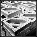
By the tonby jjbeguinComment: This is one of my favorite pictures for this week’s challenge. I like the use of contrast, line and texture in this picture. The composition is pleasing with the placement of the top blocks being offset the way they are. There are strong lines in the photograph that lead my eyes into the picture and keep them there. I particularly like the way you placed the block at the top of the frame perpendicular to the rest of the blocks. The texture of the concrete is really brought out by your choice of black and white. I can almost feel it. This photo almost looks like a charcoal drawing to me. I think it was well executed and the only suggestion I would make for improvement would be to eliminate the border. It is just my opinion, but I generally find them to be cheesy.
I hope you find this useful,
Greg
|
| Photographer found comment helpful. |
| 01/27/2003 12:47:21 PM |
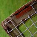
Absent Squares by paynekjComment: This is one of my favorites from this week. From looking at the other entries it looks like this is a tough topic to make interesting, but I think you have done a good job with it. I like the color in this picture, particularly the use of contrasting colors between the green OOF areas and the red rust on the wooden frame. You have also made good use of contrast between the darker background and wood frame and the lighter wire mesh. For me the composition is pleasing with the wire squares being off-center. The wooden frame leads my eyes into the picture, but unfortunately it also leads them back out to some extent. This is definitely not a serious problem at all, and I can’t really think of any way to prevent it. The colors look very vivid and pleasing to the eye. The only suggestion I can make for improvement would be to try a wider aperture so you might be able to achieve a smoother bokeh. You have done a good job keeping the wood frame and wire mesh sharp, and I think this will not suffer when using a larger aperture as long as you keep the plane of the sensor parallel to the plane of the wire mesh.
I hope you found this useful,
Greg
|
| Photographer found comment helpful. |
| 01/27/2003 12:08:21 PM |
SkyLight ^ 2 by myqylComment: This is one of my favorites for this week. There are some blown out spots in the center of the picture but I am sure these are intentional, and they work very well in this case. I like the way the light is radiating in and the intensity drops off as you get closer to the edges. The lines are very strong and almost give me a sense of motion towards the light. I wouldn’t change anything about this shot. You have made an uninteresting (to me at least) topic interesting.
Greg
|
| Photographer found comment helpful. |
| 01/27/2003 12:31:33 AM |
|
| 01/27/2003 12:11:52 AM |
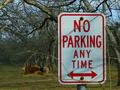
No Parking Any Time except for COWSby dadas115Comment: I guess no one understood my picture this week. I was trying to show the sign crapping up the nice pretty pecan grove. I got comments about the branches in front of the sign. When I was taking the photograph I started to move them out of the way but then I liked the idea even though man has put this ugly sign smack in the middle of nature, nature is growing over it. Oh well, there is always next week :) |
| 12/16/2002 08:13:54 PM |
|
| 12/16/2002 08:17:58 AM |
Adrenalinby oriontrailComment: This was my favorite shot in the challenge. Message edited by author 2002-12-16 08:19:40. |
| 11/25/2002 07:18:00 PM |
Faithful Flock to Flag Footballby spidermanComment: Those lights in the background are a bit distracting, you might try cropping them out and seeing how it looks. Also there isn’t any strong focal point for me in this one. Maybe if you zoomed in on one or two players it might be better? Greg |
Home -
Challenges -
Community -
League -
Photos -
Cameras -
Lenses -
Learn -
Help -
Terms of Use -
Privacy -
Top ^
DPChallenge, and website content and design, Copyright © 2001-2025 Challenging Technologies, LLC.
All digital photo copyrights belong to the photographers and may not be used without permission.
Current Server Time: 08/20/2025 06:52:55 AM EDT.