| Image |
Comment |
| 02/03/2003 11:51:42 PM |
Maddy in classic pearlsby LindaLeeComment: Very cute picture! I think this one meets the challenge very well. I can see this one ending up in the top 3 this week. It does look like the focus is just ever so slightly off.
Great job.
Greg
|
 Photographer found comment helpful. Photographer found comment helpful. |
| 02/03/2003 11:50:15 PM |
Noseyby SquiffyeitherjagComment: This would be better for me if the eye was in focus. I am guessing you are hearing this a lot this week. For wildlife pictures it is usually customary that the eyes are in sharp focus. However, I also believe that there is nothing wrong with breaking the rules. I like your picture and I hope you do well. It looks like quite a cute kitty, and it is a wonderful expression. You captured the moment well.
Greg
|
| Photographer found comment helpful. |
| 01/27/2003 01:44:42 PM |
Lacquerware Abstractionby jitamsComment: You have a modern art masterpiece here! This is my number one pick for this week. I love the composition and the use of lighting. I wonder how you got such sharp shadows in this one. I love the interaction of the colors and the texture of the boxes. I canΟΔÄôt think of a single thing I would change about it. Very well done!
Greg
|
| Photographer found comment helpful. |
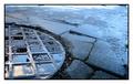
| 01/27/2003 01:40:50 PM |
Circle of squaresby vjozComment: There were quite a few boring entries this week (most of them were to me). Yours caught my attention, I think probably because of the reflections in the water. Focus looks nice and sharp and the color really gives me a feeling of a cold morning after a long rainy winter night. The composition works for me, as I like how the center of focus is not smack in the center of the frame. ItΟΔÄôs difficult to make an interesting square picture, but I think you pulled it off. The only think I would change about it would be to drop the border. It doesnΟΔÄôt add anything for me, and it takes away some of the resolution that could have been used in your picture.
Greg
|
| Photographer found comment helpful. |
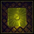
| 01/27/2003 01:40:48 PM |
Square Shimby GeneralEComment: What an interesting item, is it actually that color or did you use a filter? This picture is one of the few that grabbed my attention this week. The background is a bit dark, but not too dark I think. The color works well for me, and the texture is pleasing. The shim looks like it was just kind of tossed down there, the composition might be helped if you set it slightly off center. I donΟΔÄôt find the border adding much to the picture, and if it were my picture I would not include it. The lighting is nice and overall I think you have done a good job with this one.
Greg
|
| Photographer found comment helpful. |
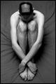
| 01/27/2003 01:40:45 PM |
Square competition gone to my head.by SharQComment: I think that this one was meant to be humorous, and maybe the joke is that the square is actually a pentagon! The subject is a bit too centered for my taste. I also find the sheet he is sitting on to be somewhat distracting. There is nice use of shape in this picture though, and there are also some nice textures in the hair. I gave it a 5.
Greg
|
| Photographer found comment helpful. |
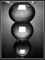
| 01/27/2003 01:40:43 PM |
Distorted Squaresby MaYzComment: Overall I liked this picture. I think that you made good use of shape and contrast. The lighting is also pleasing. The composition looks a little too contrived for me, but I think it is very difficult to get around this. Maybe if you took the picture from a different angle it would work better for me. I also would do without the border if it were my picture. I like your use of black and white on this one and think it is a strong entry.
Just my two cents,
Greg
|
| Photographer found comment helpful. |
| 01/27/2003 01:07:12 PM |
Look ... A Wild SnowManby gmacproComment: This picture really made me smile when I saw it. I donΟΔÄôt think this one will do well but I think it really should do well. I think people will find the branches in the foreground to be ΟΔÄ€distracting and detractingΟΔÄù as well as the branches in the background. I think those people missed the point (or maybe I have). For me this picture gives the feeling of discovery. I feel as if I was on a long winterΟΔÄôs walk and came upon this scene. HeΟΔÄôs alive so I have to stay hidden behind the branches, and I canΟΔÄôt get too close or I will frighten him away. I like the composition, and I also like that the snowman is not smack in the center of the frame. If I were to do anything to this picture it would be to make it a vertical picture cropping out some of the area on the right hand side. I put this one in my top ten for this week, and I hope you do well with it.
Greg
|
| 01/27/2003 01:07:06 PM |
A Tajirian Squareby jwitt33Comment: OK, IΟΔÄôll admit it, I look forward to watching Smackdown on Thursday night. This picture made me smile. What a likeness! Is this the real guy???? I just had to ask. This is a fun picture, I wouldnΟΔÄôt change a thing about it. This one made my top ten for this week.
Greg
|
| 01/27/2003 01:07:04 PM |
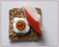
Krabby magnetic9999Comment: This is definitely the most apitizing food picture this week. Some of these ΟΔÄ€square mealsΟΔÄù I have seen just made my stomach turn. The colors work well together, and look pretty close to my opinion of what they should. Nice texture on the triscit (sp?). I like the composition and the way the subject is slightly off-center. I personally would do without the border, I think they are way over-rated, but this is a good stong entry for me. Definitely this picture is in my top ten for this week. IΟΔÄôll have mine without the olive though!
Greg
|
| Photographer found comment helpful. |
Home -
Challenges -
Community -
League -
Photos -
Cameras -
Lenses -
Learn -
Help -
Terms of Use -
Privacy -
Top ^
DPChallenge, and website content and design, Copyright © 2001-2025 Challenging Technologies, LLC.
All digital photo copyrights belong to the photographers and may not be used without permission.
Current Server Time: 08/20/2025 06:53:17 AM EDT.