| Image |
Comment |
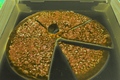
| 05/11/2006 06:27:40 PM |
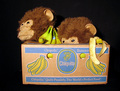
Mystic Pizzaby mComment: It's not moldy, just disgusting.
Pizza around here is about as bad as this shot.
The interesting thing about this shot was that I didn't check that it was taken between the dates but it still accepted it. Odd.
What's the point of that little box? |
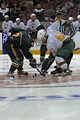
| 03/29/2006 04:15:20 AM |
The Drawby mComment: Originally posted by LoudDog:
If you had the zoom to get this same shot just around the hands, stick and puck you'd have a top 20 image. This is a little to far back for a sports action shot. |
I tried a crop around the hands and stick, but as you pointed out it's a bit far out from this shot (also othe angle isn't conducive to it as the white player has his arm tucked in too much already). I appreciate the feedback, thanks.
FWIW there are at least three glove-less hands visible, but as I stated in the comments section, I didn't expect people to think it fit the challenge even though I felt it did. |
| 03/21/2006 08:34:30 PM |
|
 Photographer found comment helpful. Photographer found comment helpful. |
| 03/21/2006 08:27:02 PM |
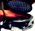
Foot Extensionsby swankFotoComment: I was going to do skates as well, but wouldn't have pulled it off anywhere near as well. Excellent lighting. |
| Photographer found comment helpful. |
| 03/21/2006 08:21:20 PM |
|
| Photographer found comment helpful. |
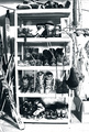
| 03/21/2006 08:09:10 PM |
Ye Olde Shoe Shopby MacTComment: The overly bright background hurts the shot, which admittedly is difficult to get because of it. Being able to mix multiple exposures would have helped the shot, unfortunately it's not permitted under the rules. |
| Photographer found comment helpful. |
| 03/08/2006 12:47:40 AM |
ouchyby yourbuddyjhawkComment: [quote]I hurt myself today, to see if I still feel.
I focus on the pain, the only thing that's real.[/quote]
Too much noise in the image. Bad lighting in general. Over saturated. |
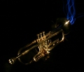
| 03/08/2006 12:31:50 AM |
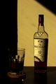
Comfort Takes Timeby mComment: The original image I submitted was overly bright and washed-out, unfortunately I seemed to have over-corrected the gamma, even more-so than I thought judging from a couple of the comments, when I resubmitted.
[re kiwipix]: I liked how the glass was split by the shadow, although I would have liked a little more to the left as well, if I had it to do over again. The shadow falling on the bottle I agree isn't nice, and I tried to minimize its distraction (unfortunately, the table used isn't much bigger than what's pictured, and there is a hole in the the table which you can see through the bottle's bottom, which limitted positioning). I was also trying to keep the glass and bottle aligned so that their shadows merged on the table.
[re Thi] por que dizes que sou norte-americano? Message edited by author 2006-03-08 00:33:07. |
| 03/04/2006 09:37:44 PM |
|
| Photographer found comment helpful. |
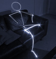
| 03/04/2006 09:37:24 PM |
Lightmanby ksymeonComment: Neat. A bit noisy, but considering the requirements for the image, acceptable. It's like a constellation sitting on your sofa. |
| Photographer found comment helpful. |
Home -
Challenges -
Community -
League -
Photos -
Cameras -
Lenses -
Learn -
Help -
Terms of Use -
Privacy -
Top ^
DPChallenge, and website content and design, Copyright © 2001-2025 Challenging Technologies, LLC.
All digital photo copyrights belong to the photographers and may not be used without permission.
Current Server Time: 08/18/2025 05:19:00 AM EDT.