DPChallenge: A Digital Photography Contest You are not logged in. (log in or register
 
Browse Settings
Currently viewing:
Registered UserRiderGal

Show comments:

Per page:

Order:

Comments:


Comments Made by RiderGal
Pages:   ... [90] [91] [92] [93] [94] [95] [96] ... [115]
Showing 921 - 930 of ~1142
Image Comment
97 years old and I STILL didn't get what I wanted!
12/30/2002 06:35:24 PM
97 years old and I STILL didn't get what I wanted!
by Gekker

Comment:
WOW... 97! Not bad. It bothers me that I can't really discern very sharp details. I'm not sure what causes this, maybe focus? but there is no real depth to any of her wrinkles or anything. This would be a cute candid, however for a portrait I might have liked to see more of the eyes, I would have suggested shooting from a different angle. The background on here is also distracting, especially in the upper right hand corner. I would suggested working with this subject again, as she'd be great in photos if you got her just right! Good luck.
Photographer found comment helpful.
Wildlife Portait- Chirping Tufted Titmouse
12/30/2002 06:30:36 PM
Wildlife Portait- Chirping Tufted Titmouse
by kandyj

Comment:
Very grainy I'm guessing due to tight cropping. I don't care for the blowing out behind the little guy, or the dof, the front blurry stick is distracting. Also I don't think this was the best subject for black and white. This photo prolly would have been better in color. Good framing of the subject though.
Photographer found comment helpful.
Introspection
12/30/2002 06:28:29 PM
Introspection
by Ptman

Comment:
Awesome textured face, but I think this picture loses out some because of the lighting, and maybe the contrast. The background is also quite distracting. Since I'm guessing this is a family member, or someone readily available for photos, I would have tried to put him on a plain or solid background.
High Key
12/30/2002 06:26:11 PM
High Key
by connie

Comment:
Dramatic! Excellent use of border... would have liked maybe a touch more, definition, because her hand (in a white glove?) is very distracting. I love the black hair though! Cool portrait! -8-
Quatro Rosas
12/26/2002 02:05:41 AM
Quatro Rosas1st Place
by fsieradzki

Comment:
This is very pretty. Nice that you have the drops of water on it for interest. Love the black background on this. A 9 because I would have liked more even lighting on the left side of the roses. Great picture though! Good luck! P.S. a good title for this might have been A quarter of a dozen. :-)
Balancing Act
12/26/2002 02:03:53 AM
Balancing Act3rd Place
by TerryGee

Comment:
I love the simplicity in this photo. Very cool, and great use of a vertical picture! Also I love the background, iit makes the photo look very 3-d. Gave this a 9 only because I personally don't like the reflection in the purple bead, when all the others are pretty solid. Good luck.
Quadrants and Buds
12/26/2002 02:02:16 AM
Quadrants and Buds2nd Place
by joanns

Comment:
9... would have been a ten if it wasn't for the hot spot on the glass. Really cool looking photo! I love it! Also great use of border on this picture! Good luck!
Photographer found comment helpful.
Reflections
12/26/2002 02:00:53 AM
Reflections
by Jean

Comment:
One of my 2 10's for this challenge. Great reflections, what are those... rocks? might have been cool if you had reflected the number 4, but a really cool photo anyway. Good luck!
A Vintners Dream
12/26/2002 01:59:48 AM
A Vintners Dream
by Ptman

Comment:
One of my 2 10's for this challenge, nice job! Would not have been as nice without the condensation on the glasses. Great job, and good luck!
My "Business" Suit for Dry Climates
12/25/2002 12:07:02 AM
My "Business" Suit for Dry Climates
by jimmyn4

Comment:
Talya's critique (critique club on break)
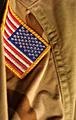
This was one of the most subtly done, yet most obvious occupations photos. I really liked the simplicity of it.
Composition - superb - I love that bright flag in the upper left hand corner. All the lines lead to the flag, and it is really well done. Plus I like how you made this a vertical photo, gives the look of standing straight and tall. Excellent job on this aspect!

Focus - i would have tried to have everything in focus here... the flag even looks maybe just slightly fuzzy. and it would have made the shot better if the whole thing were in focus. Also I'm not sure what happened on the very left side, but that out of focus piece is very distracting, pretty much the only thing I don't like about the photo.

Lighting and Exposure - both things are perfect on here... No complaints! It's well lighted all around, nice job!

Fit for challenge - truly perfect... I could tell right from the first second I saw it what you did. Really wonderful job, and good job of stating the obvious but not in an obvious way (does that make sense? HEHEHE) I thoguht this photo fulfilled the challenge better then many of the others.

Colors - good choice of keeping this in color, would not have been effective in Black and white.

Overall - fabulous job on this pic. I really liked it! I thought it was perfect for the challenge, and a very touching photo. The title was cute as well. I gave this an 8. Nice job!

-Talya
Photographer found comment helpful.
Pages:   ... [90] [91] [92] [93] [94] [95] [96] ... [115]
Showing 921 - 930 of ~1142


Home - Challenges - Community - League - Photos - Cameras - Lenses - Learn - Help - Terms of Use - Privacy - Top ^
DPChallenge, and website content and design, Copyright © 2001-2025 Challenging Technologies, LLC.
All digital photo copyrights belong to the photographers and may not be used without permission.
Current Server Time: 08/26/2025 06:49:39 PM EDT.