| Author | Thread |
|
|
01/10/2003 09:55:21 PM |
|
HI TERRY - It's been awhile - This is a terrific photo!!!! If I had voted - would have been a 10! Awesome work - you haven't lost your touch!! |
|
|
|
12/31/2002 09:33:42 AM |
Hey Terry it is TurboTech. Just want to say congrats. I was just at Bestphoto and you won there as well for photo of the day with this little Bad Boy. Congrats.
Yours Truley,
Me. :-) |
|
|
|
12/30/2002 10:04:52 PM |
Very nice. In fact it's super nice. Really love your shot. Congrats.
Fantastic light/colors. |
|
|
|
12/30/2002 11:48:45 AM |
|
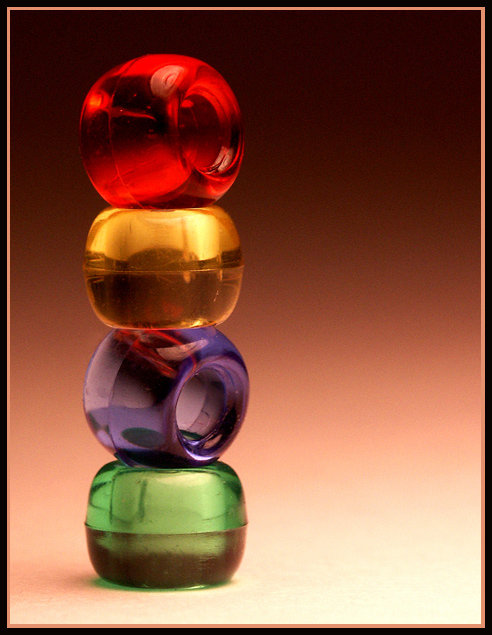
I love the background colors. You made simply little beads look incredible. Congrats. |
|
|
|
12/30/2002 11:12:25 AM |
|
Congratulations Terry! This is a really creative image, especially the gradient background - it adds a lot! |
|
|
|
12/30/2002 08:50:16 AM |
|
WOW congrats, Terry!!! You deserve it, you're very talented :) |
|
|
|
12/30/2002 01:28:26 AM |
Congrats Terry,
Nice image. Congrats with all of your POTD's recently.
Bob |
|
|
|
12/30/2002 01:13:31 AM |
|
Well done,Ilove the colours |
|
Comments Made During the Challenge  |
|
|
12/29/2002 11:54:46 PM |
|
Nice simple composition with good colors. |
|
|
|
12/29/2002 01:43:05 PM |
|
Fantastic choice of colours plus reflective qualities, great photo really like it |
|
|
|
12/29/2002 01:03:22 AM |
|
love the colors, as well as the background. |
|
|
|
12/28/2002 11:59:24 PM |
|
I really like this picture. Color tonalities are great, as is the composition. The background is excellent. Seems a little soft. |
|
|
|
12/28/2002 03:56:54 AM |
|
,mmmmmmmmmmmmmmmmmmmmmmmmmmmm |
|
|
|
12/27/2002 11:30:46 PM |
|
Don't like the color combination of beads you chose. I know this is nitpicking but the beads on their side should be flat with the holes lining up straight out. I do like the background color and the fading out. Again don't like this particular crop for this shot. 5 PTL |
|
|
|
12/27/2002 03:05:40 PM |
|
one of the best set up shots this week and one of my favorites overall. Love the colors and the gradiation of the background is superb. Keep up the nice work...9..hokie |
|
|
|
12/27/2002 09:47:02 AM |
|
I'd have left the border off this one. It is unneccessary. The shot is okay. I like the background fade. The colors are also very well done. - Inspzil |
|
|
|
12/26/2002 02:03:53 AM |
|
I love the simplicity in this photo. Very cool, and great use of a vertical picture! Also I love the background, iit makes the photo look very 3-d. Gave this a 9 only because I personally don't like the reflection in the purple bead, when all the others are pretty solid. Good luck. |
|
|
|
12/25/2002 09:11:55 PM |
|
I love this pic. I gave it a 10. Excellent job. |
|
|
|
12/24/2002 07:53:14 PM |
|
I like this shot, nice colors. |
|
|
|
12/24/2002 03:43:41 PM |
|
OK this is a good attempt with interesting colours. I especially like how you treated the background hues. Lovely and gradual on the eyes. I know it is a minor thing going on about backgrounds. But this one really works good energy for me. Those jelly bead colours speak loud visually. An interesting composition. The highlights are bright but not overpowering. Not a bad treatment of your choice of subject matter. Personally I would prefer some other element to juice up the interest. Such as toppling bead. Or snaking lurking thread. The beads are interesting but to me not quite captivating without a mini purpose "story" or visual drama to highlight a specific quality of being a bead. That is just my minor personal opinion to be tossed away with the preverbial salt grain. I believe that this is a worthy image with hidden greater potential. A decent effort...6 |
|
|
|
12/24/2002 02:27:09 PM |
|
Nice colors... great background. I think the multi-colored border distracts from the simplicity of the photo. (7) |
|
|
|
12/24/2002 08:51:09 AM |
|
Nice color contrast and concept. I also like the off-center positioning. |
|
|
|
12/24/2002 01:54:10 AM |
|
How did you create the backgroung? |
|
|
|
12/23/2002 11:02:43 PM |
|
great gradient background and colorfull subject. i think the excellent lighting completes this great composition. 10 goodtempo |
|
|
|
12/23/2002 04:03:04 PM |
|
I realy like this it must be a winner |
|
|
|
12/23/2002 11:55:35 AM |
Beautiful. Colo ris great ! Tthirds used well. Very interesting and artsy. I like it a lot !
= 10 Shiiizzzam |
|
|
|
12/23/2002 11:27:00 AM |
|
Great colors! I like the way the background is lit and goes from lighter to darker. |
|
Home -
Challenges -
Community -
League -
Photos -
Cameras -
Lenses -
Learn -
Help -
Terms of Use -
Privacy -
Top ^
DPChallenge, and website content and design, Copyright © 2001-2026 Challenging Technologies, LLC.
All digital photo copyrights belong to the photographers and may not be used without permission.
Current Server Time: 06/27/2026 07:01:29 AM EDT.


 Balancing Act


