| Image |
Comment |
| 05/26/2003 11:04:04 AM |
Beaute Naturelle by lmhrComment: Beautifully done. I love the lighting, and simplicity, and overall softness of this photo. Great use of duotone. Nice use of DOF, and I like the single white line that is on the photo... but watch that, because it doesn't look quite even on both sides. Well done. -9- |
 Photographer found comment helpful. Photographer found comment helpful. |
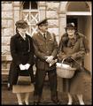
| 05/26/2003 01:05:37 AM |
Welcome Homeby tragicharpyComment: Very interesting.... looks like an oldtime photo, which is what I'm guessing you were going for. There are some things that really bother me here though... There is quite a bit of extra space at the top, and the feet are cut off, but only slightly... filling the frame is always good, I would have positioned the camera differently, so that you got the entire subjects in the photo, and didn't leave as much room at the top. Watch Your Background! The window frame looks like it' half coming out of the girls head on the left, and completely growing out of the man's head. Also the business of thee background detracts from the subjeect, using a lower DOF, to clean up the background, would have helped this a lot. |
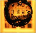
| 05/10/2003 02:10:04 AM |
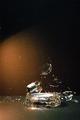
Solar Nocturnalby kiwinessComment: Very cool... somewhat of a different take on the Setz and others raindrops. Very well done except for some blotches. What is this that your looking through? Anyway... nicely done. |
| Photographer found comment helpful. |
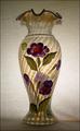
| 05/10/2003 02:08:14 AM |
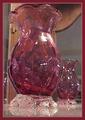
Hand Painted Fenton Glass Vaseby DougPazComment: Beautiful lighting here. This shot could have easily been ruined if the lighting hadn't been just right. Good use of the plain background, it really makes the vase stand out... A beautiful subject that was done justice in this beautiful picture. Nice job! |
| Photographer found comment helpful. |
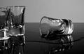
| 05/10/2003 02:05:38 AM |
One Too Manyby TiNComment: OOPS! Hope you didn't drink all of these Nice lighting here, and I like the black and white. great table top reflections... Made my boyfriend laugh :-) Great use of contrast here... very well done, I'm going for a -10- Congrats! |
| 05/10/2003 02:03:57 AM |
Winter Sun, Awakening ..by magnetic9999Comment: Very cool.... this is a very interesting photo, and I like your lighting, and how it's just the sun that stands out. Maybe tone the yellow down just a tad, but beautifully framed and off center, just very well composed. Interesting subject that could have been construed as someone else art, but you turned it into your own! Nice job. |
| Photographer found comment helpful. |
| 05/10/2003 02:02:25 AM |
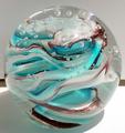
Bottle glass - worn by the seaby paynekjComment: I feel that the lighting looks a little off, and the way that the glass suddenly stops at the end is bothersome. Good use with the blue background, but there is too much empty space at the top... also keep in mind the rule of thirds, as this is extremely centered, and not very interesting. Not much there to make this photo worthwhile. |
| Photographer found comment helpful. |
| 05/10/2003 02:00:10 AM |
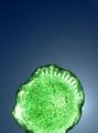
Cranberry Glass Reflectionsby GeeGeeComment: The lighting is bothersome on this photo, you have too many lights glaring off the object. Interesting idea with the glass reflections in the mirror. Watch what sorrounds the vase, the extra stuff takes away from it, control your lighting for a more effectual picture. Also watch your graininess, not sure whether you cropped or just had a very high iso, but keep that in mind. |
| 05/10/2003 01:57:42 AM |
It is fragile...by terrentiusComment: Would have been neat with a solid black background with the light shining straight down on it. The action is very nice... I suggest also zooming in so you get more of the action and less of the background.Too much empty space. |
| 05/10/2003 01:56:20 AM |
glass ballby katiedid270Comment: Too much shadow, lighting doesn't seem to be good... very bright, not extremely interesting. Subject is cool, with it's detail, just wish it wouldn't just be a glass ball sitting on a table. |
Home -
Challenges -
Community -
League -
Photos -
Cameras -
Lenses -
Learn -
Help -
Terms of Use -
Privacy -
Top ^
DPChallenge, and website content and design, Copyright © 2001-2025 Challenging Technologies, LLC.
All digital photo copyrights belong to the photographers and may not be used without permission.
Current Server Time: 08/25/2025 11:15:09 PM EDT.