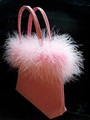
Frivolousby
joycobbComment: Challenge
- Relevant to the Challenge? Yes.
Compostion
- Good or Bad? How can it be fixed? First the background. I think there should be more velvety folds, not less. The image is nicely composed. Not quite centered, which is my style.
- Good use of Depth of Field? I can't tell if the sfotness is due to the narrow DOF or if you went crazy with NeatImage. There are parts of the image that are soft right next to parts that are details. It doesn't quite look natural. Maybe you should have gone for a wider DOF?
Lighting
- Good use of light? You have good light, but you also have some blown highlights on the handle. Soft the light or under-expose it to give us more details in the feathers in the center.
- Good use of shadows? Yes. The shadows are good on the front of the handles and the front of the bag has a nice gradual shading.
Aesthetics/Artistic Appeal:
- Colors and Contrast. Good job on the contrast between the light pink and the black.
- What is my reaction or feelings? Well, I gave it a 6 and you had heavy competition in backlighting. I keep leaning in to look at the feathers on the right edge. I love the details over there.