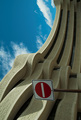
No entry- God's Playgroundby
smykComment: oooo Greeting from the Critique Club oooo
Challenge
- Relevant to the Challenge? Hard not to be in this one. ;)
Compostion
- Good or Bad? How can it be fixed? I don't understand why you chose to rotate the image. I might understand if the sign weren't there, but it is and ruins the flow of the building. On or the other needs to change. No Rotate or no Sign.
- Is there anything missing?
- Good use of Depth of Field? Yes. This requires a wide DOF which looks good.
- Good focus? Yes
Lighting
- Good use of light? Yes & No. I like to see more of the shadows, but the design of the building overhang might not allow for thme in that area. I love the shape of the shadows in the bottom portion.
Aesthetics/Artistic Appeal:
- Colors and Contrast. The sky has a funny tealish tint to it and seems oversaturated.
- What is my reaction or feelings? I'd like to see this on re-shot without the sign. If you do go take a ladder with you to get the weight you need toshoot over the sign...


![Clock Tower [high key]](https://images.dpchallenge.com/images_challenge/0-999/500/120/Copyrighted_Image_Reuse_Prohibited_339821.jpg)