| Image |
Comment |
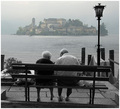
| 10/01/2006 10:03:29 AM |
Mirageby LevTComment: very good title to accompany the image. Well done |
 Photographer found comment helpful. Photographer found comment helpful. |
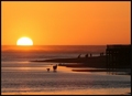
| 10/01/2006 10:01:57 AM |
At Day's Endby Faye PekasComment: i would have boosted the colours a little more and increased the contrast a tad more. good shot though |
| Photographer found comment helpful. |
| 10/01/2006 09:58:34 AM |
|
| Photographer found comment helpful. |
| 10/01/2006 09:57:06 AM |
|
| Photographer found comment helpful. |
| 10/01/2006 09:56:17 AM |
Regal Roseby KayBEEBComment: if you take a picture of just a flower. i think that having the whole thing in focus is better, but hey, it's just me. |
| 10/01/2006 09:55:17 AM |
Eyes that don't forgetby JeremyFleuryComment: focus. also, black and white would have been better here i think. there are not interesting colours per se, so you don;t lose there and you would perhaps bring out contrast more w=by making the shot black and white.
oh and cropping maybe. tighter. |
| Photographer found comment helpful. |
| 10/01/2006 09:53:10 AM |
Josieby stevebkComment: what a good looking woman. now I think that the light from the top is super effetive. gives this feeling of there being something angelic about her, or maybe there is a god out there; the light in her eye is great. the way the light falls on her face and arm; super. but is the light on her stomach necessary? have you tried with out? It does provide nice lighting on her breats. the shade between her breasts is very nice, but i guess it's just a little toooo harsh. the stomach seems to be overexposed. Maybe this is what you were aiming for but i think a softer light would have been better, if not any. but all in all i think it s a very good shot and she's very attractive. bump (not 10, but high enough to not bring you down i believe ;) ) |
| 10/01/2006 09:47:26 AM |
Cape Harbourby jacoloComment: yeessh. just to let you know, never has a small shot like this won a ribbon. It's too small. the cropping is awckward and it's very noisy and just not very interesting. |
| Photographer found comment helpful. |
| 10/01/2006 09:44:13 AM |
Hiding Placeby SlohandsComment: hmm, could use more focus..or is it image quality that is lacking? I like the blue water steams on the right though. |
| Photographer found comment helpful. |
| 10/01/2006 09:43:17 AM |
|
Home -
Challenges -
Community -
League -
Photos -
Cameras -
Lenses -
Learn -
Help -
Terms of Use -
Privacy -
Top ^
DPChallenge, and website content and design, Copyright © 2001-2025 Challenging Technologies, LLC.
All digital photo copyrights belong to the photographers and may not be used without permission.
Current Server Time: 08/09/2025 12:14:07 PM EDT.