| Author | Thread |
Comments Made During the Challenge  |
|
|
10/07/2006 09:03:57 PM |
|
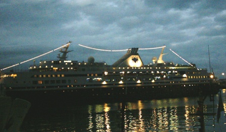
1 - This looks snapshottish. Your title suggests an image of a 'harbour', yet the main thing I see is a ship/liner. There are grain issues, as well as seemingly blur issues, it is overall too dark and the 'elements' on the left and right bottom corner are distracting as I cannot recognize them. Also (but quality dependent) this much bigger would have been better... maybe. If this was all you had to work with, your best or favorite shot for the month for the Free Study, perhaps trying to adjust the levels/lighting/something in pp may have helped this, or even a conversion to sepia or b&w, who knows. This image may hold some meaning to you (from a vacation etc), however to a viewer - they would not hold the same attachment - if that makes sense, and is indeed appropriate. |
|
|
|
10/06/2006 12:28:49 PM |
|
The small sizing makes it very difficult to see details, you really want to use the full 720 pixels this challenge allows(or at least the normal 640). There also is some tilt to this, makes the boat look like it's going downhill. Little things, but they could make almost a full point difference in your score. |
|
|
|
10/06/2006 01:53:39 AM |
|
Sorry, way too small, and no real subject that grabs and says what the picture is about. |
|
|
|
10/04/2006 05:05:27 PM |
|
To MY eyes, the sky appears to be a little grainy. I'd have loved to seen this in a bigger size. |
|
|
|
10/04/2006 01:00:37 AM |
|
Check out the resizing tutorial. Keep on shooting! |
|
|
|
10/03/2006 11:49:29 PM |
I appreciate what you were trying to capture here - good idea! I'll bet it looked really cool from the vantage point.
Two suggestions for my tastes:
1) I would prefer this image be crisper, clearer and straighter. This has an almost "camera phone" look to it, which isn't my preference for a Free Study.
2) One should really should take advantage of the size rules in this challenge. You could have gone up to 720 pixels and 200k size.
Hope that helps! |
|
|
|
10/03/2006 08:04:14 PM |
|
Interesting lights. Might benefit from a much larger image here. We're allowed 640 pixels on most challenges and 720 on this one. |
|
|
|
10/03/2006 03:39:58 PM |
|
Image needs to be larger. Too hard to see the detail on these smaller ones. |
|
|
|
10/03/2006 09:41:33 AM |
|
A bit on the dark and small side for my liking. But I can understand the seduction of such a scene. |
|
|
|
10/03/2006 08:37:27 AM |
|
too small, not in focus...a 2 |
|
|
|
10/03/2006 03:59:39 AM |
|
it's always a good idea to utilize the full 720px allowed in these challenges...you no doubt will receive many comments about the size on your image |
|
|
|
10/02/2006 04:11:49 PM |
|
Image a little small to truly judge. Title at conflict with image - I can see very little of the Harbour itself. |
|
|
|
10/01/2006 03:23:31 PM |
|
This has the makings of goodness - the lighting and reflection seems to work, but it's too small to judge properly really. |
|
|
|
10/01/2006 12:48:41 PM |
|
The photo should be larger to more clearly reveal both ends of the ship. |
|
 Photographer found comment helpful. Photographer found comment helpful. |
|
|
10/01/2006 09:47:26 AM |
|
yeessh. just to let you know, never has a small shot like this won a ribbon. It's too small. the cropping is awckward and it's very noisy and just not very interesting. |
|
| Photographer found comment helpful. |
|
|
10/01/2006 06:17:35 AM |
|
Seems a little out of focus... |
|
|
|
10/01/2006 02:41:14 AM |
|
Mate, just a little advice here. Make sure that the picture that you submit fits the challenge in all ways i.e. it should be 720 on the long side, in free study,so that you can show your picture off to its best advantage |
|
| Photographer found comment helpful. |
Home -
Challenges -
Community -
League -
Photos -
Cameras -
Lenses -
Learn -
Help -
Terms of Use -
Privacy -
Top ^
DPChallenge, and website content and design, Copyright © 2001-2026 Challenging Technologies, LLC.
All digital photo copyrights belong to the photographers and may not be used without permission.
Current Server Time: 07/01/2026 03:15:01 PM EDT.