| Image |
Comment |
| 12/23/2005 09:12:44 AM |
Saturday Mornby iamkmaniamComment: Just back for a few comments...
The title helps to add some emotion to this photo, otherwise one might wonder why a picture of a person sleeping. There are 2 things I find a bit unnatural about this shot. My thoughts are "why did they decide to focus THERE?", and "warm flannel pajamas and no BLANKET?" I suppose the focus was to make sure that there was a part of the picture out of focus both in front of and behind the focal point. Perhaps something more interesting there then? Just some thoughts to ponder. Good luck to you! |
 Photographer found comment helpful. Photographer found comment helpful. |
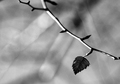
| 12/23/2005 09:08:01 AM |
Hanging onby philupComment: Just back for some comments...
This photo has a lot of things going for it.. the composition, placement of the one tiny leaf, and its general simplicity leaving the viewer feeling almost sorry for this last leaf. However, I think the lighting on the leaf is a bit dark, which leaves the viewer also trying to determine if it really is in focus and therefore completely meeting the challenge. I don't know what colors you were originally working with, but perhaps leaving the color would have also helped to make this one "pop!" I think the other downfall of this photo happens to be that there were so many photos with similar subject matter. Best of luck to you! |
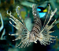
| 12/23/2005 09:01:19 AM |
The Light Belowby SandyPComment: Just back to add some comments...
What an interesting looking fish! Love the way he's got his fins all spread out... makes for a neat composition. If you look closely, you can see that you used the shallow DOF in this picture, however I think part of that gets lost in the busy pattern of the fish. A beautiful shot, but I think I might have chosen another fish in the tank for this particular challenge. Good luck! :) |
| Photographer found comment helpful. |
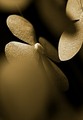
| 12/23/2005 08:58:29 AM |
Cotton flowers on nylon stringsby merheimComment: Just going back through to add some comments.
This photo met the depth of challenge criteria well... I love the texture you captured in these flowers. I like the composition as far as the different angles of the flowers and the light that is hitting them. As for suggestions, I think there may be a bit too much of the very front flower out of focus. I like the way that blurred space raises the main subject from the very center of the picture, but the blur seems somewhat distracting. Good job! |
| Photographer found comment helpful. |
| 12/23/2005 01:20:56 AM |
Sweet Toothby DianaComment: Just coming back to add comments...
I usually think of these little candies as Halloween candy... so my first reaction to this shot after going through a ton of Christmas pictures was "Yay! Some variety!" I like the way you used the colors to bring out different parts of the candy... the white bottom to highlight the yellow, the orange middles to highlight the white tip of the front candy, and the blue background to highlight the rest of the white tips. There's something unsettling about a piece of candy corn THIS big though. I don't know if you could have achieved the same use of colors though without using a close setup like this though. Nicely done. |
| Photographer found comment helpful. |
| 12/23/2005 01:13:47 AM |
Glowby kerrangComment: Just coming back to add comments.
I like the way the line of the garland flows around the picture and leads down to the lights. I love the glow of the lights, but found the actual lights to be just a bit too bright. It also appears as if the one bulb is burnt out. I like the festive feel to this one, but in a challenge where we saw so many similar Christmas pics, I think it's hard to stand out. |
| Photographer found comment helpful. |
| 12/23/2005 01:07:52 AM |
Love, comma...by HVGB_photosComment: Just going back through to add some comments...
Definately a shallow DOF! I think I would have liked to see a bit more of the letter thats written above, and the signature part moved in to the middle of the paper. You have captured just a tiny bit of the writing at the top, and the edge of the paper at the bottom, and I find both to be awkward. Great idea... thanks for thinking beyond all of the plants and Christmas ornaments we've seen in this challenge! |
| Photographer found comment helpful. |
| 12/23/2005 01:01:46 AM |
The Spoonby lowonenergyComment: Just going back to add some comments. I like that you can see the texture in the fabric (?) that the spoon is resting on, as well as in the reflection... shows how shallow your DOF was. I like a simple, clean shot with lots of negative space, but I think this one came out a bit too bright. |
| Photographer found comment helpful. |
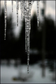
| 12/23/2005 12:52:36 AM |
Vertical H2Oby ShutterPugComment: Going back through to add a few comments... I chose this one because when browsing the thumbnails I noticed the neat lines you captured with the dark trees and the icicles, and the way they sort of mirror each other. But when I view the picture larger, I didn't see the lines as much since the focus is on the ice (where it should be for this challenge). I gave this one a 7... I think it's just missing a little bit of that "Wow!" factor. |
| Photographer found comment helpful. |
| 12/23/2005 12:48:11 AM |
C A Tby CalliopeKelComment: Wow! Love the expression, warm colors, perfectly focused nose, the whiskers... wonderful crop, and good use of a border. A perfect 10! |
| Photographer found comment helpful. |
Home -
Challenges -
Community -
League -
Photos -
Cameras -
Lenses -
Learn -
Help -
Terms of Use -
Privacy -
Top ^
DPChallenge, and website content and design, Copyright © 2001-2025 Challenging Technologies, LLC.
All digital photo copyrights belong to the photographers and may not be used without permission.
Current Server Time: 08/18/2025 07:39:50 AM EDT.