| Image |
Comment |
| 12/21/2009 11:58:56 PM |
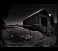
Seen Better Daysby hotpastaComment: I think the wide angle distortion makes this feel bloated and unbalanced. The gradient in the sky and contrasting highlight on the roof are gorgeous. This was probably taken during the day, but I'd like to think it was lit by the moon--the BnW helps with the effect! |
 Photographer found comment helpful. Photographer found comment helpful. |
| 12/21/2009 11:55:50 PM |
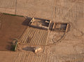
Parchedby CorySmithComment: I think this is potentially an interesting subject, but the composition doesn't do it justice. I would either pull back to show more of the landscape, which would make the buildings look more isolated and would put more of an emphasis on the texture created but the plows, or I would crop closer to show more detail of the buildings. The buildings are also a little centered for my taste. I love the uniformity of the color, but I wish there was a tiny bit more contrast to make everything pop (though the low contrast may be because I'm on a laptop). |
| Photographer found comment helpful. |
| 12/07/2009 08:49:20 PM |
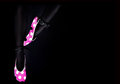
Tippy Toeby IvoryComment: I'm curious as to the editing on this. The legs look too matte for them to be tights/pantyhose/etc. Did you do that by darkening the skin tones? Or is it really material? Beautiful separation between the legs and the background! |
| Photographer found comment helpful. |
| 11/20/2009 05:45:45 PM |
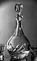
Carafeby AVPComment: Gorgeous lighting! Great control of the highlight and the gradient on the background! |
| Photographer found comment helpful. |
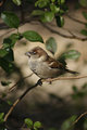
| 11/20/2009 05:44:52 PM |
Perchedby MannphotosComment: Great framing with the leaves. The color is also well-done: not oversaturated, but still full-bodied. |
| Photographer found comment helpful. |
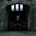
| 11/20/2009 05:36:43 PM |
Sitting in the Abbeyby paynekjComment: I wish you had desaturated the color of his gloves : ) They break up the otherwise wonderful mood you've created! |
| Photographer found comment helpful. |
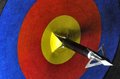
| 11/20/2009 05:35:24 PM |
Bullseyeby mefnjComment: I would have put the bullseye in the upper left so that the tip on the arrow was in the middle. As it is now, the diagonal leading line leads the eye out of the photo. |
| Photographer found comment helpful. |
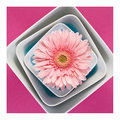
| 11/20/2009 05:32:13 PM |
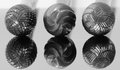
Sweet Spotby h2Comment: The little touch of blue is just enough to make the colors seem balanced and not overwhelming. |
| Photographer found comment helpful. |
| 11/20/2009 05:30:14 PM |
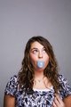
Toriby E109Comment: I would have cropped a little closer (the hand makes her seem too self-conscious) and placed the bubble in the very center. You can get bigger bubbles if you don't use real bubble gum, but a balloon instead! |
| Photographer found comment helpful. |
| 11/16/2009 08:33:20 PM |
The Grindersby MarsComment: The overall tonality of this image is slightly flat. There are lots of middle grays and a few blacks, but hardly any whites (the lighter parts are actually still grays--check the numerical values in photoshop). Some directional lighting (maybe from the side and/or slightly behind?) would add some beautiful highlights. |
| Photographer found comment helpful. |
Home -
Challenges -
Community -
League -
Photos -
Cameras -
Lenses -
Learn -
Help -
Terms of Use -
Privacy -
Top ^
DPChallenge, and website content and design, Copyright © 2001-2025 Challenging Technologies, LLC.
All digital photo copyrights belong to the photographers and may not be used without permission.
Current Server Time: 08/09/2025 02:40:24 AM EDT.