| Image |
Comment |
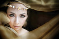
| 07/09/2010 06:40:16 AM |
The Farmerby ambakerComment: The detail in this image is wonderful, but I wish you had brightened his skin tone so it wouldn't be the same shade at the canvas behind him. His shirt also blends in with the food behind him. The overall contrast of this image is pretty good, but the contrast between the subject and the background is not there. |
 Photographer found comment helpful. Photographer found comment helpful. |
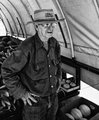
| 07/09/2010 06:37:19 AM |
Working Joeby michelaudetteComment: For portraiture, the subject is usually award that his or her photo is being taken. Here, it doesn't look like Joe knows he is being photographed. It looks candid, which the details of this challenge specifically say not to do. This really could have been a great image if the subject was engaged. The lighting could be improved, but the contrasting colors and the potential for the broom to be used as a leading line make me think this could have been a wonderful portrait. Don't be afraid to get close to your subject! He might say no, but he might say yes. Either way, he won't bite ; ) |
| Photographer found comment helpful. |
| 07/08/2010 05:07:59 AM |
SIENAby seasonsandyng5Comment: In case you didn't know, being confused with Manny Librodo is one of the biggest compliments you can get here. Congratulations on your ribbon! |
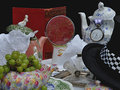
| 06/27/2010 02:36:43 AM |
Mad Tea Partyby doremiComment: There are no whites in this image. The brightest parts of this image are actually light grey. You can compare the brightest parts of this image to the background of DPC to see just how dark this image it. With so much detail, it would also be nice if it were sharper. |
| Photographer found comment helpful. |
| 06/27/2010 02:34:45 AM |
|
| Photographer found comment helpful. |
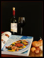
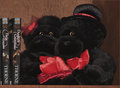
| 06/27/2010 02:31:46 AM |
Sugar and Spiceby retakeComment: I wish the light had come from the other side so the back of the book wouldn't be so bright. Such a large bright spot is pretty distracting. |
| Photographer found comment helpful. |
| 06/27/2010 02:13:13 AM |
|
| Photographer found comment helpful. |
| 06/27/2010 02:12:17 AM |
|
| Photographer found comment helpful. |
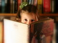
| 06/27/2010 01:47:19 AM |
out of the book...by cyparisComment: The background of this image should be white, but it's not. It's middle gray. That makes the image look dingy, which it not what you probably want to convey with wine and hearts. Some sharpening could also go a long way with this image. |
| Photographer found comment helpful. |
| 06/27/2010 01:31:11 AM |
Constant Companionby sfaliceComment: I wish the background matched the subject matter better. Why would you put an expensive piece of electronics on the floor? A white background would have been cleaner and would have made more sense than a floor. |
| Photographer found comment helpful. |
Home -
Challenges -
Community -
League -
Photos -
Cameras -
Lenses -
Learn -
Help -
Terms of Use -
Privacy -
Top ^
DPChallenge, and website content and design, Copyright © 2001-2025 Challenging Technologies, LLC.
All digital photo copyrights belong to the photographers and may not be used without permission.
Current Server Time: 08/08/2025 07:56:50 AM EDT.