| Image |
Comment |
| 04/10/2011 11:28:34 AM |
move your bodyby andreiplesaComment: Since the body is out of focus, you should have used more directional/contrasty light on her to help define her shape and to help her stand out amongst the rest of the blur. More "pretty" light on the bottle might also explain why the bottle is in focus instead of the person. |
 Photographer found comment helpful. Photographer found comment helpful. |
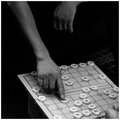
| 04/10/2011 11:26:32 AM |
Market Piperby banmornComment: Since the image's focus is probably the hands, I would have liked to see sharper, clearer detail on them. That way the clarity of the hands (and the flute) would contrast the natural texture of the jacket. The grain does look beautiful on the stone wall in the background though. |
| Photographer found comment helpful. |
| 04/10/2011 11:23:13 AM |
Fashion victim on dutyby cyparisComment: If you're at the Vatican, those were designed by someone *very* famous ; )
As for the image, I think the background is very distracting. I would have cropped off at least the bottom quarter, since it doesn't tell us anything we don't already know, then I would have used a much shallower depth of field to blur out the background. I don't even think it would be necessary to keep the whole subject in focus here; you could focus on just one aspect of the crazy fashion (the buttons and the belt buckle, for example) and blur the rest so you can make sure the image has a very prominent/specific focus (which would also give the image a more specific message--which specific part of the outfit would the fashion police arrest him for?). |
| Photographer found comment helpful. |
| 04/10/2011 11:16:51 AM |
Relax!by ferrissComment: It looks like you used Clarify or some similar technique. While that gives some great gritty detail that helps convey the horror or a dentist's chair, I still wish the image was a little brighter overall, particularly in some of the shadows. |
| Photographer found comment helpful. |
| 04/10/2011 11:14:47 AM |
the decisive momentby ubiqueComment: I wish there was a bit more detail in the shadows. As it is, the black seems to swallow the rest of the image. |
| Photographer found comment helpful. |
| 04/10/2011 11:13:36 AM |
Moon Over Miamiby JuliBocComment: Unfortunately, the highlights on this are very overblown. Yet something about this is very appealing to me. It somehow looks like something from the 1950s. I'm not sure if it would loose that vintage feel if it were properly exposed, but if it did, I'd take the over-exposure just to keep that old feeling! |
| Photographer found comment helpful. |
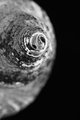
| 03/31/2011 08:04:04 PM |
Spiral Nautilusby jimsappComment: This is probably the best of the shells in this challenge, but it still leaves me wanting. The lighting is ok, but it doesn't reach Weston's level, where the shell looked absolutely silky and luminous, almost as if the light was emanating from it. It might have helped to dodge the highlights down the middle of the shell (I've heard that's how Weston did it). |
| 03/30/2011 05:29:58 PM |
Natural studyby hajekaComment: Weston never really used shallow depths of field like this. He was into texture and tonality, both of which are lost when you open up the aperture. |
| Photographer found comment helpful. |
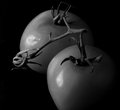
| 03/30/2011 05:16:16 PM |
Weston's Tomatoesby littlemavComment: I know tomatoes always seem to look out of focus is photographs due to their strange skin texture, but I think yours is actually OOF since the leaves aren't as sharp as the stem. Weston usually used small apertures and long exposures to get a deep depth of field. The texture in the stem is great though. |
| Photographer found comment helpful. |
| 03/30/2011 05:13:28 PM |
|
| Photographer found comment helpful. |
Home -
Challenges -
Community -
League -
Photos -
Cameras -
Lenses -
Learn -
Help -
Terms of Use -
Privacy -
Top ^
DPChallenge, and website content and design, Copyright © 2001-2025 Challenging Technologies, LLC.
All digital photo copyrights belong to the photographers and may not be used without permission.
Current Server Time: 08/06/2025 09:22:09 AM EDT.