| Image |
Comment |
| 12/02/2002 01:13:00 AM |
Into Deepby 'PongComment: Nice angle, nice composition. The exposure is nicely done for this picture it serves it well. The ground changes tones a little too quick, but besides that very nice picture. |
 Photographer found comment helpful. Photographer found comment helpful. |
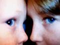
| 12/02/2002 02:15:00 AM |
My Babies' Bluesby Wheeler1992Comment: The focus is poor, with better focus this shot could have been improved greatly. And I think I see part of a computer monitor or something between the two faces. |
| 12/02/2002 01:07:00 AM |
Feelin' Blue Castby jpooleComment: Definately have a feeling of blue in this one. I love the rain on the window, The pose is nice, the expression is nice. I don't like the bright spot outside the window though. If that could have been eliminated it would have looked all the much better. Overall, well done. |
| 12/02/2002 01:42:00 AM |
Bluedby ReubenComment: Cute picture! The lighting could be a little better, if the tongue was lit better, and the shadows reduced. I like the crop though, the glasses are great. nice shot :) |
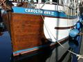
| 12/02/2002 01:20:00 AM |
Blue Ladyby Digital_DeamonComment: Kind of busy, the reflection in the water is hard to pick up on right away. The angle is a little weird I think, it makes the ship look sort of 2d... |
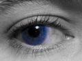
| 12/02/2002 12:44:00 AM |
Visions in Blueby YomiComment: Wow nice macro shot. You can see the contact amazingly. I'm not sure I care for it overall though. As far as quality of the picture though, well done. |
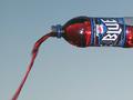
| 12/02/2002 02:29:00 AM |
? Blue ?by ppritcheComment: interesting shot. the picture looks a bit odd but at first you don't even see why. Then you realize the blue liquid isn't blue like it should be. then you relize that something is wrong with the tilt of the bottle. the liquid isn't level so the picture must have been rotated. It's a neat shot I like it, but the background is a little too grey... |
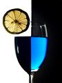
| 12/02/2002 01:12:00 AM |
Two Tone Tonic by jmsetzlerComment: This I like. Really neat concept. The only thing I could suggest to fix it would be the color in the blue section being smoother, and maybe a little darker. I Absolutely love the lemon though, which draws my attention. Unfortunately the lemon isn't blue, and doesn't really make me feel blue. Overall nice picture, though not the best for this challenge. |
| 12/02/2002 01:29:00 AM |
Vertigoby IGJOEComment: Nice, I like how abstract it is. If it was a bit sharper, and smoother it'd make for a nice print. |
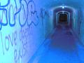
| 12/02/2002 12:55:00 AM |
|
Home -
Challenges -
Community -
League -
Photos -
Cameras -
Lenses -
Learn -
Help -
Terms of Use -
Privacy -
Top ^
DPChallenge, and website content and design, Copyright © 2001-2025 Challenging Technologies, LLC.
All digital photo copyrights belong to the photographers and may not be used without permission.
Current Server Time: 08/23/2025 02:58:31 AM EDT.