| Image |
Comment |
| 11/25/2005 12:56:51 AM |
Eroded Rocks or Sealife?by kaidaehnkeComment: I'm confused on this shot, I can't see what's odd with the shot, so I gave it a 3 because it looks like it's a picture placed in the wrong challenge. Giving credit to the title, perhaps for me seeing these kind of scenery is common to me so it's not odd. It's a nice picture though, but I think it's a bit out of focus. |
| 11/25/2005 12:54:19 AM |
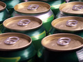
Just Oddby DirtypainterComment: I don't find any odd in this photo, could be because my dad drinks beer quite often so I'd see this seen in the fridge very often. Even the numbers of can shown isn't odd. It doesn't seem to fit the challenge to me, so I gave this a 3. |
 Photographer found comment helpful. Photographer found comment helpful. |
| 11/25/2005 12:52:46 AM |
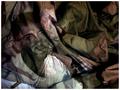
Strange Nightby darksidehunComment: This looks very much like a random night shot and lots of fooling around with the camera. I did that too when I knew my camera could take long exposure shots. Personally, I don't think it's a great shot so I gave it a 3. One thing intriguing about his shot is that it makes me wonder where it's shot. Perhaps if this was a little more composed it could have gained higher points. |
| Photographer found comment helpful. |
| 11/25/2005 12:50:23 AM |
1st hole, par 5, on for 3, odds on a birdie? Evensby fredandaudComment: I'm not a golf player, and I try not to judge for the title. Stil, the title doesn't help very much. The course looks good though. So personally I'm not sure where the odds are. I gave it a 3 because I didn't get your concept in this shot. The focus doesn't look where it's supposed to be pointed. Sorry, this shot confused me a lot. |
| 11/23/2005 06:43:24 PM |
On Returning to Warby JPRComment: When I first saw this shot, I wasn't sure how it was assembled, I'm still quite amazed. It's a shame that somethings like the Photographer's Comments can't be shown during the challenge, I think it makes an entry like yours more personalised. I feel bad that I gave this a 5, while on the other hand you gave me twice as much as I gave you. None the less, I still thought it's an awesome picture and creative. |
| Photographer found comment helpful. |
| 11/17/2005 03:11:01 AM |
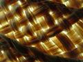
Chameleon Computerby ephesusComment: This is very much like the shot that won second place on a challenge done not so long ago. Very well set up, but I think it needs a bit more originality. So I gave this a 4. It's aligned almost perfectly, but a few gliches. Sorry I gave this a 4, I believe it deserves more like a 7 at least. Like I just said, the effect was recently done so I took off a lot of points there. |
| 11/17/2005 03:08:10 AM |
In Liberty's clothesby srugoloComment: I gave you a 4 because of the creavity and effort you put into this shot. I think you're missing a book though. I would have thought from this angle you'd be able to see at least the corner of the book. I'd give it a 6, but because this picture was lacking that book and it's grainy. |
| Photographer found comment helpful. |
| 11/17/2005 03:06:12 AM |
Nothin like Scotch, I tell you. Nothing.....by mpembertonComment: I thought this was rather witty of you to place the lens into a scotch bottle container and then placing it on a leather jacket. A good disguise for the lens. I gave a 4 though because it didn't give a good first impression. |
| 11/17/2005 03:03:33 AM |
Camouflage...A bad example.by bairasComment: I'd judge you for the title, but I take the challenge in a more literal way. It's a great shot none the less. I just ended up giving a 1 on this one because it does fit (to me) into the challenge. I know you made it stuck out like a sore thumb on purpose and it's a great effect to desaturate colours. If placed in another challenge I'd definitely give you somewhere around a 5 to 8. Sorry I gave you a 1 though. |
| Photographer found comment helpful. |
| 11/17/2005 03:00:14 AM |
Hatby PuffaliComment: This looks more like a shot for a texture or single light source challenge. I can also leave it to my imagination and prentend that you were hiding somewhere. It's a good photo but lost it all (in my opinion) not being in the right challenge. The picture is a bit pixelated as well, so maybe a smaller photo would have done better. I hope it helps. |
Home -
Challenges -
Community -
League -
Photos -
Cameras -
Lenses -
Learn -
Help -
Terms of Use -
Privacy -
Top ^
DPChallenge, and website content and design, Copyright © 2001-2025 Challenging Technologies, LLC.
All digital photo copyrights belong to the photographers and may not be used without permission.
Current Server Time: 08/17/2025 09:11:43 PM EDT.