| Image |
Comment |
| 05/03/2006 10:31:41 PM |
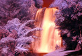
Come Hell Or High Waterby 3DsArcherComment: This photo seems extremely over processed. For me the connection could have been made with a nicely saturated in natural colors. The processing takes away. |
 Photographer found comment helpful. Photographer found comment helpful. |
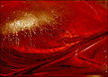
| 05/03/2006 10:30:04 PM |
"I'm on top of the world"by red_geckoComment: WOnderfully colored and set up photo. I like the saturation and the backlighting effect. However I would make it fit the challenge maximum size of 640 pixels. Nicely done. |
| Photographer found comment helpful. |
| 04/29/2006 10:48:11 AM |
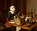
Invitingby jeroweComment: Greetings from the Critique club. First let me tell you what I love about this photo. I like composition of this photo. I love the models expression and the framing of her hands for the face. The shallow DOF works well for the right side of the photo, however getting a little deeper DOF and sharper focus on the eyes would make this photo stand out. I also feel that the hair in front of the right eye is distracting. Overall a pretty good attempt with a few changes this could be a very well done shot. |
| Photographer found comment helpful. |
| 04/29/2006 10:33:33 AM |
Renaissancesqueby arminComment: Hello from the Critique club. I think this is a well done and nicely posed and framed photo. The antique and painting feel of this works extremely well. The coloring of the photo seems extremely lifelike and well done. There are a few things I think could be changed to make it score even better then it did. Although the colors are nice the photo seems a bit flat bumping the contrast up with levels and curves adjustment would make the photo POP which seems to be required to score in the top 10 here on DPC. Focus on the face is a touch soft. The antique feel while wonderful in my book seems to be working against you with the voters. The other thing that I can think of is that its not truly a studio Portrait but more of a well done snapshot. Had this been in a different challenge I think it would have scored even better and placed better as well. Overall well done and a good placement considering the challenge. |
| 04/05/2006 11:54:12 PM |
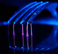
Hydro-Static by MQuinnComment: Wow I hadnt even looked at abstract macro, and here you rocked it out dude! Congrats on your first ribbon. And congrats on bringing that Olympus camera to the front page! Nicely done you deserve it. |
| Photographer found comment helpful. |
| 02/22/2006 01:30:24 PM |
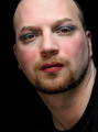
_I Feel Pretty..._by ArtysteComment: Anyone that will put makeup on theirself and actually post it on the internet for their art deserves a 10. And you got one from me. You are the man! err yeah I think thats right. |
| Photographer found comment helpful. |
| 02/17/2006 08:09:13 PM |
Icy Hotby brizmamaComment: Greetings from the Critique club. I think your photo really meets the challenge well. Its definatly an abstract. I like the colors and the lines. I think you scored really well, there are a few suggestions that I might suggest to help you fix the problems I see with it. The light? reflection in the upper left likely should have been cloned out and made the photo super smooth. I also would have tried to clone out the bubbles that have the reflections in them. I am kind of surprised at the lack of comments you got. Thats kind of surprising for a photo to finish with an above average score and not get comments. I think overall you did very good with a few tweaks to the post processing it likely would have scored even better. Good luck in future challenges. |
| Photographer found comment helpful. |
| 02/17/2006 11:31:15 AM |
LoveSwans - Heart makingby GunnsiComment: This is a really nice image that you flipped to make the effect. I would have liked to see you use the eraser to take the blue tint off of all the swans to make them not Blue. Good idea though. |
| Photographer found comment helpful. |
| 01/30/2006 08:25:45 PM |
Tulips on Blueby banmornComment: I really like the colors and the composition on this. However the blue in the background looks noisey. Not sure if that was intentional or not, however I think it takes away from the photo. |
| Photographer found comment helpful. |
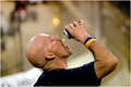
| 01/27/2006 09:04:39 PM |
The Racetrack Beer Vendorby jseyerleComment: Greetings from the critique club. After spending some time reviewing your photo for the challenge I have a couple of suggestions. First off I think you have a great subject, nice colors good focus with nice stop action on the beer spilling off the subjects face.
Some things that dont work well according to the challenge. I would think singled out would require a crowd, a different angle of this same subject with the crowd in place and the shallow DOF would have done wonders for the score. Centering doesnt usually work really well for DPC voters otherwise a good entry scoring about where I would expect. Good luck with future challenges. |
Home -
Challenges -
Community -
League -
Photos -
Cameras -
Lenses -
Learn -
Help -
Terms of Use -
Privacy -
Top ^
DPChallenge, and website content and design, Copyright © 2001-2025 Challenging Technologies, LLC.
All digital photo copyrights belong to the photographers and may not be used without permission.
Current Server Time: 08/01/2025 10:13:08 AM EDT.