| Image |
Comment |
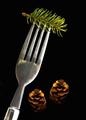
| 03/23/2004 12:19:50 AM |
Easy Home Cookingby KonadorComment: Nice except for the shadows. Very creative in my opinion. Althought you should have arranged the 3 items so that the left one was parallel to the grains in the upper left, and then so the other two are perfectly aligned with the right and bottom edges of the image. |
 Photographer found comment helpful. Photographer found comment helpful. |
| 03/23/2004 12:17:57 AM |
Wby AleciaComment: What is "W"? Is it like a Playboy type of thing? You should have cloned out the freckles on her arm. |
| Photographer found comment helpful. |
| 03/23/2004 12:16:37 AM |
Metropolisby flip89Comment: More contrast!!! I want to see dark black and whiter whites here but don't. :( The composition is very interesting however. |
| Photographer found comment helpful. |
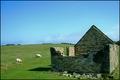
| 03/23/2004 12:15:13 AM |
Country Livingby xburnerxComment: Ack it's tilted to the left. :( Not more but it's noticable for sure. Otherwise it's really cool. What I really like about this (and which fits the "magazine title" thing) is the how there is green in the bricks of the building which I think fits the theme well and blends in with the green of the pasture. |
| Photographer found comment helpful. |
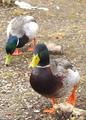
| 03/23/2004 12:12:39 AM |
Ducks Unlimitedby nsoroma79Comment: Real magazine? Sometimes I think people make up these mag names. :) If this really is a magazine, this would be a GREAT cover shot. The only thing would be to remove that rock in the foreground near the ducks right foot. |
| Photographer found comment helpful. |
| 03/23/2004 12:10:12 AM |
ATV ACTION!by spydrComment: I like the exagerrated green. Goes well with the white and blue. |
| Photographer found comment helpful. |
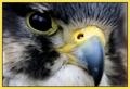
| 03/23/2004 12:09:16 AM |
Bird Timesby pitsamanComment: Magazine covers should be Portrait not Landscape. It amazes me how many people don't seem to realize this or think of it. With the apparent high rez you have here, it seems you could have easily cropped this so that it's Portrait. |
| Photographer found comment helpful. |
| 03/23/2004 12:06:32 AM |
|
| Photographer found comment helpful. |
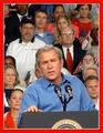
| 03/23/2004 12:04:52 AM |
TIMEby RonBComment: Should have sharpened the George W. a little. Is this a real picture or did you take a shot of your TV? :) Would make a great magazine cover. Also you should have tried to get all of the Presidential Seal on the podium. Good job anway. |
| Photographer found comment helpful. |
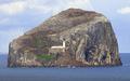
| 03/22/2004 11:47:05 PM |
Lighthouse Digestby browntComment: Doesn't look real. What ever you did, was wrong. :) It's tempting to select a certain portion of an image and then go crazy with adjustments, but this a clear example of what NOT to do when fixing your images in PS. |
Home -
Challenges -
Community -
League -
Photos -
Cameras -
Lenses -
Learn -
Help -
Terms of Use -
Privacy -
Top ^
DPChallenge, and website content and design, Copyright © 2001-2025 Challenging Technologies, LLC.
All digital photo copyrights belong to the photographers and may not be used without permission.
Current Server Time: 08/27/2025 09:41:47 PM EDT.