| Author | Thread |
Comments Made During the Challenge  |
|
|
03/28/2004 03:51:04 PM |
|
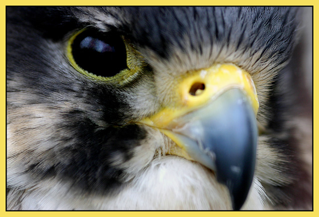
At first glance I didn't like this shot, and wouldn't even give it a vote. But now I really enjoy the almost too aggressive diagonal composition. It's hard to judge whether the bird is alive or not. But I really don't care in this case. The picture has got nice colours, and the sharpness is on the right spot, i.e. the eye! |
|
 Photographer found comment helpful. Photographer found comment helpful. |
|
|
03/27/2004 09:40:46 PM |
|
The border is a bit overwhelming and the landscape format detracts from the Magazine Cover idea. Outside of those two items, strong image, very well captured. |
|
| Photographer found comment helpful. |
|
|
03/27/2004 12:25:42 PM |
|
| Photographer found comment helpful. |
|
|
03/26/2004 11:25:58 PM |
|
Yikes! Any closer and you'd scratch the lens. The detail is so wonderful that I want to see more of it, so the shallow DOF hurts. |
|
| Photographer found comment helpful. |
|
|
03/26/2004 10:57:42 PM |
|
wish the beak was in focus too! |
|
| Photographer found comment helpful. |
|
|
03/26/2004 03:27:29 PM |
|
Too bad about the horrible yellow border. How would an editor crop this to put it on a magazine cover? Nice closeup though |
|
| Photographer found comment helpful. |
|
|
03/25/2004 09:23:06 PM |
|
Your picture is really nice. The only improvements I could suggest would be to have the beak in focus and perhaps not crop it quite so closely. |
|
| Photographer found comment helpful. |
|
|
03/25/2004 07:40:31 PM |
|
I like the composition, but the depth of field is too narrow. The center of interest is the nostril, and it should be in focus, as well as the feathers with their fascinating texture. |
|
| Photographer found comment helpful. |
|
|
03/24/2004 07:17:41 PM |
|
Great shot but wrong orientation. |
|
| Photographer found comment helpful. |
|
|
03/23/2004 11:45:02 AM |
|
| Photographer found comment helpful. |
|
|
03/23/2004 08:24:11 AM |
|
Just about jumped out of my chair when your photo came up on my sreen very well done... |
|
| Photographer found comment helpful. |
|
|
03/23/2004 05:08:11 AM |
(I'm writing this to everyone who submitted a landscape shot) The challenge was to produce a shot worthy of a magazine cover but to me a shot like this is not suitable to be put on a "portrait" format magazine.
Great pic otherwise though I do find the border distracting
---ADDITIONAL---
Due to forum discussions and accusations that marking landscapes down is nitpicking, I'm going through them and remarking. I still think some of the landscapes would not make good covers because of their orientation but I am no longer marking down because of that.
I still think landscape is inapropriate for the majority of magazines but I'll give the benefit of the doubt to the photographers. |
|
| Photographer found comment helpful. |
|
|
03/23/2004 03:18:44 AM |
|
Very distinctive photo, I like it a lot, although I think a portrait photo for this challenge is better - 8 |
|
| Photographer found comment helpful. |
|
|
03/23/2004 12:09:16 AM |
|
Magazine covers should be Portrait not Landscape. It amazes me how many people don't seem to realize this or think of it. With the apparent high rez you have here, it seems you could have easily cropped this so that it's Portrait. |
|
| Photographer found comment helpful. |
|
|
03/22/2004 11:41:14 PM |
|
beautiful close up... really really wonderful! |
|
| Photographer found comment helpful. |
|
|
03/22/2004 03:45:13 PM |
|
excellent idea, but its not magazine format. maybe better with the nose in focus as well. But colorwise its very good. |
|
| Photographer found comment helpful. |
|
|
03/22/2004 03:43:21 PM |
|
Lovely close up of a stunning bird but as a "landscape" shot I dont really think it works as a magazine cover. |
|
| Photographer found comment helpful. |
|
|
03/22/2004 03:36:39 PM |
|
Stunning, what can I say, hope you didn't get pecked. Would deservedly grace a magazine cover - 9. |
|
| Photographer found comment helpful. |
|
|
03/22/2004 03:33:35 PM |
|
Nice falcon, would rather see more head or whole specimen. |
|
| Photographer found comment helpful. |
|
|
03/22/2004 12:21:17 PM |
|
This picture is the greatest, really nice colors |
|
| Photographer found comment helpful. |
|
|
03/22/2004 10:17:46 AM |
To much of the photo out of focus, I think. A larger dof would help, imo. I don't like the extreme close up all that much. I would have backed off just a bit for the shot.
Cute subject. |
|
|
|
03/22/2004 09:49:46 AM |
|
Again this distracting NG border ! :(. Otherwise super nice bird closeup shot. |
|
| Photographer found comment helpful. |
|
|
03/22/2004 08:34:29 AM |
|
Awesome photo! Is it a Kestrel? Would have like to seen a little deeper DOF and a portrait orientation. |
|
| Photographer found comment helpful. |
|
|
03/22/2004 07:35:42 AM |
|
Nice idea, but how many magazine covers use the landscape format? Excellent color and detail. |
|
| Photographer found comment helpful. |
|
|
03/22/2004 04:52:48 AM |
|
I reckon using a smaller aperture to get more details would be nice... |
|
| Photographer found comment helpful. |
|
|
03/22/2004 01:57:15 AM |
|
I would like his beak a bit sharper, but cool anyway. |
|
| Photographer found comment helpful. |
|
|
03/22/2004 12:27:12 AM |
|
Wow! This is an awesome shot. This is top quality and pitch perfect. I'm going to give you a high mark; however, you may find others will mark you down for having a horizontally cropped image instead of a vertically cropped image. IT seemed to be an issue in the last magazine challenge. |
|
| Photographer found comment helpful. |
Home -
Challenges -
Community -
League -
Photos -
Cameras -
Lenses -
Learn -
Help -
Terms of Use -
Privacy -
Top ^
DPChallenge, and website content and design, Copyright © 2001-2026 Challenging Technologies, LLC.
All digital photo copyrights belong to the photographers and may not be used without permission.
Current Server Time: 06/29/2026 01:39:33 PM EDT.