| Image |
Comment |
| 05/22/2004 09:05:19 PM |
|
| 05/22/2004 09:03:59 PM |
|
| 05/22/2004 09:02:16 PM |
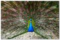
Show Off!by osramComment: Cool shot. Couple things: 1) It's tilted to the right. Amazing how many people miss this. 2) The bird isn't centered. Still a cool shot however. 7. |
 Photographer found comment helpful. Photographer found comment helpful. |
| 05/22/2004 08:59:38 PM |
quiet reflectionby ursulaComment: The colors are a little off but the composition and subject is great. This is a perfectly "weighted" image. Not sure if it fits the challenge however since the horizon (centered part) really isn't strong enough to be the subject. I guess it does fit. |
| Photographer found comment helpful. |
| 05/22/2004 08:56:25 PM |
Squirrelby rj324Comment: It's amazing how the fur has almost the exact same texture and color as the bark of the tree. Excellent picture BTW. :)
|
| Photographer found comment helpful. |
| 05/22/2004 08:55:04 PM |
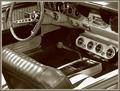
A "Shift" Back to the Pastby tfarrell23Comment: You've probably already heard this: The shifter isn't a strong enough subject. Still a good picture, but just doesn't fit the challenge well. |
| Photographer found comment helpful. |
| 05/22/2004 08:53:34 PM |
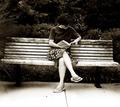
Away from it Allby elsapoComment: Two things: 1) It's tilted to the right. Looks like she is going to slide right off the end of the bench. 2) You should have cropped it a little so the frame is more portrait. That would fit better with the person and also not show the ends of the bench. The B&W/Sepia is nice.
|
| Photographer found comment helpful. |
| 05/22/2004 08:49:54 PM |
Grandma's Crossby katlynComment: It's a little out of focus. And the whites are "blown out", meaning there is a lot of pure white (dead) pixels. |
| 05/22/2004 08:48:42 PM |
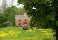
Springtimeby emorgan49Comment: Should have not included the tree in the foreground. The door of the house looks interesting... you should have tried taking a close up of that instead. |
| Photographer found comment helpful. |
| 05/22/2004 08:47:35 PM |
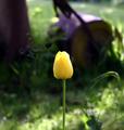
Tulipby Ecce_SignumComment: What is that mess on the left side? Looks like you tried to clone out something but just gave up? The flower itself is great, nice lighting. The background is extremely distracting however. I'd have cropped this more so there's less background. |
| Photographer found comment helpful. |
Home -
Challenges -
Community -
League -
Photos -
Cameras -
Lenses -
Learn -
Help -
Terms of Use -
Privacy -
Top ^
DPChallenge, and website content and design, Copyright © 2001-2025 Challenging Technologies, LLC.
All digital photo copyrights belong to the photographers and may not be used without permission.
Current Server Time: 08/27/2025 06:06:12 PM EDT.