|
|
|
Showing 611 - 620 of ~1383 |
| Image |
Comment |
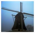
| 12/23/2002 10:47:26 PM | windmillby jeboComment: excellent photo! love the blue sky, the silohoutte blades, and the oak tree. the mist or fog really sets the mood for this image. great job. 10 goodtempo |
| 12/23/2002 10:47:16 PM | Two by two.by mykolearyComment: took a while to figure this one out. love it. great composition. very creative. good exposure and color. 10 goodtempo |  Photographer found comment helpful. Photographer found comment helpful. |
| 12/17/2002 09:54:06 PM | Sabbatier Starby GordonComment: Critique Club critique:
Composition/Content: This picture has great "Wow" effect with the bright and almost neon colors. The shape also adds to the presentation of the colors. The center of interest is the bluish purple star shape in the center of the picture. From there the eye is drawn outward in every direction as the star seems to explode with color in every direction. Very dramatic coloring with the yellows/oranges/reds contrasting with the blues. Interesting crop: we know the shape is a star, but we want to see the tips that have travelled out of the picture. The crop left just the right amount of background.
Background: The gradient from the light blue background around the borders to the darker blue background closer to the subject makes it appear that the subject is part of the background but at the same time is connected to and is coming out of the background.
Camera Work/Technical: Nice work with the zoom to create the "Star Burst".
Digital Processing: Interesting Sabbatier Effect processing to produce the overall effect.
My Opinion: I think you impressed everyone with this photograph. I think it would have scored higher if the audience was told ahead of time to expect some photographs with creative digital processing. I think the photo might win on other sites used to creative digital processing. The more I look at it the more I like it. Well done! |
| 12/17/2002 09:07:57 PM | Yuleby KimblyComment: Critique Club critique:
Composition/Content: Great composition and unique idea. The eye wanders all over the picture seeing the lights and shadows on the skin. Nice framing of the figure and nice subject. There are some opinions below about the overall tint of the photo, I put some blue back into the photo and it didn't look as good with the background still greenish. Good clarity with the goose bumps on the skin clearly visible, which adds to the visual effect of the picture.
Lighting: Lighting is excellent with good use of shadows giving the figure depth.
Background: Background is good. It might look good with a slightly darker background to create contrast between the background and the figure.
Camera Work/Technical: Good exposure and great focus/depth of field.
Digital Processing: Turning down the blue added to the mood and expression of this picture.
My Opinion: Very interesting and original photograph. I think the color of the skin is fine but the background is questionable. Other than that, I wish I'd thought of this. Great idea and execution.
|
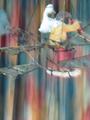
| 12/17/2002 08:15:06 PM | Wings Of Motionby AnthraXComment: Critique Club critique:
Composition/Content: It looks like there is a duck on a monkey's back who is looking through binoculars and they are on some kind of airplane. By the looks of the background they are moving up or down. With most of the picture blurry, the point of interest is the bright spot, the duck. If the plane, duck, and monkey were more in focus they would better catch the eye as ther center point of interest.
Lighting: The lighting is good, all parts of the picture have adequate light.
Background: The background is great, with the all the colors and blur showing motion.
Camera Work/Technical: The exposure might be a bit too long. The foreground colors are a bit washed out.
Digital Processing: I would like to have seen the colors saturation level a bit stronger.
My Opinion: It looks like you had a great idea and had some difficulty executing it. It looks to me like they are going up and looking down to where they came from. Nice job.
|
| 12/16/2002 10:06:31 PM | Music Box Ballerinaby SquiffyeitherjagComment: Critique Club critique:
Composition/Content: Great subject and colors. Great idea too. The eye wants to go to the ballerina's face but goes to the two bright spots on top of her head and to the right of her. I would like to have seen the ballerina's arm fully in the picture.
Lighting: The lighter spots in the picture take the eye away from the ballerina. Otherwise, the lighting is right on.
Background: The background colors give the picture life.
Camera Work/Technical: It looks like you either started with the ballerina on the right and moved it left, or the camera on the left and moved it right. In either case it produced the same thing, part of the blur on top of the ballerina. If you started with the ballerina on the right and moved it to the left to end up in the position it is in, you might have avoided the blur being on top of the ballerina. Or, you might have done what indigo997 suggested below. Exposure is good.
Digital Processing: Colors, saturation and contrast look good.
My Opinion: You have all the makings of a great picture, just needed to change the center of interest. Nice job. | | Photographer found comment helpful. |
| 12/16/2002 09:32:23 PM | Gliding Swanby icemarnComment: Critique Club critique:
Composition/Content: The ripples in the water and the position of the duck show motion. The diagonal is good. The point of focus of the photo is the rear end of the duck and the orange feet of the duck. This is where my eye lands first. I would have liked to see the picture cropped so that most of the water on the left and bottom was not in the frame. This would have moved the point of focus closer to the head of the duck and the direction it's moving.
Lighting: Lighting is good. It looks like you might have used a polarizing filter or the lighting was even from an overcast. No glaring spots.
Background: The water is clear and blue.
Camera Work/Technical: Exposure is good as is focus.
Digital Processing: You might have brightened the picture a little making the duck a little brighter white, and saturated the blue water and orange feet just slightly.
My Opinion: I think with brightening the picture and cropping to put the duck crossing the photo rather than apparantly leaving the photo would have given this photo several more points in scoring. |
| 12/16/2002 08:33:37 PM | Going with the Flowby spidermanComment: Critique Club critique:
Composition/Content: Catches the eye with the shiny metallic surface. The center of focus is the center of the photo where the surface is the shiniest. From there the eye wanders in two directions: up to the left across the pouring surface, and down to the left to where the liquid is pouring into the bubbles. The bubbles add content to the photo. The grain in the upper left is a little disappointing to the eye. Great camera angle and composition.
Lighting: Lighting is excellent, bright across the photo and no particular bright or dark spots.
Camera Work/Technical: Exposure is good. ISO of 400 might be the cause of the grain in the upper left. I don't know, but possibly a smaller aperature, F8, and longer exposure might have let you shoot at a lower ISO, resulting in less grain at the top and a wider depth of field. Again, that might not have been possible.
Digital Processing: Color tweaking looks great, is balanced and nice and bright.
My Opinion: I might have cropped the top third. Great creativity, color, and overall impact to the eye. |
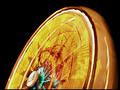
| 12/16/2002 08:04:46 PM | Ferris Wheelby FrooberComment: Critique Club critique:
Composition/Content: The bright colors and shape against the black background give this photo "Wow". The center of focus appears to be in the center of the photo where the yellow lines have more contrast with their background. I woulk like to have seen the center of the wheel or the structure holding the wheel more in focus to give the eye an anchor to latch on to and wander from.
Background: The black background gives the bright colors great contrast.
Camera Work/Technical: Exposure is very good. Focus appears to be center weighted and might be better either towards the center of the wheel or widened.
Digital Processing: Color is balanced and nice and bright.
My Opinion: I usually don't like titles having to explain a photograph. I would like to have seen more of the structure or something in the picture that told me this was a ferris wheel. When I first looked at it, I thought it was a toy or a fan. Anyway, this is a great photo and a great idea.
| | Photographer found comment helpful. |
| 12/12/2002 08:16:37 PM | Sunny Side Upby DougPazComment: interesting photograph. the apparent motion makes it look like the egg flipper may have been angry and was slamming the egg down into the pan. the oil bottles help set the scene. the bluish purple under the pan looks surreal. nice shot. |
|
Showing 611 - 620 of ~1383 |
Home -
Challenges -
Community -
League -
Photos -
Cameras -
Lenses -
Learn -
Help -
Terms of Use -
Privacy -
Top ^
DPChallenge, and website content and design, Copyright © 2001-2025 Challenging Technologies, LLC.
All digital photo copyrights belong to the photographers and may not be used without permission.
Current Server Time: 08/18/2025 06:18:43 PM EDT.
|