| Image |
Comment |
| 02/10/2003 07:18:41 PM |
Magic Carpetby NatashaComment: interesting but i would like to see it a little closer, maybe too much background. |
 Photographer found comment helpful. Photographer found comment helpful. |
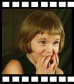
| 02/10/2003 07:14:50 PM |
|
| Photographer found comment helpful. |
| 02/10/2003 07:13:49 PM |
|
| Photographer found comment helpful. |
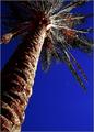
| 02/10/2003 07:12:34 PM |
Moon Palmby AnnidaComment: i like the perspective, but the post processing looks a bit overdone. |
| Photographer found comment helpful. |
| 02/10/2003 07:11:49 PM |
|
| Photographer found comment helpful. |
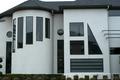
| 02/09/2003 07:51:03 PM |
All the Shapesby DennisFComment: Critique Club Critique
COMPOSITION/CONTENT: Very interesting house and nice capture of the image. The shapes of the windows on the house are very interesting, so interesting that they become the main focus of the photograph, rather than the squares. Since you included the shrubs and sky, I would have liked to have seen the entire roof (not cut off) and possibly more of the foreground.
CAMERA WORK/TECHNICAL: Good angle and square to the subject. The focus is a little soft and the exposure could have been a little longer. I might have used a polarizing filter to be able to brighten up the white surface of the house while minimizing the reflections in the windows.
DIGITAL PROCESSING: With some color and histogram adjustment, the green in the bushes could be greener, and the overall image could be brighter with more contrast between the light and dark areas.
MY OPINION: The subject here is fantastic. With a little post processing this image could be much more impacting. Great shot! |
| Photographer found comment helpful. |
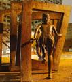
| 02/09/2003 07:23:53 PM |
Jumping through squaresby jab119Comment: Critique Club Critique
Composition/Content: Interesting image. You've had some really good comments on how to improve this. The different sources of light create a background that is a different color than the foreground and that takes away from the impact of the image. Being a picture of someone else's artwork also takes away points. The camera angle hides the other figures jumping through the squares.
Camera Work/Technical: You've really done a good job with the focus, exposure, and the night shot.
My Opinion: I think that being mostly a picture of another's artwork, having a distracting background, and the main subject not really a square contributed to this image's final score in the challenge. Even so, I think it is a very interesting shot and would like to have seen it from the front of the figures. |
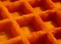
| 02/09/2003 06:53:58 PM |
Stop Waffling!!!by KimInNBComment: Critique Club Critique
Compostion/Content Interesting subject but I also think it could use something else to set off the waffle. Maybe not quite so close and a pat of butter or some syrup. It's a good closeup and meets the challenge but lacks that 'Wow' something. Maybe even some whipped cream on it, not really sure.
Camera Work/Technical Excellent focus and exposure.
Overall Opinion Meets the challenge, looks good and appetizing, but could use something else to set it off. Another idea might be to get closer and create an abstract out of it or use more dramatic lighting to create shadows and depth. Nice shot! |
| Photographer found comment helpful. |
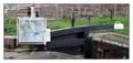
| 02/09/2003 06:43:15 PM |
Firepool Lockby ioComment: Critique Club Critique:
Composition/Content: The central point of focus, the square, looks broken and dirty and is not very attractive. The image is busy with the background items distracting from the subject. It might have been better to back up and show what the lock looks like and its relationship to the square.
Camera Work/Technical: Focus is a little soft even on the main subject. Exposure is good with good color.
Overall Opinion: The subject is an interesting subject but not at the angle it is currently captured. A slightly different composition with more of the lock in the foreground and a spot focus on the square would blur the background more, make the square sharper, and would better show the square's relationship to the lock. |
| Photographer found comment helpful. |
| 02/04/2003 07:17:24 AM |
Erlaby IceRockComment: This would have been much better without the border. |
Home -
Challenges -
Community -
League -
Photos -
Cameras -
Lenses -
Learn -
Help -
Terms of Use -
Privacy -
Top ^
DPChallenge, and website content and design, Copyright © 2001-2025 Challenging Technologies, LLC.
All digital photo copyrights belong to the photographers and may not be used without permission.
Current Server Time: 08/06/2025 09:20:56 AM EDT.