| Image |
Comment |
| 01/10/2007 10:28:36 PM |
|
| 01/10/2007 10:27:35 PM |
Jasby rsimmonsComment: I think this lacks detail - perhaps it has been cropped down so much that detail has been lost? I'd like to see more detail, contrast, and sharpness in the eyes. |
| 01/10/2007 10:26:28 PM |
|
| 09/13/2006 12:23:54 PM |
|
 Photographer found comment helpful. Photographer found comment helpful. |
| 09/08/2006 01:44:53 AM |
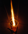
Hostageby JutildaComment: This image is amazing. It is also amazing the disparity between the avg. commenter's vote and the end result. I feel your score is highly underrated, and I wish more of the under 6 voters woould share what they liked or disliked abut the image.
The textures are fabulous. The lighting is perfect - very dark and emotive. The subject mater is powerful. |
| Photographer found comment helpful. |
| 09/07/2006 11:43:35 PM |
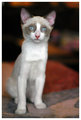
sugar-portrait.jpgby L1Comment: What a beautiful little kitten, Laurie. I like the way the warm background sort of contrasts with the cool color of his/her eyes. |
| Photographer found comment helpful. |
| 08/17/2006 12:58:07 AM |
Worst singer in the worldby BoltiComment: *Critique Club*
This is a funny image. The lighting is nice. The humor is dead on. There is a little loss in the detail of the water towards the center of the frame over the shirt. I think a closer crop and a cleaner glob of water (rather than a spray) would lend more magic to the image. Well done! |
| Photographer found comment helpful. |
| 08/17/2006 12:53:38 AM |
Precisionby Dr.ConfuserComment: *Critique Club*
You have produced a clean and very crisp image. The colors are fantastic, and the details are very clear. I think the image would have more imoact with a different crop - to show more of the contrails and leave more negative space in the frame. Just a thought. Well captured though, and beautifully presented. |
| Photographer found comment helpful. |
| 08/17/2006 12:49:58 AM |
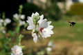
Time to Head Homeby jaysonmcComment: I would have to agree on the cropping. You actually have a couple if really nice options. For the Stopped Motion III challenge, I think a crop to fill the frame with the flowe and the bee would have more impact. I do love the colors in the image, and the shallow DOF lends a nice Bokeh effect to your background.
I really like the soft blur of the bee's wings and the pick centers of the blossoms. It is what I find in small details like this that makes the image beautiful. |
| Photographer found comment helpful. |
| 08/14/2006 05:04:02 PM |
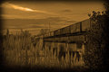
Remembering the Pastby SDWComment: Your post processing technique is beautiful. I love the tall grass in the foreground. Image looks like an old fashioned daguerreotype. |
| Photographer found comment helpful. |
Home -
Challenges -
Community -
League -
Photos -
Cameras -
Lenses -
Learn -
Help -
Terms of Use -
Privacy -
Top ^
DPChallenge, and website content and design, Copyright © 2001-2026 Challenging Technologies, LLC.
All digital photo copyrights belong to the photographers and may not be used without permission.
Current Server Time: 06/30/2026 05:54:20 PM EDT.