| Image |
Comment |
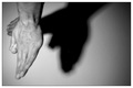
| 01/10/2006 10:40:51 AM |
Eagleby matoComment: I like how you had quite a different take on shapes by presenting shapes made by shadow. My critique on this piece is that I think you could have easily cropped off more negative space on the right. It does little to help with the composition overall and closely cropping it will help maintain the viewers focus on the main subject - the hands and the shadow on the wall. Also I would have liked to have seen the hands in sharper focus - the fingers on the hand in the forefront are slightly blurred. Another element that could help in improving this composition is the close down the aperature (if possible) to increase the depth of field such that the shadow is also in sharper focus. |
 Photographer found comment helpful. Photographer found comment helpful. |
| 01/09/2006 01:03:35 PM |
Shaping Life and Lightby BotKeeperComment: You set up a composition that is very challenging. It can be very difficult to mantain/keep a sharp focus on all elements in the photo because the flower stems below the water line are going to be distorted from the glass & water - Focusing on them will make the stems outside the glass or above the water line slightly out of focus. Shooting just a portion of a see through vase like you did here will be difficult to keep all elements in focus. Also the composition could be stronger if you had pulled back to include the flowers in their entirty - the reason why the flower and not the stem is attractive is because it has visual appeal. I get the feeling that you wanted to show the shapes - not from the stereotypical flower in vase shapes- but by the 'lines'/the stems that draw on the sustanance needed to sustain life (the flower). By focusing on the stems you get away from the typical flower shot but by doing so you snipped the visual appeal off at the bud. If I am correct that you wanted to show the shape of lines drawing on life to sustain the flower there could be better ways in presenting it without losing overall visual appeal. Just one suggestion that I can offer is that the composition could have introduced patterns made with the stem shapes. First I would have filled the water to the top that way it would have minimalized the 'distortion you would get from light bending the stems and thus increase overall sharpness in the image. Next, you could have arranged some of the flower stems to take the shape of a cross-hatched pattern thus adding visual interest to what is occurring in the vase itself. This may take some creative arranging with using some invisible tape inside the glass vase or string tied around the stems such that the rim hides it. Lastly just to add a little visual punch to the composition and remind the viewer what these stems are supporting, you would include just a small glimse of flower. This adds a little color and a little more dramatic interest if we just see the bottom half or fourth of the flower peeking into the image. |
| Photographer found comment helpful. |
| 01/09/2006 12:40:12 PM |
iciclesby ralphComment: I love the freeform shapes of the ice crystals in this photo. The focus is so sharp and detailed that we can see all the imperfections/bubbles withing each icicle. The composition is simple and clean with the main focus staying and settling on those various sized icicles - The image is crisp in sharpness but because of the subject I also feel the "crisp" from the coldness in the air. I also like the long icicle on the far right for it twists & curves, adding a unique shape that sets it apart from the other icicles. |
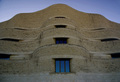
| 01/09/2006 12:35:32 PM |
Civilization Buildingby Steveo77zComment: I can't say exactly why I find this so appealing but I love the "stacked" shapes of the building as it rises to the sky. The curves of the building also add high visual interest because it is not the typical square cornered building. This almost comes off as looking like some ancient Mayan pyramid. |
| Photographer found comment helpful. |
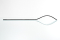
| 01/09/2006 12:32:43 PM |
BiForkby FedericoComment: Very simple and elegant minimialistic presentation with this composition. The balance of light and dark in both of these "forks" invokes the idea of the yin & Yang symbol. At times I can see the shapes of the forks here but the way that they join one can easily visualize a sharp tipped spoon - yet another utensil shape. |
| Photographer found comment helpful. |
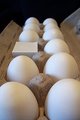
| 01/09/2006 12:28:16 PM |
Square P' Egg + Round Hole = Sore Chickenby willagherComment: Love the creative "out of the box" thinking and presentation on this composition! The chicken really got bent out of shape 'pegging' this one:-). Lighting is good and the angle you shot it at was excellent for the composition. Presenting it with the egg carton showing the eggs in two straight lines really helps the composition because our eyes travel down the rows to discover the odd man/shape out. Those neat two lines really draws our eyes to what is the main focus/idea/surprise of this photo. |
| Photographer found comment helpful. |
| 01/07/2006 09:34:22 PM |
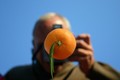
Focus on Fruitby LeejpComment: I like how you have taken the approach to shot a picture from a different angle. Changing position/angle can add dramatic interest. This composition has that but there is elements that can be improved upon to make this shot great. First is that I think the composition would be improved if the photographer had moved such that we see more of the camera and photographer that is hidden by the orange. The circular shape of the lens would greatly compliment the circular shape of the orange and further strengthen the connection to the Shapes Challenge. Also, if you can, addusting the aperature down to the highest settings say 8-16 will greatly improve the depth of field. The background will be in sharper focus which would therefore give us a sharper image of the photographer and his camera in the background. Lastly, I think the leaf on the orange is a distracting element - especially when we can see the reflection of it on the mirror. |
| 01/07/2006 09:25:27 PM |
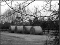
Country Hayby espy2Comment: Nice dominate circular shapes found in the bales of hay. A nice capture of pastoral life but there are two things that could improve the image. First there are the tree branches in the forground that dominate half the photo. They are a distraction and take attention & focus away from the main subject - the hay bales. By moving up a couple of feet you could eliminate them from your composition and regain the focus on the main subject. Next is this appears to be a straight on eye level shot. Shooting at a higher or lower angle can add dramatic interest. I.E. taking a shot from the ground angled up can give this hay bales some hight giving us an impression of a large size. |
| Photographer found comment helpful. |
| 01/07/2006 09:20:10 PM |
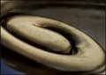
Koru in bronzeby kari1Comment: O.K. I have to admit that I had to do a Google search for the meaning of Koru. The image has a lot of potential if certain elements were included. The spiral shape of life, movement and growth would be more appealing if it had a companion. Some greenery to compliment the symbology of the symbol - such as a new sprig of a curled fern or fern or plant life near it or around it - maybe even framing it. The bronze hue of the Koru seems washed out - the colors are not rich and warm perhaps a change in lighting would help in bringing out more of the gold/amber hues - then again perhaps bringing in some greens/plantlife would really offset it may set off such that the colors would be more rich and warm. Here the color scheme is not very varied and comes off a little cold. |
| Photographer found comment helpful. |
| 01/07/2006 09:09:49 PM |
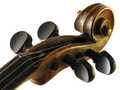
Wooden Curlsby AlbireoComment: I like the curves in this musical shape. Nicely captured but I feel the white background does nothing to compliment the image. The reason is that the white is stark and sterile - no rich hues to compliment the wood tones and brownish golds seen on the instrument. I think a background of a rich brown velvet or a dark gold would greatly compliment the color hues - especially since those colors can convey a feeling & mood of rich, warm music spilling forth from this musical instrument. |
| Photographer found comment helpful. |
Home -
Challenges -
Community -
League -
Photos -
Cameras -
Lenses -
Learn -
Help -
Terms of Use -
Privacy -
Top ^
DPChallenge, and website content and design, Copyright © 2001-2025 Challenging Technologies, LLC.
All digital photo copyrights belong to the photographers and may not be used without permission.
Current Server Time: 08/09/2025 02:40:19 AM EDT.