| Author | Thread |
|
|
01/12/2006 06:23:52 PM |
I wind up giving this advice at least a few times each time I do threads like this. The colors here are so muted that I would instantly think about B&W. You could make some excellent contrast here and then the picture becomes all about shape instead of us staring and wondering exactly what color the swirl is.
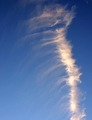
You may have confused people a bit with the title. I didn't know what a Koru was, and I'm sure a lot of others didn't either. The picture is cropped a bit too close to give us any context. So either you could have zoomed out, so we can get a clue as to what a Koru is, or (if you wanted to keep the picture all about "shape") kept the crop, but leave the name out of the title. Although it seems unfair, titles can play a role in your score. Not a huge part, but maybe a tenth or two. |
|
 Photographer found comment helpful. Photographer found comment helpful. |
|
|
01/12/2006 06:21:02 PM |
I really love this picture and it's too bad it didn't score higher.
I gave it a 8 because it was a pure shape. My only regrets were to have the curves of the shape touching the border and the white ray on the left border.
Once again very nice picture ;) |
|
| Photographer found comment helpful. |
|
|
01/12/2006 05:54:38 PM |
Challenge
- Relevant to the Challenge? Yes
- Is subject unique (vs. unoriginal or rehashed)? Yes
Compostion
- Good or Bad? How can it be fixed? I really didn't know what to think here. I feel like I am missing out on the bigger picture, however the image you captured. is good. Nice textures.
- Good use of Depth of Field? Yes. I like the softness to the front of the image.
- Good focus? Yes
Lighting
- Good use of light? Yes. I love the reflections and the shadows.
Aesthetics/Artistic Appeal:
- What is my reaction or feelings? It's a nice shape, but you had very heavy competition for this one. |
|
| Photographer found comment helpful. |
|
|
01/11/2006 12:25:20 AM |
Greetings from the Critique Club...
I hate that this photo didn't score higher than it did. I'm gonna take a leap and say that the subject is too abstract for the general population. I love the image. The image is all about shape in it's purest form. The image is nothing but shape, and it's very well done. I find that when people are asking me what they are looking at, they generall don't like the image. However much that sucks, it's a fact of life around here. The only time I have ever seen abstracts do particularly well on dpchallenge is when the challenge calls for abstract. You did a great job here of making shape the dominant theme of your image.
John Setzler |
|
| Photographer found comment helpful. |
Comments Made During the Challenge  |
|
|
01/08/2006 02:27:17 PM |
|
You know I like this but there is such a flatness in the color, a little boost in saturation may have scored higher. I still like it though. |
|
| Photographer found comment helpful. |
|
|
01/07/2006 09:20:10 PM |
|
O.K. I have to admit that I had to do a Google search for the meaning of Koru. The image has a lot of potential if certain elements were included. The spiral shape of life, movement and growth would be more appealing if it had a companion. Some greenery to compliment the symbology of the symbol - such as a new sprig of a curled fern or fern or plant life near it or around it - maybe even framing it. The bronze hue of the Koru seems washed out - the colors are not rich and warm perhaps a change in lighting would help in bringing out more of the gold/amber hues - then again perhaps bringing in some greens/plantlife would really offset it may set off such that the colors would be more rich and warm. Here the color scheme is not very varied and comes off a little cold. |
|
| Photographer found comment helpful. |
|
|
01/06/2006 10:57:11 PM |
|
| Photographer found comment helpful. |
|
|
01/04/2006 12:38:23 AM |
|
This is just stunning, beautiful patena and light |
|
| Photographer found comment helpful. |
|
|
01/04/2006 12:38:23 AM |
What's a koru?
ahh... found this on google:
The koru shape is a scroll shape and is linked to the New Zealand fern plant. The shoot of the fern has a curled-over tip which unfurls and becomes a fernleaf.
The koru reaches towards the light, striving for perfection, encouraging new positive beginnings...
The koru, represents the unfolding of new life, that everything is reborn and continues. It represents renewal and hope for the future.
Spiral, geometry of life, sacred creation...
Nevertheless it still looks like a turd to me ;-) |
|
| Photographer found comment helpful. |
Home -
Challenges -
Community -
League -
Photos -
Cameras -
Lenses -
Learn -
Help -
Terms of Use -
Privacy -
Top ^
DPChallenge, and website content and design, Copyright © 2001-2026 Challenging Technologies, LLC.
All digital photo copyrights belong to the photographers and may not be used without permission.
Current Server Time: 06/29/2026 05:42:22 AM EDT.